The best print and digital designers are those who can master the use of grids. In many cases it’s possible to forego the grid, but you’ll generally create higher-quality work if you learn the rules of grid structure and composition.
Grid design is one of the most important components for structuring layouts. Websites use grids to find balance between text, images, and overall page elements.
Although there are many free open source grid systems available, you’ll generally be better off learning to create your own. This post will cover the benefits of custom grid design and how you can learn to build your own grids from scratch.
Planning the Composition
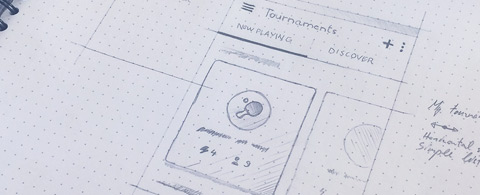
The best professional design workflow starts with wireframing. This traditionally takes the form of a quick sketch where you draw out various ideas to see if any of them feel right.
Some designers prefer to work digitally while others prefer pencil & paper. There is no right or wrong answer – only the the best method for you. Stick with a method that allows you to rapidly iterate between ideas so that you can find the best ones to fit your content.
While sketching you need to consider the overall composition. Think of a website primarily as a container for content. Important tidbits should stand out through symmetry mixed with asymmetry. Design a grid that fits your content and don’t be afraid to move things around.
Generally speaking, wireframes are used to discover raw ideas. During this phase there are no mistakes – only experiments.
Find a way to organize grid structure to create a repetitive meter between different areas of content. Balance can be created by sticking with measurable spaces in recognizable patterns.
If you have trouble getting started pick out a pre-built system like 960GS. It would be better to create your own grid but there’s no harm in starting with a trusted grid system. This allows you to focus more on content organization and less on specific column/gutter values.
Use this initial phase as a testing ground. Figure out how to create repeatable patterns so that users learn when to expect content while browsing through a website.
Spacing Patterns
Symmetrical rhythm is a big part of grid design, especially in regards to lengthy vertical websites. Content should have a natural flowing pattern that guides visitors throughout the page.
One way to find a natural rhythm is to study other websites. Measure the distances between paragraphs and put together a vertical/horizontal rhythm for content. Vertical space is most important on the web but horizontal space also plays a role in compositional structure.
Keep in mind that patterns are meant to be templates as opposed to rules followed slavishly. The best designers rely on their grid as a compass for direction. Sometimes it’s a good idea to break the grid to help an element stand out against surrounding elements.
When it comes to pattern recognition you will need to create some semblance of repetition. Give visitors something to expect while browsing the layout, but don’t be too stiff. I know it seems like a hypocritical remark but with practice you’ll learn when to follow patterns and when to break them.
Grid Design in Practice
Some designers like to use Photoshop guides for delimiting grid columns while others use a separate layer full of rectangles. It honestly doesn’t matter how you create grids, so long as you feel comfortable with your method.
Although there is no particular workflow to follow it’s usually good to start with a horizontal grid. This defines the total number of columns and their sizes in relation to gutters. This process will also give you a final width so you know how big to make the PSD or Sketch file.
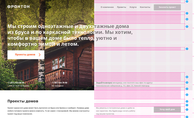
Once you’ve settled on a horizontal grid it’s a good idea to organize a vertical grid, also known as a baseline. The vertical grid’s function is to organize typography so that it aligns with other elements in a natural rhythm.
When combined together you’ll have a powerful tool that can help you reorganize and realign layers so they fit together comfortably. The best grids aren’t seen by users but their presence can be felt in all aspects of the design.
To get started try building a practice project for a made-up client. This way you have no pressure to do a good job but can still learn a lot about custom grid design workflow.
Beyond the Structure
After creating a grid you’ll need to learn how to use it for content placement. Obviously your skills will improve with practice but there are some prototypical rules you should keep in mind.
Try to see beyond the grid structure and imagine how content would fit together. Web design is dedicated to content and every layout should reflect this accordingly.
Try restructuring paragraphs to fit them in the middle of columns instead of right on the edges. Add some extra space below content sections to give the impression of a “new” area on the page.
Another thing to try is merging different grids together for an overarching unified system. Take for example The Gerstner from Gridset. This design uses a 6-column grid with a 4-column overlay matching the same width.
Now you have multiple points to work with so your options are greatly enhanced. But the extra grid can be intimidating so you really should practice traditional grids before overlapping and merging ideas together.
One other advanced technique you might try is using an asymmetrical grid. Fonmon is another sample from Gridset using 5 columns of differing widths. Although it’s rather unconventional, this can help you break out of a regimented structure and reframe your design ideas in a new light.
Grid Tools & Resources
You’ll find plenty of articles discussing various grid systems and how to use them, so I’d like to avoid these resources and focus on grid-based webapps. I’ve put together a few websites that can help you generate your own custom grids from scratch.
It’ll help if you already understand composition and have some working knowledge about how to design grid layouts. But when getting down to the nitty-gritty you’ll save time and stress by using grid generators/calculators.
Gridpak
In the realm of grid generators one of the best options has to be Gridpak. It’s a free online webapp that allows you to scale the grid based on any width to fit columns/gutters accordingly. When you’ve fully designed the grid you can download a “Gridpak” that includes HTML/CSS code along with a PNG template.
Gridr Bildrrr
If you’re looking for a simpler solution Gridr might be perfect. This tool allows any grid size by manipulating columns, margins, and gutters together. It’s perfect for testing various ideas before devoting yourself to a particular grid.
GuideGuide
Perhaps my favorite Adobe extension is GuideGuide for Photoshop. It’s completely free and lets designers auto-generate guides for grids based on repeating intervals. You simply enter your grid details and GuideGuide will do the rest.
This extension works on Photoshop CS5-CC and is frequently updated to handle newer releases. You can also find more information in the GuideGuide documentation covering general setup tips.
Practice Makes Perfect
If you’re unfamiliar with grids then the best way to learn is to just get started. Wireframe 10 or 20 different layouts with the goal of simply learning. They might be horrible or they might be great. Ultimately grid design is learned through experience so the sooner you push through the fear of failure, the sooner you can start designing with confidence.


Leave a Reply