
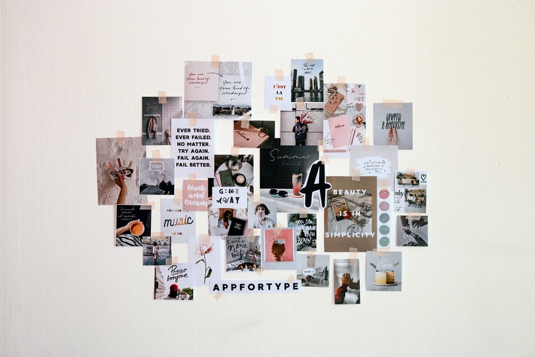
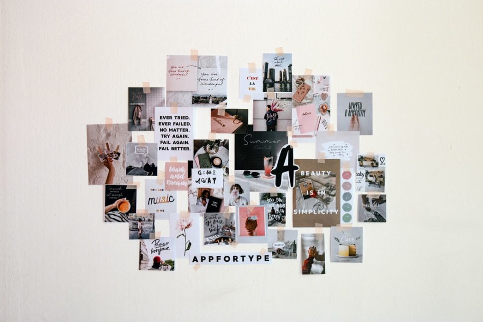
How do you understand when a graphics project is effective? When it’s nice or ugly? Should it be “cute”? Should it be “fashionable”? In short: how do you assess the quality of a project? In this article I really want to talk about this topic, and try to explain how you to really evaluate the quality of a project. In an objective way. Let’s jump right into it!
How do you evaluate the quality of a project in graphic design?
When evaluating the quality of a design project, the subjective aspects and personal tastes certainly play an important role. But it is important to ensure that the evaluation of a project does not depend solely on those two things. In fact, in graphic design, a project is created to communicate a message and get specific results. And those are objective aspects: they do not depend on your personal tastes.
The aesthetic aspect is an important factor, but by itself, it will not tell you if the design is effective or not. To know if your project is a winner, you need to consider the elements of good visual communication and judge the project with respect to them. Well, keeping these things in mind, here are some questions you should ask yourself when evaluating the quality of design.
How to assess the quality of a project: the 4 questions to be asked
1. Does your project achieve its goals?

Let’s start with the basics: what are the goals of the project you are working on? Understanding the objectives of a project is a fundamental step in any graphic design project. This should always be your first step. A good way to understand them is to do a good design brief. We can talk specifics on a design brief another time. For now, let’s keep this train rolling. But what does understanding goals mean?
If it is a logo, for example, that logo aims to represent and communicate a corporate identity. If it’s the landing page of a website, instead, maybe the goal is to convince users to click on the “Buy” button or sign up for a newsletter. And so on. Each graphic project has a specific objective. And if it doesn’t have one, it means it’s not graphic design, but art or decoration. Always check if the target has been achieved! The first step to verify the achievement of the objectives is to make sure that all the relevant information is present to communicate the message you want to communicate.
2. Is the message easy to understand?
Every designer project must help to communicate a certain message correctly. Does your project do it easily? How about immediately? Here are some practical tips for building an effective graphic layout, in which the message is transmitted immediately:
Use a focal point on the page. Such as a large text or a title. Something that catches the viewer’s attention. The important thing is that attention goes to an important and useful element to convey the message. Then choose the focal point carefully!
3. Is it aesthetically pleasing?
Design is made to solve problems through visual solutions. But if those solutions are pleasing to look at, as well as functional, you double the strength of what you communicate, right? Is your project pleasant? Looking good? This is probably the most subjective part of evaluating graphic design. What is appealing to one person might be horrible for another. Different minds, different opinions.
However, generally, already applying the principles of graphic design, one can obtain excellent results in terms of aesthetics. Doing something beautifully does not necessarily mean doing something extremely different from what it already is. Because the result of something deliberately “different” could be too extravagant in the end.
Paul Rand, one of the most important twentieth-century logo designers, said: “Don’t try to be different, try to be good.” Wiser words have perhaps never been spoken. So try to do something that works, even if maybe it’s not something radically different from everything you’ve seen before (which is practically impossible, actually).
Are the aesthetic style and the graphic elements used suitable for the target audience? Most of the time you’re not just planning for yourself, but you’re trying to create a design that appeals to a particular audience. A rainbow color palette is not suitable for a finance website because most customers are looking for a consultant who is reassuring, loyal and trustworthy. Therefore, a more moderate and sober tone may be more appropriate. On the contrary, research shows that children prefer bright colors, so it makes more sense to turn to bright and over the top colors when it comes to children.
4. Is your project original?

Not different in the sense that we have never seen anything like it before, but different in the sense of creativity. The meaning of “originality” depends on the type of design you are dealing with. If it is a logo, it is better to make sure it is as unique as possible, because it is necessary to be able to register the trademark and the trademark application will be rejected if you use a copy of a design. An example of difficulties that can arise from logos that are too similar: the ongoing cause between 3M and Formula 1. It is difficult to create a logo with a simple and distinctive design that does not resemble any other existing design because so many ideas have already been taken and registered as trademarks. If a designer creates a logo that looks similar to an existing design, it’s not necessarily because he copied it, but because there are some logo concepts that are really common and that can be achieved regardless of seeing those designs.
This is why it is necessary to research other designs in your market and avoid designs that are too generic. However, in reality, beyond the logo, the true differentiation of a company over another is in the management of the brand and the complete coordinated image. When instead we talk about simpler elements, like the business card, differentiating oneself is something not very sensible and useless.
Good design is useless if it communicates something wrong
Good design can do great things for a business, but it will not work miracles. It doesn’t matter how good your job as a designer is if the company communicates to the wrong audience. A good design will not be effective if the product is poor or the communication is inadequate, and in the same way, a bad sales performance is not always a consequence of the quality of the design.
There are many ways to measure the performance of a project in the real world, such as A / B tests for web pages, product focus groups, results in social media interactions or sales. However, not everyone can test a project before putting it on the market. In most cases, the customer will trust your judgment. So it is essential that you develop a critical sense of analysis of your work and your projects. Let’s not reinvent the wheel here, maybe just try another way to use it.


Leave a Reply