

To understand when a typeface is of good quality and well designed, we must first understand that within type design, or font design, there are innumerable technical aspects to consider, which contribute to the final result of that font. We talk about things like the quantity of styles, typographical variations like bold, italic, black, thin, small caps. But also things like space management and therefore kerning, tracking and leading.
All the proportions between the various glyphs, between the vertical and horizontal rods. Or even the management of open type features of a font. These are all functional, technical and aesthetic aspects that help us understand how the quality font is… or isn’t. The knowledge necessary to build a complete and well-made font are many and are not limited to aesthetic or stylistic choices only.
Technical aspects to be analyzed
The best way to understand if a font is of quality or not is to verify if, within it, there are these technical and design features. A typeface, to be considered quality, obviously also needs to respond to certain aesthetic characteristics.
And here everything becomes a little more complex. Because if, on the one hand, the technical aspects are easily analyzed and identifiable, the aesthetic canons are more subjective, right? No. I will explain this to you shortly.
Now, let’s focus on some technical aspects that I personally use to check the quality of a font:
Glyphs must be well designed
The first thing to do is to observe and analyze the individual glyphs. There are some features that make a quality typeface, and there are some that make them quite the opposite. The thing to look at is how the various glyphs are consistent with each other in terms of style and design. Individual letters must communicate in the same way within each typeface.
To do this kind of analysis, there are some tricks that type designers have used for hundreds of years. For example, there are some groups of letters that are designed using the same compositional elements, such as h / n / m / r / u. As well as the b / d / p / q or uppercase letters like O / Q / C / G, which have similar structures and curves.
It is this set of elements that make up the supporting structure of a typeface. When you go to analyze the quality of a font, you need to look for that repetition of those shapes, of those curves, of that thickness of the rods. In this way, reading a text with a quality font, one perceives a sense of rhythm. There is nothing out of place.
Furthermore, one way to analyze the design coherence of the glyphs is to compare certain details and their components.
Graces must be visually consistent
In a quality serif font, for example, the graces must be visual all the same or at least coherent with each other. And the same goes for the punctuation, the eyelets, the thickness of the temples, the ends of the temples and, in short, all the details.
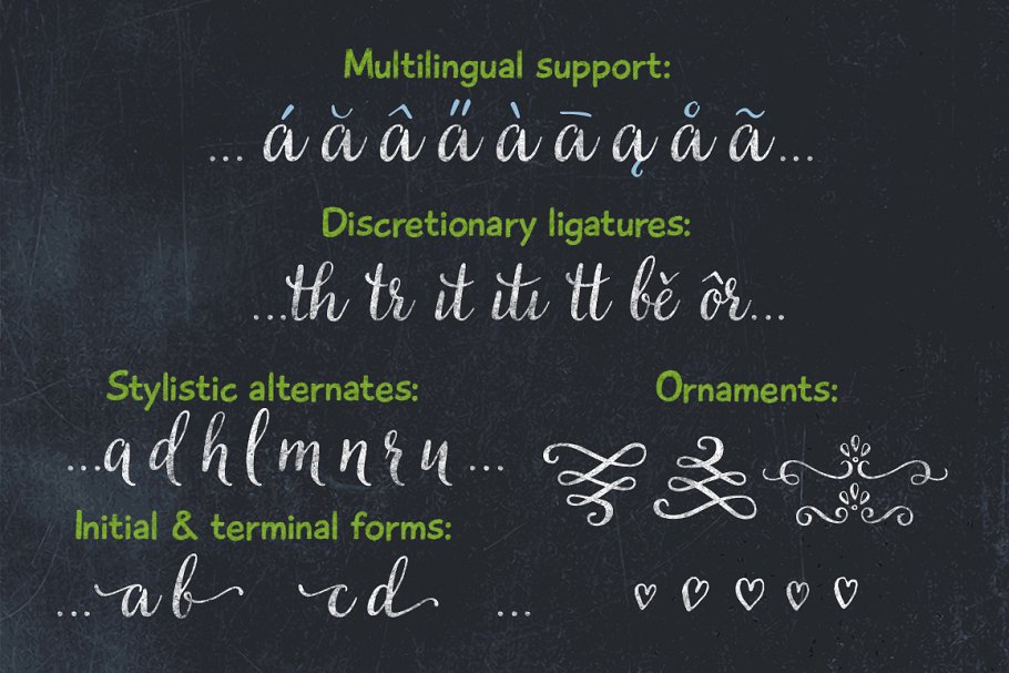
Diacritical marks must be well balanced between them
Other things I always look at are the accents and diacritics, especially those of glyphs not commonly used in English as circumflex accents. Even if these elements are well designed and balanced, following the same aesthetic principles and with attention to detail, it is often an excellent sign of quality.
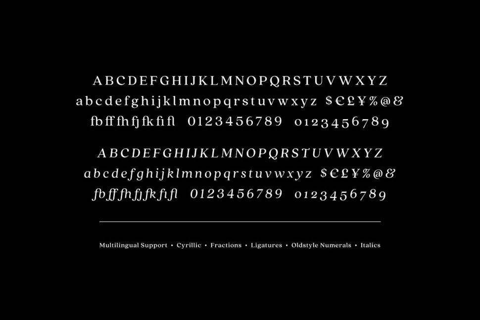
The number of glyphs
Furthermore, the quantity of glyphs contained within a given typeface is also attentive. Having many glyphs is not a collector’s habit, but it is simply a tool that makes the font you use flexible since it makes it adaptable to all the various languages that use those specific glyphs or diacritics. For example, German uses the double S (or scharfes S ) ß, the Polish, the ogonek ę, again the French, the cedilla ç.
So, if you plan to write a long text, I suggest you choose a font that also contains these diacritical marks, because every now and then you will have to enter foreign words.
How to understand if a font is of quality
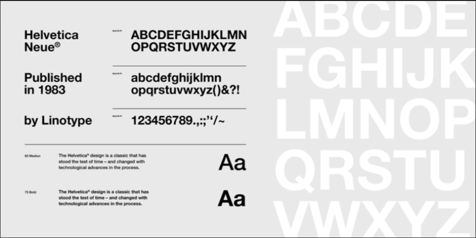
Now let’s take an example of everything we’ve said so far. Take the Helvetica Neue, Minion Pro and Melisande Sharp fonts. There is no doubt about the perfection of the first two, both designed with undoubted coherence. Writing a text in one of these two fonts, everything will appear in its place, coherent and linear.
Melisande Pro (downloaded for free), on the other hand, is not horrifying but appears to be of poor quality. Analyzing the first group of letters of the image, we can see that the h / n / m / u have the same basic forms. However, the r does not recall the form of n, as happens in the other two fonts.
Furthermore, m / n / r do not have optical corrections, which is very important when working with typography.
Another mistake can be seen in the accents, which are inconsistent with one another. This denotes a lack of attention to detail, which makes this font altogether of low quality.
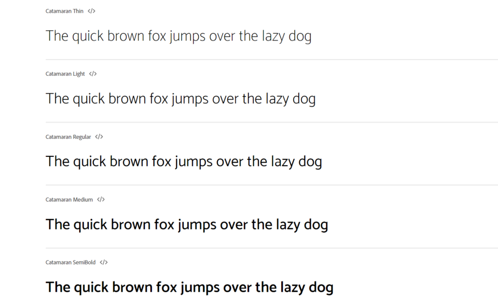
1. Does it have different weights?
The fact that a character has many different weights does not mean that it is by force of quality, but it is a sign of design care, which is often a sign of care in other areas. Furthermore, having fonts with many weights is quite useful for one’s own projects, because it allows us to create contrast and visual hierarchy.
Generally, it goes from a minimum of 4 style and weight variations, namely roman and bold, and roman italic and bold italic. But it’s always better when there is more.
When you have to use the font only for a logo, or for a single title, it’s not essential, but to have more flexibility, I suggest you consider how many weight variations a font has.
2. Do you have any real text variations?
In particular, I refer to italic, oblique and small caps. Generally, a quality font, especially if it is to be used for a long text, needs true italics that is a variant of the font that has different glyphs, especially if it is a serif or pardoned. For example, in this case, the Minion Pro has true italics. If it does not have an italic type, it must have an oblique, as in the case of geometric or neo-grotesque sans-serif fonts such as Futura, Helvetica or Univers. They do not have a true italics but they still remain quality fonts if used in the right ways. The important thing is that they don’t have an oblique version which is simply a stretched version of the font in the regular version.
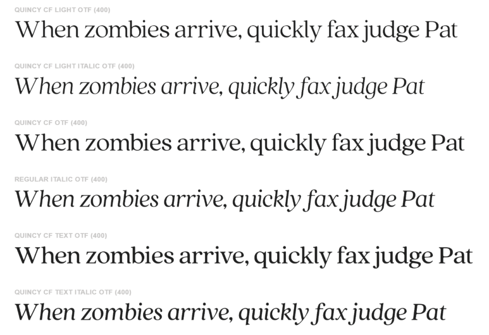
Another variation that I think is very important is the small caps. To understand if a font you already have has a TRUE small-case, just open a program like Illustrator or InDesign, set a few small caps and check the thickness of the rods compared to that of lower case. If they are the same, then it is a real small cap, if they aren’t, then it is not a real small caps.
3. Does it have good space management?
Managing spaces within a typeface is an art. Really. The real type designers keep their tricks to manage the various kerning pairs as something extremely precious. A quality font is one in which, when used, almost no changes are to be made in kerning and spacing (apart from cases where there are design needs to do so).
4. Do you use Open Type features?
The last aspect is that the font has open type functionality. Open Type is a font file format, developed in the late 1990s by Microsoft, which has become the main format when it comes to font files. This is because an open type font allows for many glyphs, many features, such as the use of ligatures, the use of different numbers (such as apex, as a subscript), which are all consistent with the rest of the font.
Conclusion
I really hope this article has been useful to you and that it has provided you with the necessary tools to be able to recognize a quality font for your next projects. Obviously yes, it is important to assess whether a font is of quality or not, but at some point the final question to ask before the fateful choice is: is this font suitable for the project in which it will be used?
Until later,
WDL


Leave a Reply