
The popular website builder Squarespace got a brand new look and we got the chance to ask them a few questions about the design process. Squarespace frontside team lead, Andre Ribeiro is here to tell us about their adventure in redesigning the website and the challenges that came with it.
1. What was the biggest challenge in redesigning the website?
Our biggest challenge was our deadline. At the end of 2016, we realized we wanted to start the year with a fresh homepage to reflect our new strategic positioning and product offerings.
The goal was to have something up and running by the first week of January 2017 in order to see how our customers interacted with the new designs before our Super Bowl campaign featuring John Malkovich. Since we get an incredibly high amount of traffic during the game, it’s important to exhaustively test any big changes in advance.
We had to rethink everything, including our messaging approach, site structure, UX; and craft both copy and visuals from scratch in just a few months. And of course, we had to implement and QA all breakpoints in only a few weeks.

2. What was the main reason why you made the decision of redesigning your website?
We wanted to simplify the onboarding experience by giving new users just two entry points: they can either start by registering a Domain or they can pick a template in order to create a Website. We also sought to improve the overall user experience on mobile. That led us to rethink the following areas:
Domain first onboarding — After offering domain registration as one of Squarespace’s main services, we were preparing to launch a Super Bowl campaign that focused on promoting our new product offering.
We wanted to create a quick and prominent way for our users to search for a domain straight from our landing page. The result was a simple but powerful domain search takeover that includes most of the content and functionality we originally had on our Domains page.
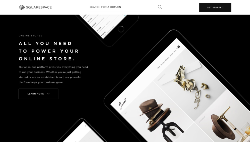
A reimagined shopping experience — We also overhauled the Template Store completely. After some user tests and insights gathered by our customer support team, we realized that a simpler but more powerful way of browsing through the templates was needed.
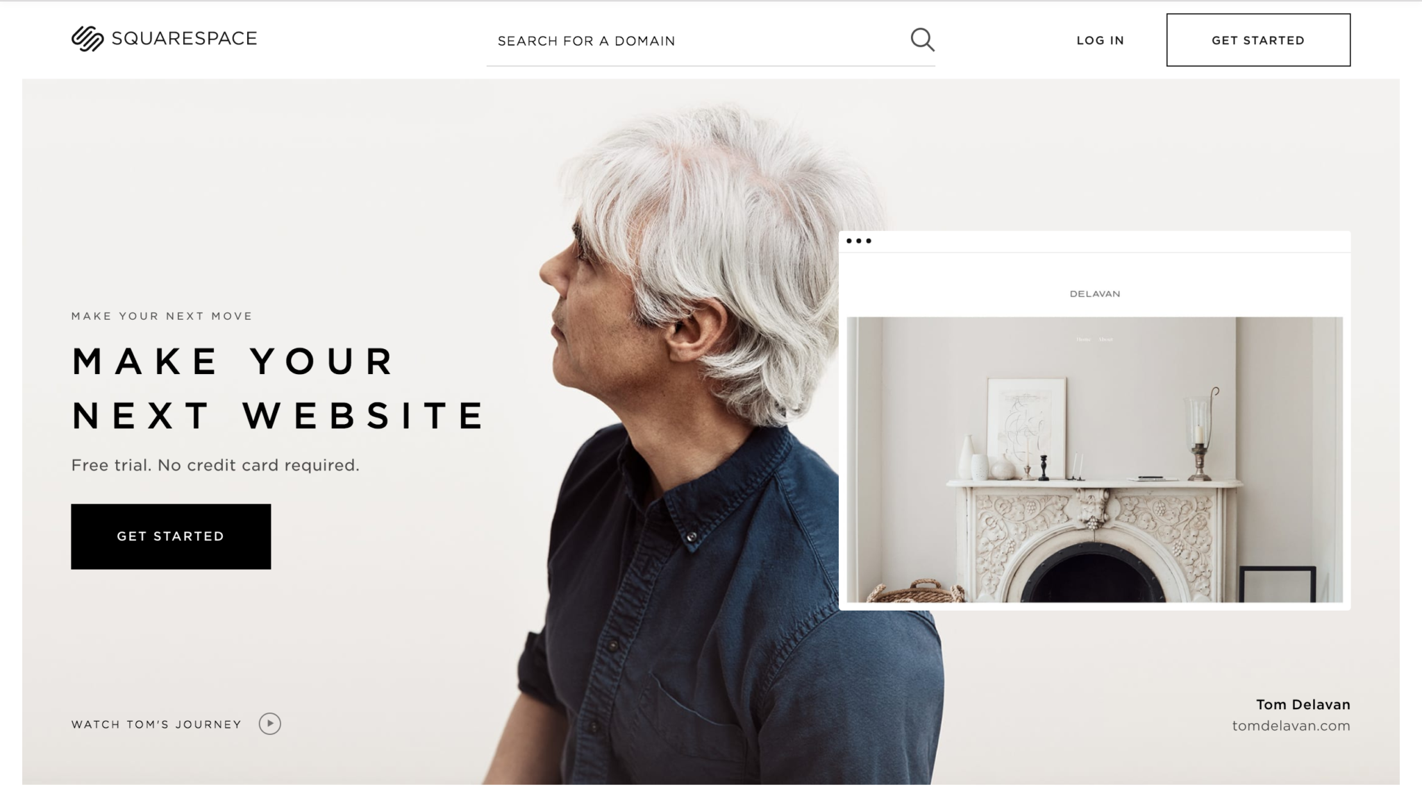
Putting our customers front and center — Squarespace has some of the best customers in the world, including John Malkovich, Leon Bridges, Sophia Amoruso, and Roy Choi, just to name a few. All those customers have such powerful and compelling stories that we felt it would be a missed opportunity to not put them on a pedestal and feature them on our homepage hero.
3. In your view what was the biggest priority in redesigning the website?
One of our mains goals was to have a marketing page that reflected our new strategy and messaging—a page that could talk in depth about all of our feature offerings without confusing or overwhelming new users. We wanted to refresh both the visuals and the language, as well as try out different ways of presenting information and marketing content. Our focus was to elevate our customers’ experience.

4. Details do matter. What are your favorite details and design features of the redesign?
A few things we really love about the new designs:
Homepage — One of the most elegant aspects of the new homepage is our new method of displaying selected customers and their websites. These customer portraits are paired with their website screenshots, creating the feeling that their sites are an extension of their personalities. Having quick access to videos about each featured customer adds depth and color to their stories.
Template Store — After listening to user feedback, we decided to add a few features to improve the Template Store. We added more effective ways to filter the designs, and also brought short descriptions of the templates into the grid view. Now, users can “heart” their favorite templates and browse through them later. And these changes are just the beginning. We are soon adding preview videos when a customer hovers over template options, and we are also bringing the ability to filter templates by special features (e.g., parallax effect, search bars, etc.). Finally, we’re looking to build richer and more bespoke template detail pages. The Template Store refresh was a simple but successful example of a redesign that takes into consideration user pain points and iterates upon their needs and feature requests.

Mobile – During the design of the new Homepage, the Domains takeover, as well as the new Template Store we had the chance to start things from scratch and to drastically improve the user experience on mobile. Searching for a Domain on your device is now simple but powerful. The same convenience also applies when you’re browsing through our templates.
5. Has the redesigned menu affected the website’s performance or conversions?
The strategic shift of unifying our website products allowed us to simplify our navigation, and therefore play with different ideas. Instead of having the traditional “Domains, Websites, and Online Stores” navigation items, we realized we could rely solely on the “Get Started” button as the main entry point to the website shopping experience. The new “Search For Your Domain” input field became the main way of searching for a domain. That way we could simplify the onboarding experience by routing the customers to just two main areas: either the domains search or the template store.
We had some good results: after launching this new navigation paradigm we saw a significant increase in people both searching for and buying domains with us.
6. Have you received feedback from your users regarding the redesign?
Yes we did. Apart from the many A/B tests we often run, we also conducted an in-depth user test a couple of weeks after the launch. We got some minor design feedback, which we addressed and tested promptly. The new website was overall well received by our community and prospective customers, with users mentioning how visually appealing, informative, and easy to use it was.
Both the new homepage and the new Template Store created better user experiences than any of our previous designs, both on desktop and mobile devices.


Leave a Reply