In order for messages to be clearly transmitted, many factors play an important role. Depending on the type of communication, factors such as stuttering, poor grammar, bad alignment of letters, incorrect use of punctuation marks, mumbling, and others set apart unclear from clear messages. In oral speech, diction, proper intonation, a calm tempo of spoken words, the intensity of the voice are all skills that anyone who wants to be a good communicator has to achieve. In written speech, readable caligraphy, correct alignment of letters, words, sentences, and paragraphs, will make any text accessible to the reader.
Why are all these important? Designers have a major responsibility to make the latter type of communication possible without any obstacle. There are a few notions any designer should be familiar and able to work with: Kerning, Leading, and Tracking.
What is Kerning?
Kerning: Definition
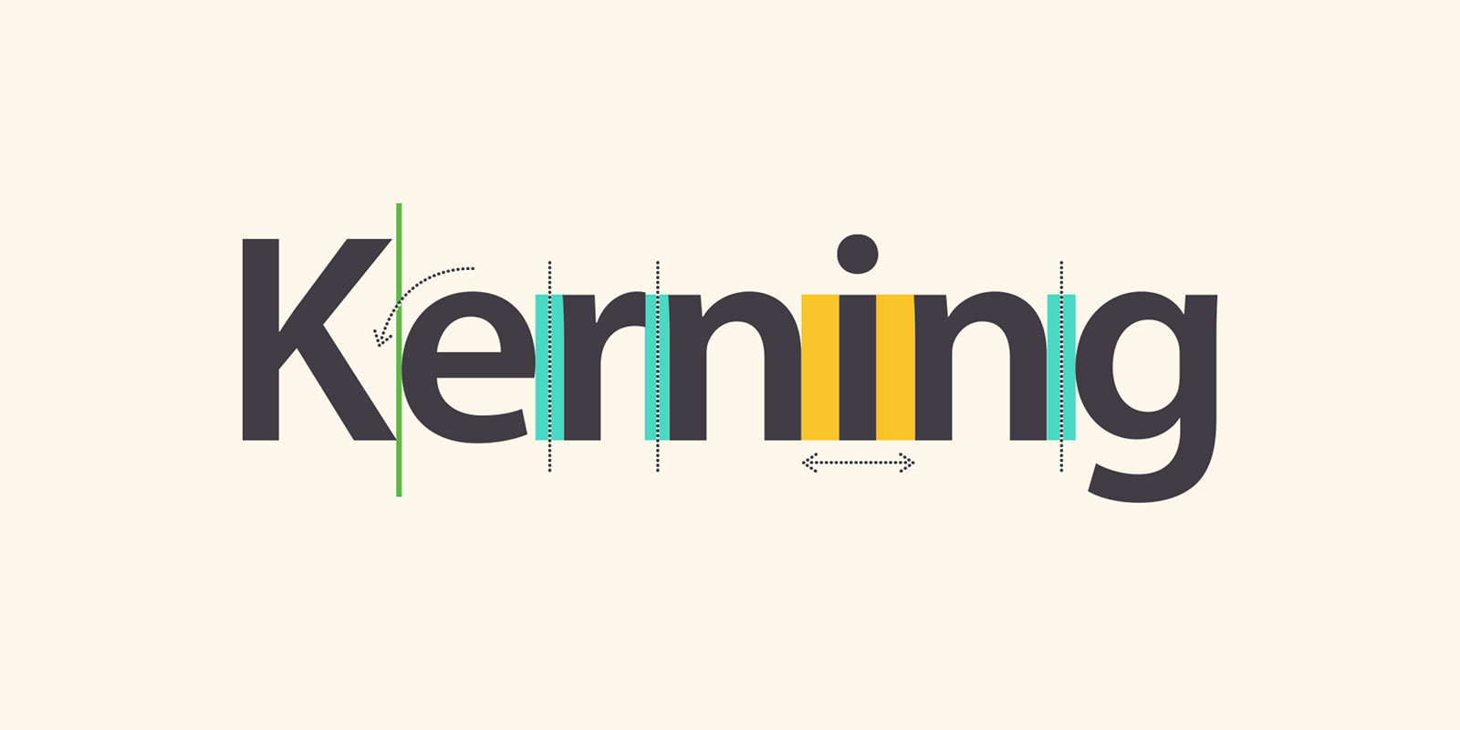
Kerning is the stylistic process that makes you read the first word of this sentence “KERNING” and not “KEMING”. You’ve probably already guessed it. Kerning is the act of adjusting the space between two letters in order to avoid the irregular flow of the words and to improve legibility.
Kerning: Meaning
Back in the good old days, before the current form of typing had been invented, people would use pieces of metal, each having imprinted one letter on them. Now, remember that each piece of metal was the same size. Are the letters the same size? No way, Jose. Imagine that the letter “V” used to have a metal cast as big as the letter “A”. If we wanted to write Avant Garde without kerning the letters, meaning shaping each metal cast so that they fit better, our words would look like this:

Obviously, there is too much space between the letters of AVANT. But after shaping the metal cast, a side of A and V would hang out the metal cast so that they could be brought closer together. The result would be the following.
Kerning Typography
In the past few years, designers have been creating new fonts. Classic fonts have the process of kerning already incorporated, while new ones either have automatic kerning, or designers can play with the spacing between letters as much as they’d desire. Manual font kerning isn’t the best option for many graphic designers, as it takes a good eye to understand how spacing works. This leads us to the next important chapter of this topic:

Bad kerning examples
As the saying goes, we always get what we pay for. While there are amazing graphic designs and typographers who are great at their job but are not always given credit for it, the bad kerning examples always put on a show. We do believe that learning from other people’s mistakes is much wiser than learning from our own failures, that’s why we are bringing into your attention how kerning can go wrong. Judge these examples yourself.
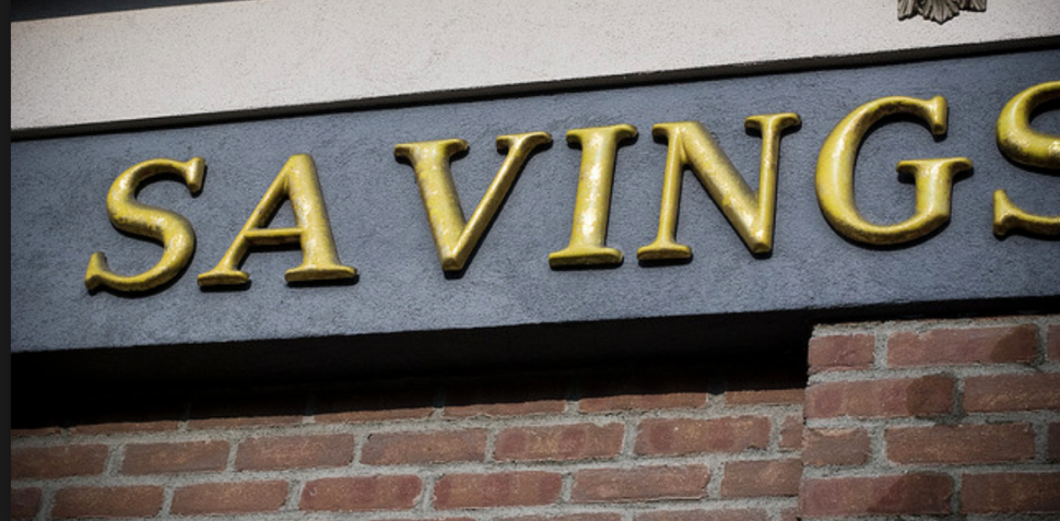
- SA VINGS

- KIDS EXCHANGE

I don’t know what they exchange at this place nor do I want to find out. It sounds just as bad even if I try to guess the correct kerning.
- Travel

That moment when Tra decides to travel without Vel. Bad designers ruin relationships.
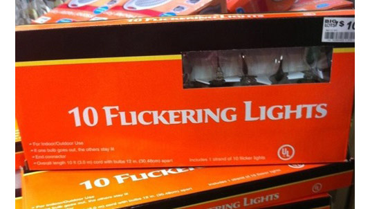
- Flikering Lights

- Stop

I believe the painter of this stop sign took a break between ST and OP. Or he’s just really bad at kerning.
The examples can continue, but we hope that now that you understand better what kerning is all about, you won’t skip it in your projects.
Kerning vs. Leading
We talked at the beginning of this article about the three notions every designer should be familiar with. We briefly explained what kerning does to our words, now it’s time to go to the next important term: Leading.
![]()
Simply put, leading is the process that makes your text more airy or more compact. Leading refers to the spacing between each individual line of your text. When writing in a notebook, your lines are already spaced and your text is kind of forced to follow a certain leading process. But when writing on a plain sheet of paper, you have the freedom to have the lines of text as close or as far apart as you like. Take this concept to a virtual canvas, and you can separate each line to your liking.
Kerning vs. Tracking

Tracking is the third notion we are shedding a light on today. Tracking is the process that allows you to stretch a word as far out as you want. If kerning deals with the spacing between two letters of a word, tracking deals with the spacing between all the letters of a word. While it does have to be pleasing to the eye, tracking requires a less intense concentration to get it right.
The Summary
Kerning – the process that deals with the spacing between two letters in order to make the word look good.
Leading – the process that deals with the spacing between the lines of a text in order to make it breathable.
Tracking – the process that deals with the spacing between all the letters of a word in order to make it look as you please.
We hope that this article explained well enough the difference and the roles of each of the three essential design aspects. We would happilly answer any questions posted in the comment section below on this topic. For more trendy topics of discussion, ideas, and inspiration, we invite you to visit us daily.
Until later,
WDL


Leave a Reply