By definition, the landing pages exist to serve one and sole purpose: getting your website visitors to convert to the next stage in their buyer journey. Although their purpose is simple enough in theory, in practice, things are just a little bit different.☺ And putting together an A+ landing page could be tricky.
Actually, designing a successful landing page that converts requires few steps, from deciding to which stage of your buyer’s journey it is addressing, to planning, designing testing, and of course, a lot of landing page inspiration
Of course, there are many elements that you should consider if you want to have a top-notch landing page. And often the goals of the landing page are the starting point for making those elements the “best” key for you. Therefore, seeing what goes into an effective landing page and few examples of these nuances in action will help you rise up the bar in terms of this game.
Regardless of what your business is selling or the conversion action you intend to get, it’s always useful to get some landing page inspiration by seeing how other great landing pages look like. Even if there are some best practices for designing a landing page, there is not a right or a wrong way for doing this. And for sure, by seeing a few examples of landing pages that are designed for different stages of the buying process will inspire you.
When I started doing my research for this article, I found lots of websites that have modern and, impressive landing pages, which are more than just simple sign-up forms. Therefore, we decided to put together a list of 20 landing page designs that we love.
1. Wistia

On the landing page for Free Wistia Account, you’ll notice the one-form field for creating your account. The light blue with minimally pattern background contrasts nicely with the bright white form field, making obvious the goal of the landing page: signing up for a free account. The length of the form, combined with the central placement, almost makes it effortlessly. But if you have any doubt, you may scroll below and find the answer to your question on the FAQ section. As those two sections are separate by the stark color contrast, focusing on converting is much easier.
2. Basecamp

Setted up also as their home page, Basecamp has a really long, in-depth landing page, with lots of information below the form. In terms of design, the funny cartoon at the top informing me “2017 is the year to get it together” that spruces somehow this minimal page won me immediately. I also love the placement of the sign-up form in the top part of the page, directing the visitor’s attention to it straight away. Can’t get much better than that. But if you are not so sure about signing up, you also can read few testimonials from paying customers and some data related to the increasing number of the signed- up accounts.
3. Zendesk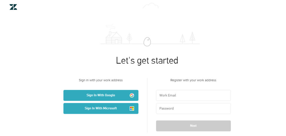
I just love the simplicity and the minimalism style both in design and copy of the Zendesk’s Free Trial landing page. The only things that matter here are the two CTA buttons. If you pay enough attention, you’ll also notice the egg drawing at the top, which wiggles as though it’s about to crack open.
The form itself it’s simple and easy, requiring just a work email address and a password to create an account. Or, you can just use your Google Apps login, shortening the conversion path even further.
4. IMPACT Branding & Design

For sure, IMPACT’s landing page could be a great source of inspiration. I like the simplicity of this layout, from the big and bold copy and detailed feature image, to the outline that surrounds the form and the contrasting colors and fonts that are pleasing to the visitor’s eyes.
I have to notice the field check box for subscribing to their blog, which is also a great way for increasing the subscribers. But it’s also better to leave it unchecked and let the users opt in. Otherwise, you may risk adding many low quality subscribers to your contact base.
5. WebDAM

Even if the WebDAM’s landing page has not many features, my favorite (by far) is the form. The little stars behind of the text are all indicative of the information you need to put in. The form also has a blue background that stands out from the hero image behind it. And for a customized and compelling copy, the Download now button features on a sparkly dark pink background, which is a complementary color to light blue.
6. Unbounce

It’s not a surprise that Unbounce’s landing page is so great. They’ve actually written a book about creating high-converting landing pages. Even if there are many amazing things about this landing page design, the two that caught my attention are: 1) The directional cue from the supporting images to the CTA button, and 2) the detailed – but well packaged – information below the form. The first helps direct your attention to the goal of the page – filling out the form. In addition, the second one gives this page a SEO boost, because the search engines will have more content to crawl.
7. Squarespace

Unlike the landing pages presented above, Squarespace opted for a landing page that makes use of one giant background image, showing the product in action. Landing pages like this — ones that keep the design simple and without any form to fill out — can work really well when done effectively, and Squarespace have kept theirs beautiful, simple and easy to use.
8. H. Bloom

Sometimes, we have just to stop and admire a landing page for being beautiful. Using high-resolution photography and lots of white space, H.BLOOM’s landing page is a pleasure to look at. Aside from its beauty, the page has some great conversions elements: an above-the-fold form, clear and concise description of what’ll happen when you fill out the form, and even the bright red “Submit” button.
9. Velaro Live Chat
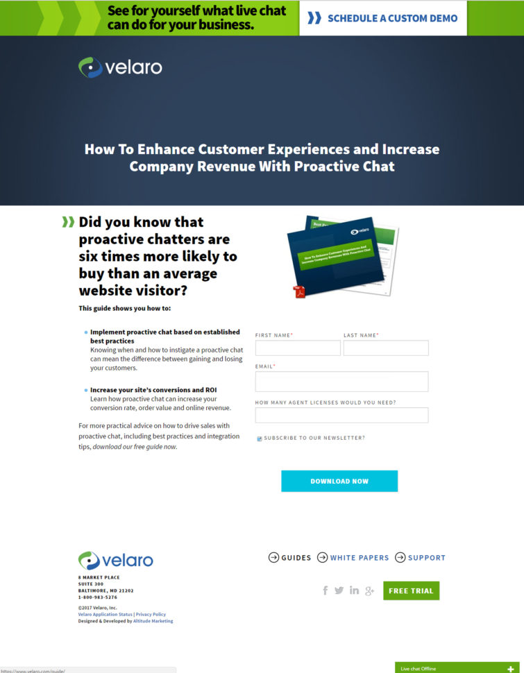
Sometimes the smallest details make the biggest difference and for sure, they make Velaro Live Chat’s landing page awesome. That small PDF symbol over the feature image helps set expectations for the format of the download. The arrow in front of each subheading helps further direct the audience’s attention to important copy they want visitors to read.
Like IMPACT, they also have an auto-checked box for subscribing to their newsletter on their form. This can be a great way for increasing subscribers. All of these small, seemingly insignificant details help bring together a solid, admirable landing page design.
10. Shopify

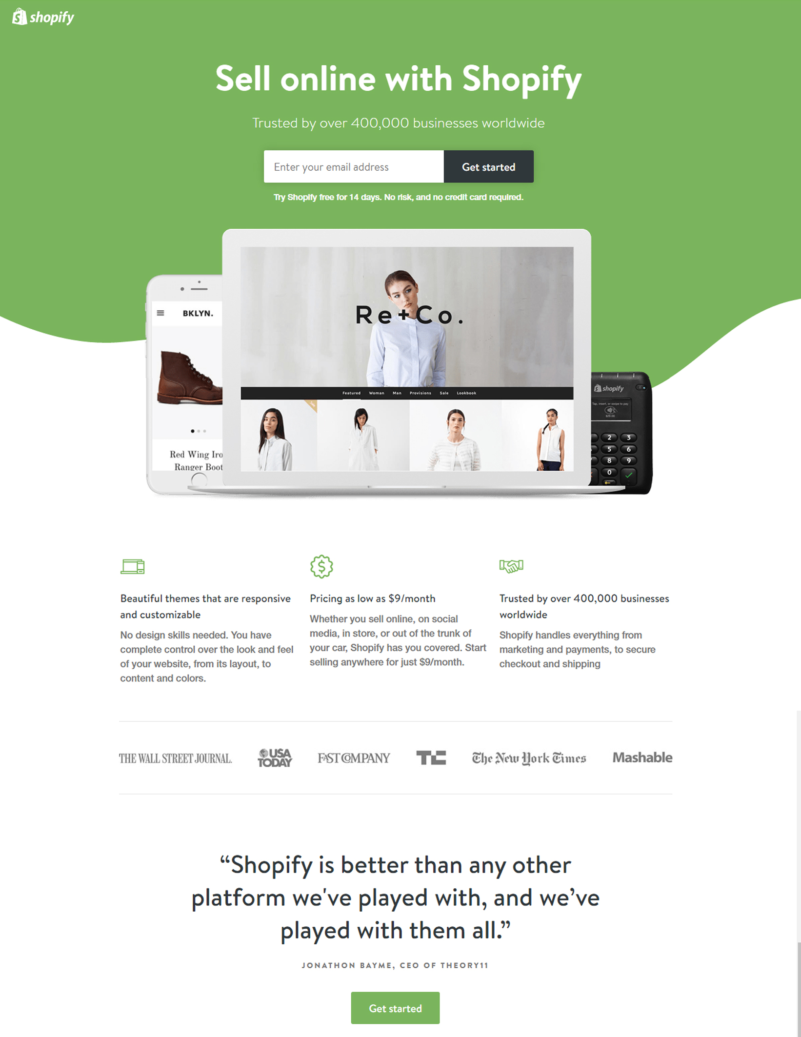
Like many of the other landing pages, Shopify’s trial landing page keeps it simple. The user-oriented headline is just a few words, and the page relies on simple paragraphs, to communicate the trial’s details and benefits. There are only a few fields you need to fill out before you get started. All of this makes it easier for you to get to the point: selling online using Shopify’s tool. And thanks to its responsive design, this landing page looks awesome and is functional on any device.
11. Conversion Lab

Even if, normally, I shouldn’t include a home page in an article about landing pages, this layout is special. It’s a one-page website, while the navigation just send you to the information below.
When you click “Get Help With Landing Pages”, the form appears from the right side. You’ll notice you don’t have to leave the page to fill out the form, and also the form won’t feel intrusive to you – if you want to scroll for more information – or to casual website visitors.
Below is what it looks like after you click that CTA:
12. Startup Institute
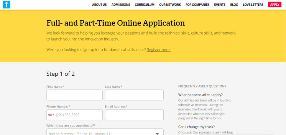
I like the simplicity and the clarity of Startup Institute landing page. Taking into consideration that no one is willing to give personal information without knowing what they’re going to get in return, Startup Institute used this landing page to set expectation upfront. On Full and Part-Time Application landing page, they make abundantly clear what will happen after the visitor applies, by listing a Q&A right beside the form. That clears the air, and can also weed out the people who don’t take their services seriously.
13.Breather

This is another example of clever and delightful design of a landing page. As soon as you visit breather.com, there’s an instant call to action, that let the website’s visitors indicate where they want to find a space.
It’s interesting how Breather used simple, to-the-point copy to let the visitor know what the company does, followed immediately by the CTA to select a city. And if you need to scroll down for more information, you can see how they played with cony and design to bring us closer to the brand. The negative space and soothing color scheme are also aligned with the product.
14. Lyft

I love the Lyft’s landing page because it shows us how we can address to two different types of people in their conversion paths: those who are ready to make a decision and those who still need more information before they convert. The first ones are the drivers who will fill the Apply Now form (which, by the way, stands out because of the contrast between the form and the background). But when the visitors just want to know how much money they can make, they fill out that information and press “Calculate”. Instead of directing to a new page, the visitors will see a dollar amount followed by a new call-to-action button to “Apply Now” (which, once clicked, takes drivers up to the form).
15. Trulia

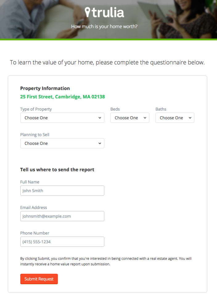
Trulia’s landing page is a great example of a company giving value to their visitors from the get-go, while setting visitors’ expectations about what will happen as a result. It starts simple with a simple form asking for “an address”. Below this simple form field is a bright orange button that contrasts well with the hero image behind the form, and emphasizes that the estimate will be personalized to your home. On the next page, after answering to more questions related to your property, you’ll see the copy “Tell us where to send the report”. By entering this information, you’re agreeing to connect with a real estate agent.
16. University of California, Davis

In the UC Davis’ case, the beautiful website design extends to their landing page for free sample lesson on the art of making sparkling wine. In terms of design, the opaque blue background of the form is an extension of the hero image at the top, which draws the eye downward toward the form. Although they have an arrow, on the “Watch the Sample Lesson” CTA at the bottom of the form, the design is also a great directional cue.
17. Khan Academy

The hard part about using your homepage as a landing page is that you have to address to several different types of audiences. Khan Academy’s homepage does that very well. This page is clearly designed for three different types of visitors: those who want to learn something, those who want to teach, and parents who are interested in using Khan Academy for their kids.
18. Instapaper
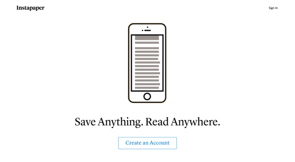
Instapaper, one of the most successful of the read-it-later apps, is known for having a simple, minimalist app interface. Its landing page follows suit, with an incredibly heavy-on-the-white space approach that has everything you need, with none of the cruft.
19. Intercom

The Intercom’s landing page takes a reasonably complex idea and makes it easy to understand how the product works, and why it might be beneficial. One thing I really like about this design is the illustration of the old way of working, versus Intercom’s simple approach.
20.Campaign Monitor

Creating a simple and elegant landing page isn’t easy, but Campaign Monitor has done an astonishing job. This is one of the simplest, but most beautiful pages I’ve seen. It ticks all the right boxes too: it has a strong headline, a well-written introduction that lets you know the benefits of using the software and a very obvious and impossible-to-miss call to action.



Leave a Reply