Although Microsoft revealed a lot during its Build developer conference that took place in Seattle last week, for the developers, the most expected news was the announcement of the Windows 10’s biggest UI refresh: Windows 10 “Fall Creators Update”. As the name implies, this update will come up later this year; because Microsoft didn’t want to say the exact date of this launch, I think it’s a fair bet to assume they will put it for all Windows 10 users somewhere in September.
There are many updates in the Fall Creators update, but perhaps the most notable is for the former Project Neon; except that now, it has another name: The Microsoft Fluent Design System. Given that the name is a mouthful, let’s all go ahead and agree to name it on short, Fluent.
Fluent not just brings a new aesthetic philosophy but also aims to give developers the access to a single design language that will work across all devices. According to Kevin Gallo, Microsoft’s VP for Windows Developer Platform, the team wanted to build a system that would help the developers write more “delightful” applications.
This update will actually come up with a number of few features that will change the way you use Windows device and possibly your smartphone. The Fluent’s overall design principles want to create a design language that looks light, feature layers and depth and animations, as well as materials. Because of its support for materials, Fluent will also bring back some translucency, which Windows app lost in the recent iterations of the operating system.
In Gallo’s view, what makes it stand apart from the competition is that Fluent is meant to work well both in 2D and 3D environments. This is something Microsoft is very interested in, given its investment into HoloLens and the overall “mixed reality” ecosystem. According to Gallo, “the way we define this is that we wanted a design system that allows you to build for all devices”. Taking into consideration that Fluent is optimized for a wide range of use cases, it’s at least somewhat comparable with Google’s Material Design, in that both adopt a flat design philosophy.
For a quick view, you can check out Microsoft’s intro video below before we dive in.
Fluent is an aesthetic philosophy, made up of five primary aesthetic components. Here is the synopsis:
Light has a way of drawing out attention, being warm and inviting, fluid and purposeful. Light creates atmosphere, by adding an element of illumination to apps – particularly useful for mixed reality, in which illuminating where you’re gazing serves as a pointer, and helps separate UI elements from virtual environments.

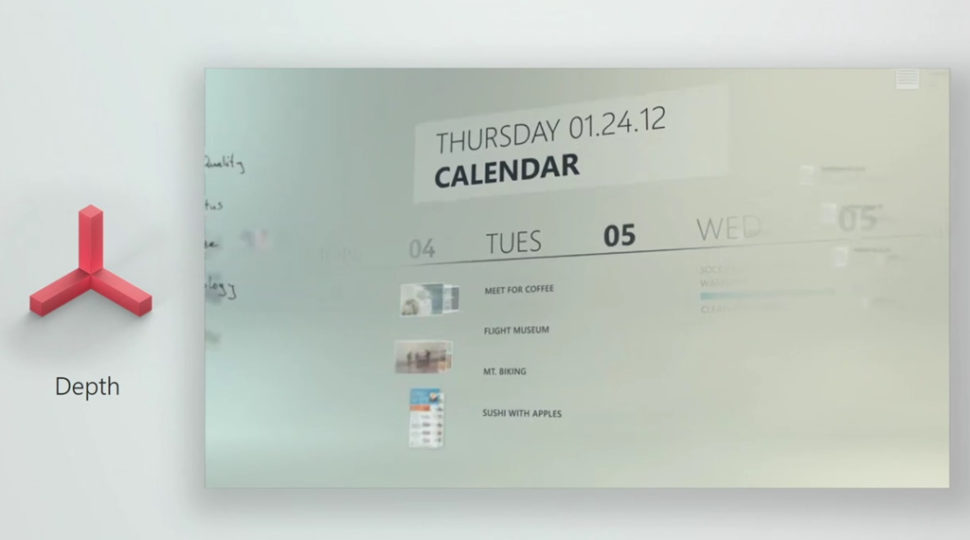
Depth adds z-axis information to the UI for things like parallax effects and some extra pizzazz in mixed and virtual experiences. It helps establish a relationship between UI elements, adds some polish to animations, and can increase the sense of space within an app.

Motion adds animations that interconnect as you navigate throughout an app’s UI. It helps establish continuity as you move between pages, selections, and tasks. The seamless transitions keep you focused on the story and bringing experiences to life.

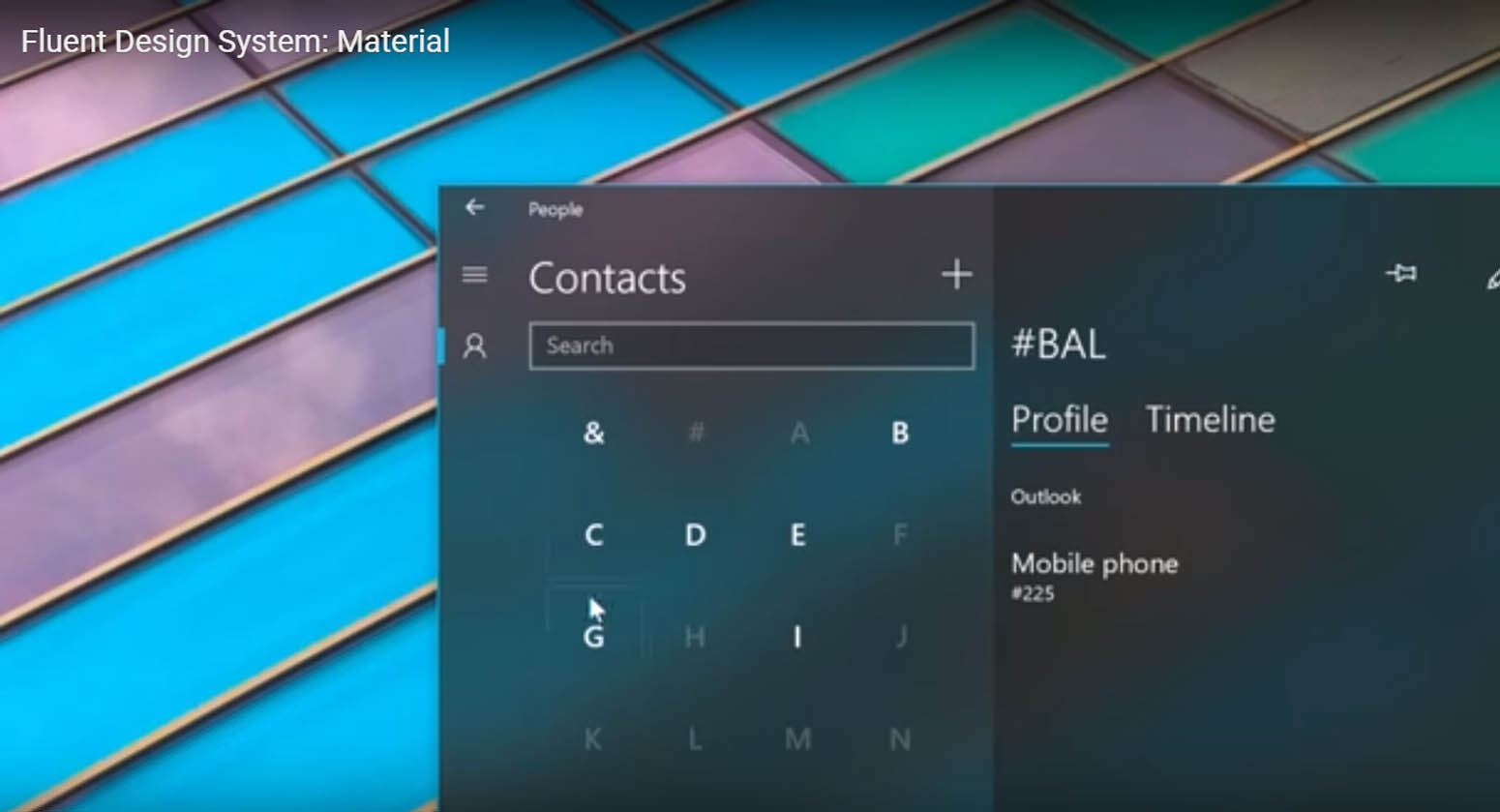
Material controls ‘physical’ properties of UI elements. It can help take the full advantage of the available screen space to celebrate content, bringing a sense of lightweight, ephemeral user experience. The first of these is a frosted acrylic look, with modifiable characteristics. Materials can also dictate how the UI can “bend, stretch, bounce, shatter, and glide” as you interact with them, something that will likely play a greater role as mixed reality becomes more prominent.

Scale affects how apps reshape and present themselves across different devices. Scale allows us expand our toolbox for more dimensions, inviting innovation across new device form factors. We can scale our design system from 2D to 3D, inviting innovations across new forms. The adoption of these responsive design concepts makes resizing windows much more useful than it was once.
These appear to be general concepts rather than hard-and fast rules.
But if you expect to see how Fluent will dramatically reinvent Windows 10 with the Fall Creators Update out of hand, you’ll be disappointed. Microsoft says only some Fluent elements will be found in the Windows 10 Creators Update, as the system was (and perhaps is) still being developed. When the Windows 10 Fall Creators Update ships later this year, the transition to Fluent won’t be complete yet. According to Aaron Woodman, a senior marketing director at Microsoft, “it’s going to be a long journey”. So, you’ll start to see some elements of it this year, but Microsoft is describing Fluent as a series of ‘waves,’ each introducing new features and visual elements.
Fluent will be launched in gradual “waves”
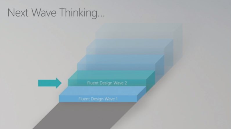
Microsoft mention two “waves” for launching Fluent, but the graphic shown during the presentation seems to indicate at least five waves on the way; and still it’s not clear the timing for each wave. They could be launched with every new release of Windows 10, or the features will be made available as they come.
Some of these features have already rolled out
You might’ve already seen some elements of Fluent if you have paid close attention to Microsoft’s first-party apps. The People, Calculator, Voice Recorder and Groove apps, are already showing off some of the cool lighting effects, transparent materials, and fancy animations.
Discovering Fluent Wave 1
Fluent Wave 1 seems to focus on five new specific effects for developers: Reveal Highlight, Acrylic Material, Connected Animations, Conscious Controls, Perspective Parallax. Most of these aren’t particularly revolutionary, and some of these effects could already be achieved, but Microsoft will feature these elements directly into Windows to give the regular users a cleaner more cohesive look and to ease the work of developers.
You can already find Reveal Highlight in some of Microsoft’s first-party apps mentioned earlier. It shows up as a glowing effect that highlights different buttons you can interact with. It helps show what you’re pointing at when using mixed reality apps, or when you’re hovering over a screen with a stylus.

Microsoft said that more materials are planned, but for now, they will start with just one: “Acrylic”. This is a translucent, generated material that uses Gaussian blur combined with noise to create a sort of plastic-like effect. Moreover, there are different types of acrylic materials you can use to establish design hierarchies or just prettify things a bit. They can also be assigned colors or match your current Windows theme.

Connected Animations: Adds seamless transitions for individual UI elements as you navigate around an app. For example, tap on an album in Groove, and the album cover will animate into place instead of instantly changing.

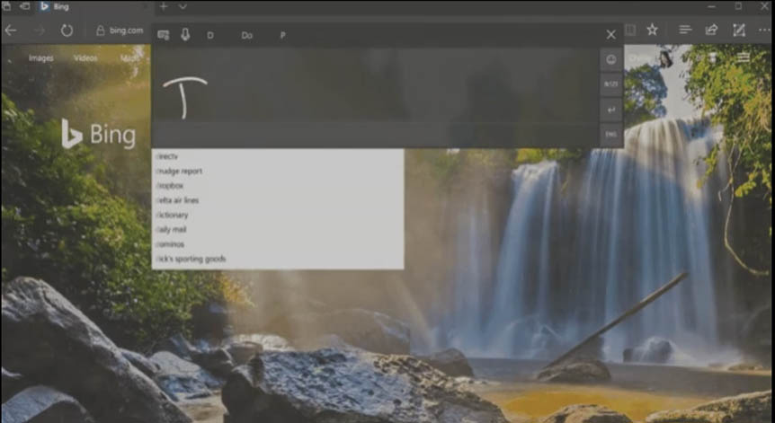
Conscious controls are a bit more of a vague concept than specific addition, but they are UI elements that can adapt to different device types and appear only as you need them. For example, scroll bars only appear when you hover over them, rather than taking up permanent space on the side of the window. And in the example shown below, tapping on the text box in Edge with a pen automatically displays a handwriting box.
Part of Fluent ‘Depth’ pillar, Perspective Parallax essentially puts different UI elements on different planes of the Z-axis, in order to help establishing some interaction hierarchy. Background might scroll slower than foreground elements, creating some parallax, which in turns adds a sense of depth.

These are just the features expected to roll up with the Fluent’s Wave 1, but there are also few concepts for future versions of Windows 10. Some of the new features already are, some of the concepts that flashed by during Microsoft’s demo reel are much more interesting and dramatic departures from the current aesthetic.
The message is clear: Fluent isn’t just something for Windows 10, but rather something that will likely permeate throughout the company – much like Material Design has shaped Google. In the future, we’re likely to see Microsoft branding evolve from the current totally flat design to something with a bit more variety and motion. It seems the company wants to make Fluent a pioneering UI for all 3D interfaces.
In any case, it’s crystal clear that we’ll be hearing about Fluent for quite some time – Microsoft is just getting started.




Hopefully they’ll provide a way to turn it off, too, if the user chooses.
Sometimes these little “features” are about as useful as flashing text.