Today we have the honor of having Nick Misani with us,
an amazing designer and great letterer from New York, whom we admire very much.
Webdesignledger: Nick, at Webdesignledger we’ve been very impressed with your work and we decided that we want to get to know you better. Tell us what are five things you want people to know about you when they first meet you.
Nick: Well, first off, thank you very much for your kind words and thanks for your thoughtful questions! Okay, my five things are: (1) I’m a freelance designer/letterer living in NYC. (2) I was born in Northern Italy, where I also grew up. (3) I’m fascinated by historical design, decorative arts, typography, and ornament, while also nurturing a somewhat closeted love of extreme minimalism. (4) I have a (not altogether uncommon) type A cocktail of perfectionism, insecurity, ambition, and desire to please. And (5) I’m vegan and gay, both important parts of my identity and both aspects that are strongly reflected in my political views.
Webdesignledger: We read on your blog that you lived in Japan, a country that has a lot to offer. How has that experience influenced your work? What made you leave Japan and move to New York?
Nick: I lived in Japan for a period while I was in high school. I left Japan because the exchange program that facilitated my stay came to an end. My move from Osaka to New York wasn’t direct, however: I first returned to Italy for a year or two, then to upstate New York for college, and finally down to NYC to continue my studies and to start working in the field. Japan has such a rich visual culture and I’m sure living there has influenced my work in many ways, though it’s hard for me to pinpoint one in particular.
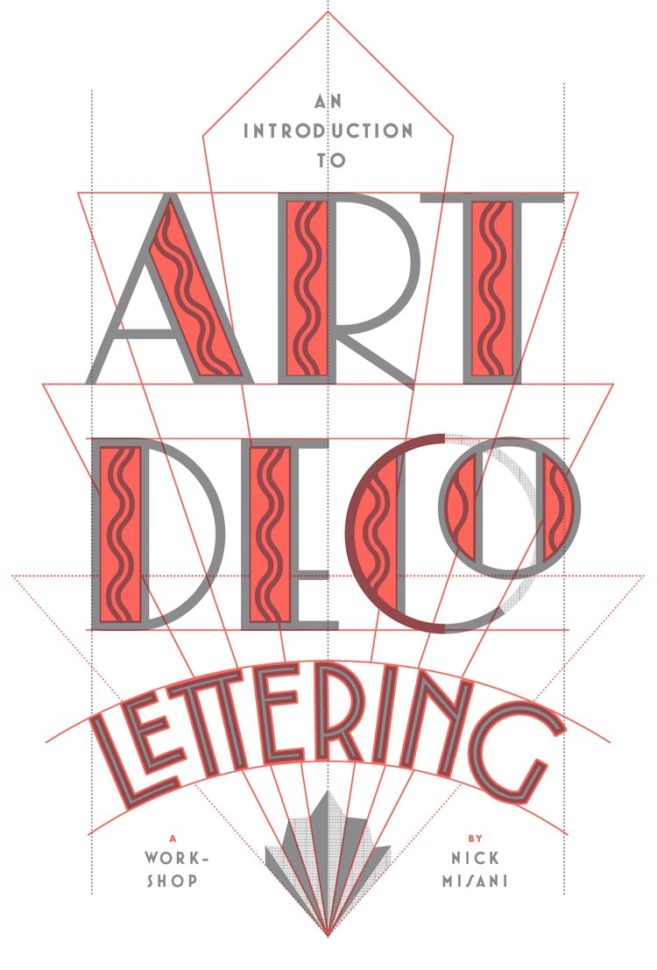
Webdesignledger: Tell us about your workshops in Chicago, New York City, and Boston. How did they go? Do you find teaching about Art Deco Lettering more satisfying than the work itself?
Nick: Chicago, NYC, and Boston were the last three stops of a workshop tour that has taken me all over the States and as far as Australia over the course of the last 10 months. I think they’ve all gone well. I love to give tons of individual attention to my students, which provides real value to the attendees and gives me the opportunity to talk meet a lot of people and connect with them one-on-one. Students seem to leave happy after the intense, 4-hour session and I haven’t had any complaints for far. Both teaching Art Deco Lettering and creating it are equally satisfying to me.
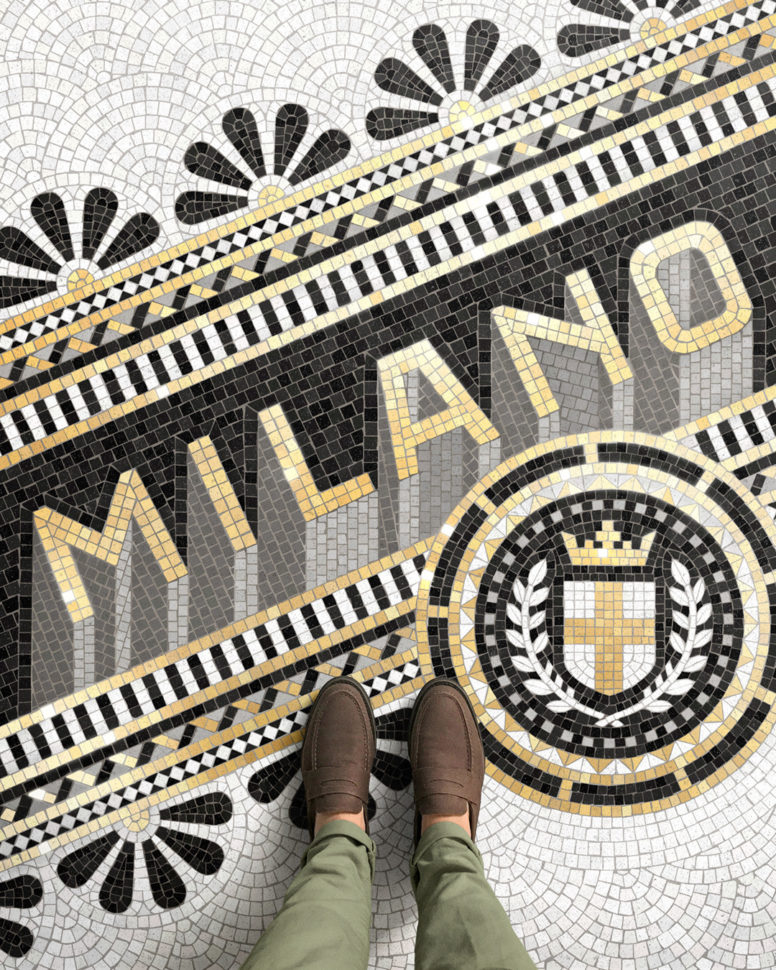
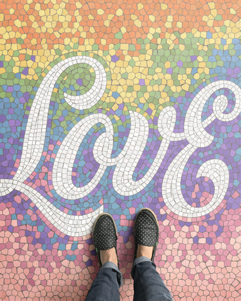
Webdesignledger: Walk us through your Fauxsaics collection. What are your favorite illustrations?
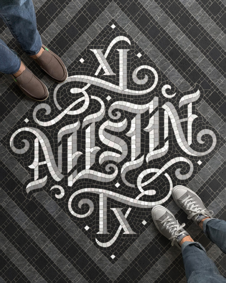
Nick: I really enjoy the illustrations where I experimented with different tiling patterns, like the Kansas City piece—with it’s alternating of square and irregular tiles—and the Saratoga Springs piece—where there’s lots of movement happening in the background. Among my favorites are also Milan, San Diego, London, and Paris.
Webdesignledger: Every designer has at least one project that he/she is very proud of. What is the project that has the most emotional value to you, that helped you express your style the most?
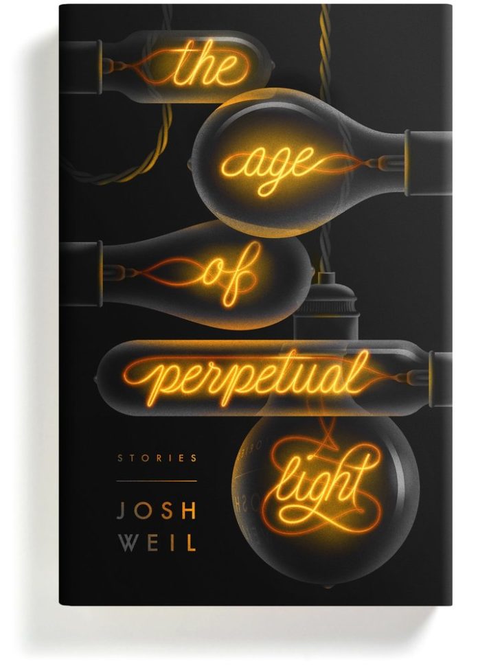
Nick: One of my favorite recent projects was a book cover for a series of short stories by Josh Weil called, The Age of Perpetual Light. I was inspired by the bold graphic shapes and airbrushed gradients found in Art Deco poster design, but wanted to create something a little more mysterious and evocative to reflect the title. The author was keen on trying on option with Edison bulbs, so I immediately knew I wanted to do create type from the incandescent filament and really have fun with the distortions and reflections in the glass. I’m attached to this project because it’s an example of an occasion where the sketch was fairly conservative, but I chose to push myself a bit farther. That, coupled with a very supported editor and author made for a really fun and exciting designing experience.
Webdesignledger: If you could choose the era you were born in, what other century would you choose design-wise?
Nick: It’s a tough question to answer. On the one hand, I’d be tempted to say somewhere between La Belle Epoque and Art Deco. I love that a desire for modernity lived alongside traditional crafts. That said, moving to that time period would also mean dealing with two World Wars and very few rights if you’re not a straight, white, Christian man. Ultimately, I’m pretty happy with the time I’m in: I get to choose the historical style I want to work and do so with the aid of a computer in the comfort of my 21st century apartment.
Webdesignledger: Being your own boss comes with many responsibilities. Do you use a certain time or project management software to make your workflow smoother?
Nick: I use Trello to keep my projects more or less organized and also keep a master spreadsheet on Google Docs. I do my invoicing with Quickbooks, but I work with an accountant for the heavy duty filing and itemizing of expenses. I’m also represented by an artist agent, who helps with outreach and managing clients as they come in.
Webdesignledger: Describe your creative process. What are the major steps? Do you follow a certain routine?
I can’t say I follow a rigid routine. I get up rather early, around six, and after eating and walking my dog, I pretty much get right to work. The process itself also changes depending on the client or project, but it usually starts with a sketch on my iPad Pro which is either finished in raster or vector.
Webdesignledger: Are you currently working on a project? How is it coming together?
Nick: Yes. I usually have around 4 to 6 projects going at the same time, which often include a mix of book covers, mosaic illustrations, traditional lettering, and upkeep work. One project I’m working on at the moment is quite different. I am making a (real) mosaic out of tiny vegetable cubes. I’m a bit nervous, since I’ve never done anything like this, but also excited by this new experience.
Webdesignledger: What is something new that you learned as a designer in your past experience (jobs & internships)?
Nick: Before going full time freelance, I was the senior designer at Louise Fili Ltd, a very small studio in NYC that specializes in historically-inspired typography and lettering. At LFL, we often worked from primary sources (old type specimen books, original ephemera, vintage posters, etc) and gradually I learned how to really look at a historical piece and decide how it can be used in a modern application. Reference material, especially when there is a lot of it, can get overwhelming, so being able to take it apart and evaluate which elements can be used for a specific project has been very useful.
Webdesignledger: What advice would you give to a new lettering artist/illustrator?
Nick: Don’t worry too much about finding a voice, just follow your passion and interests and do lots of experiments and your voice will develop naturally from that journey. It’s advice I often forget to listen to myself.
Work by Nick Misani:



Leave a Reply