Modern minimalism is vastly overrated for the value it adds to a website. When content is centered as the main priority users are free from excess distractions. Granted not everyone likes minimalism because it can be seen as lazy, simplistic, or just boring. But this is not the case!
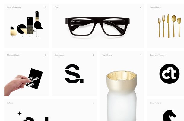
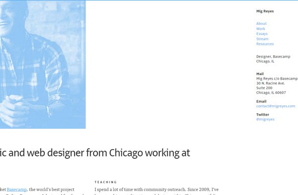
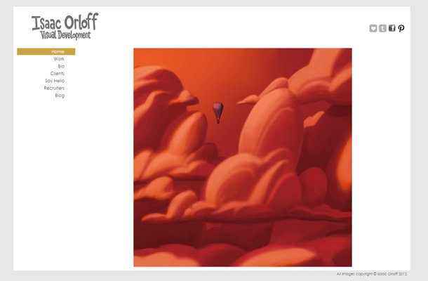
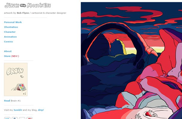
The best minimalist websites are anything but boring. In this gallery I’ve put together a series of minimalist layouts for personal creatives like writers, designers, and performers. Minimalism is a powerful tool when used appropriately. Graphics and photos have their place but not always higher than content. Take a peek at these examples and see if you can draw any ideas for your own creative work.











“Modern minimalism is vastly overrated for the value it adds to a website.”
???
This is really a good collation specially Sam Dallyn’s web site I like best.
Amazing collection. You would add some feature of the themes also 🙂 whatever amazing collection.