The debate between serif and sans serif is still an epic one. There are pro and cons that people bring up all the time when arguing why one is better than the other one. But can any of the two teams own the absolute truth? No way! It’s like debating your Pepsi preference with a Coke lover. You’ll never get to an end. In order to give you a few hints on how you can best use any of the two, we invite you to take a pen and a notebook and write down the following important ideas.
Serif Fonts
The serif fonts have been around since the Roman Empire and they originate in the Roman alphabet invented back then. The Trajan’s Column is a classic example using serif letters, dating back to 113 a.o. In “The Origin of the Serif” study, Edward Catich affirms that the serif font is a remnant of the painting process of the letters on stone, a technique used before the stone carving. This fact takes us to the meaning of the word Serif which, according to the Oxford Dictionary, is closely related to the Dutch word “schreef” and it means “line” or “sign made by a nib.”
A short classification of the Serif Fonts:
Old Style
Dating back to the 15th and 16th century, during the Renaissance, these fonts are legible and elegant. Later in the 16th century, the fonts develop into a wider range of lines, creating a stronger contrast. The arched serifs become popular. Examples: Garamond, Minion, Goudy Old Style, and Bembo.

Transitional
These fonts date back to the 17th century. As the name suggests, they “were born” between the Old Style and the Modern periods. Their contrast is amplified vertically, making the fonts harder to be read than the Old Style ones. They feature a neutral design and a triangular serif. Examples: Times New Roman, Baskerville.

Modern
Created at the beginning of the 19th century, the modern fonts have a high contrast between the thin and thick lines. Due to their lack of curved lines and arched corners, the fonts have a rigid look. Examples: Bodoni, Didot.

Sans Serif Fonts
The name was given by Vincent Figgins in 1832 and comes from the combination between “sans,” which is French means “without,” and “serif.” Some may consider it inappropriate because it implies a negation, a lack of something. Recently, in England, they recommend the word “linear” instead, but not many have adopted it yet.
A short classification of the Sans Serif Fonts
Grotesque and Neo-grotesque
Dating back to the beginning of the 19th century, the name “grotesque” has been given to these fonts to accentuate their incondite esthetics compared to the popular serif fonts of that time. The most representative fonts are Vincent Figgins’s “Two-line great primer sans-serif” (an only capitals font), and William Thorowgood’s font (the first one that included lowercase letters). The latter introduced the term “grotesque” from the Italian “grottesco,” meaning “in the cave.” Other examples: Univers, Arial, Franklin Gothic.

Geometrical (1920-1930)
Inspired from the Bauhaus current (less is more), they are characterized by the lack of contrast, the minimalist look, and by the geometrical aesthetics. The letter “G,” for example, contains two elements: a curved line and a horizontal line that closes up the arch described by the curved one. The letter “a” is formed by a circle and a vertical line.

Humanist
These fonts are characterized by fluidity, inspired from the hand-writings. Until the beginning of the 20th century, the sans-serif fonts haven’t suffered any improvements. The one who brought a new look to the sans serif fonts was Edward Johnston who created Johnston Sans. This font was used on the Londonese tube. A more famous font during this period was Gill Sans, created by Eric Gill for Monotype Corporation. It was the first sans serif font that had an Italic version, as well. Other fonts: Optima, Verdana, Tahoma, Myriad.

So what do we choose?
Sans Serif, Serif, or both?
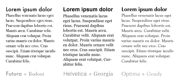
The classic answer would be: sans-serif fonts for titles, headings, and serif fonts for the content. Used as a pair, the two types of fonts ensure the needed contrast. But even so, you must be very careful so that the result doesn’t look odd or exaggerated. Imagine a combination between the Old Style and a geometrical Sans. Total failure! Why don’t you try a combination of a transitional serif font and a neo-grotesque sans serif? They would make a much better pair; even an Old Style font combined with a Sans Humanist would look good.

The personality of a font must be understood very well, otherwise, we take the risk of making unsuccessful combinations of fonts. The Sans Serif fonts are simple, they have a clean and clear aspect, and they look much more modern. These fonts hook the reader’s attention faster. On the other hand, the Serif Fonts look much more formal, more traditional, and, although they have more personality, generally speaking, they distract the reader’s attention. Their look is more refined and well balanced. In these conditions, we don’t recommend you to use an elaborated font for titles, and an equally detailed font for the content. They will both claim the reader’s attention. There are a few supplementary aspects that you have to keep in mind when choosing a combination of two fonts: the physical attributes of the fonts, meaning the color, the size, the weight, and the common origins.
Read more: 20 Hipster Fonts You Can Download For Free


Leave a Reply