

Branding is closely related to marketing and website design is a huge aspect of digital marketing. Desktop software especially needs a great website because most people make their purchases online.
I’ve collected this set of websites & landing pages featuring quality designs made for selling software applications. If you plan to release your own software online it’ll definitely need a great-looking website. Follow along with these examples to pick up on trends worth integrating into your own design work.
Adobe After Effects

Adobe Photoshop

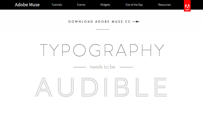
Adobe Muse
Toon Boom

Inkscape

Unity

Houdini

Blender

ZBrush

KeyShot

AutoCAD

Firefox

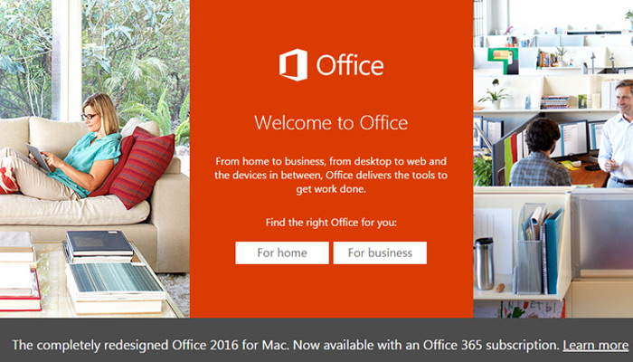
Microsoft Office
Acronis

Notepad++

ArcSoft

SketchUp Pro

Skype

FL Studio

Corel Painter


Nice article with many great examples.
But not all of these examples are very user friendly after first impressions: SketchUp Pro mobile experience is not that great – the logo and the menu positioning is out of display view, so it makes hard to navigate through page.
Blender mobile menu isn’t very user friendly as well, because once you open it through menu icon, you can’t close it with that icon. And one more minus is that in the landing page, if you are the top and you click on menu icon – menu items aren’t well-read, because melt together with the background because of menu transparency (when user scroll lower transparency is replaced with white background).