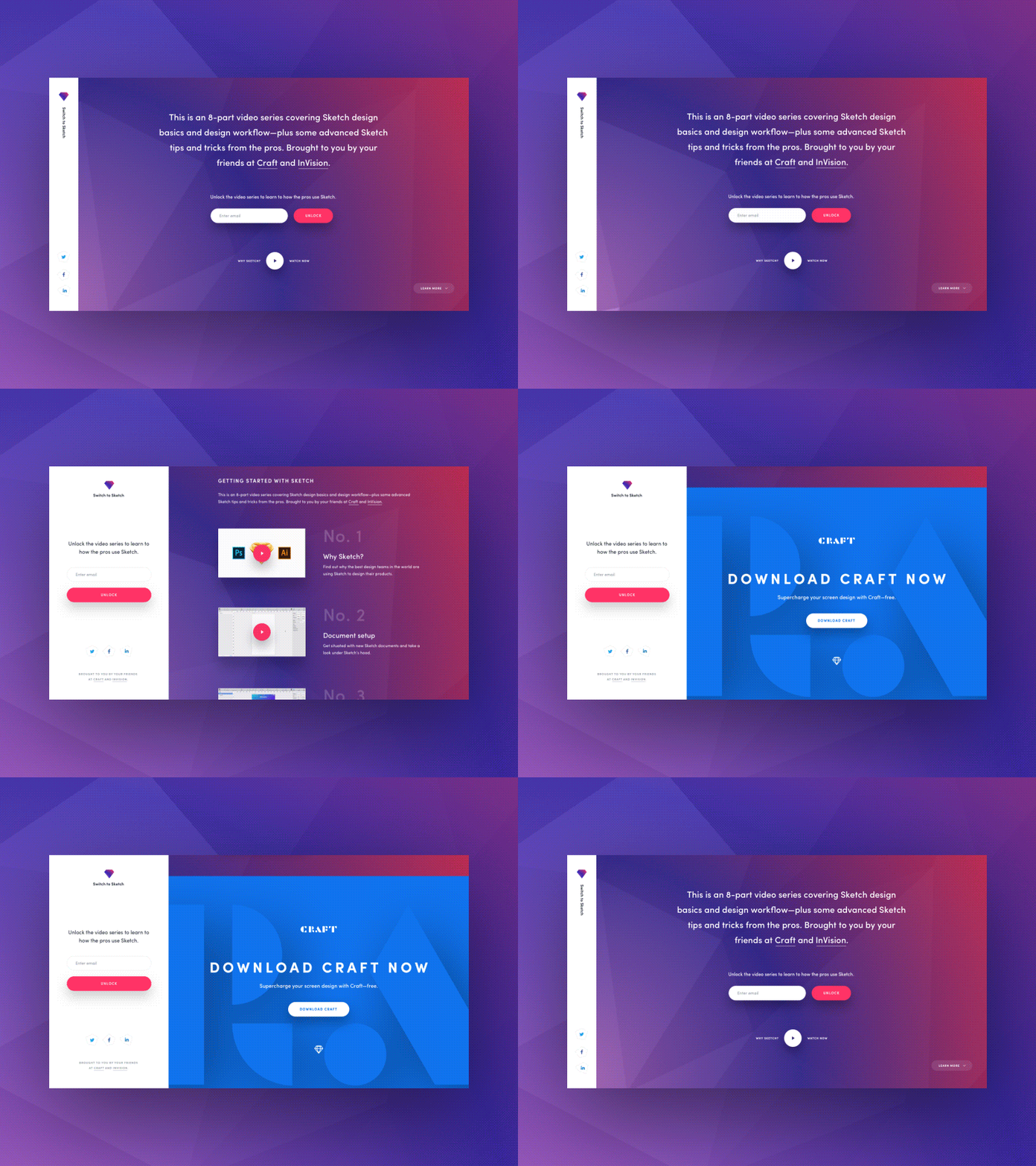
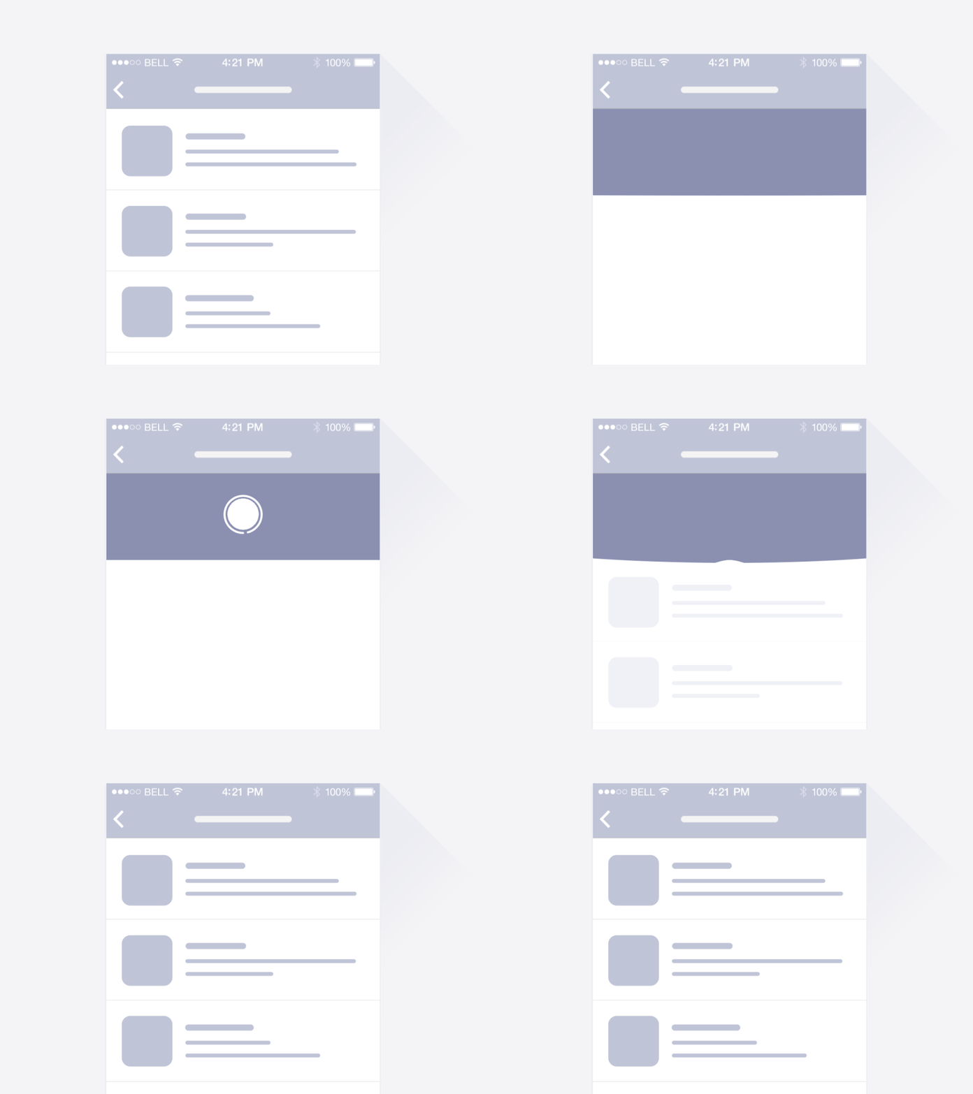
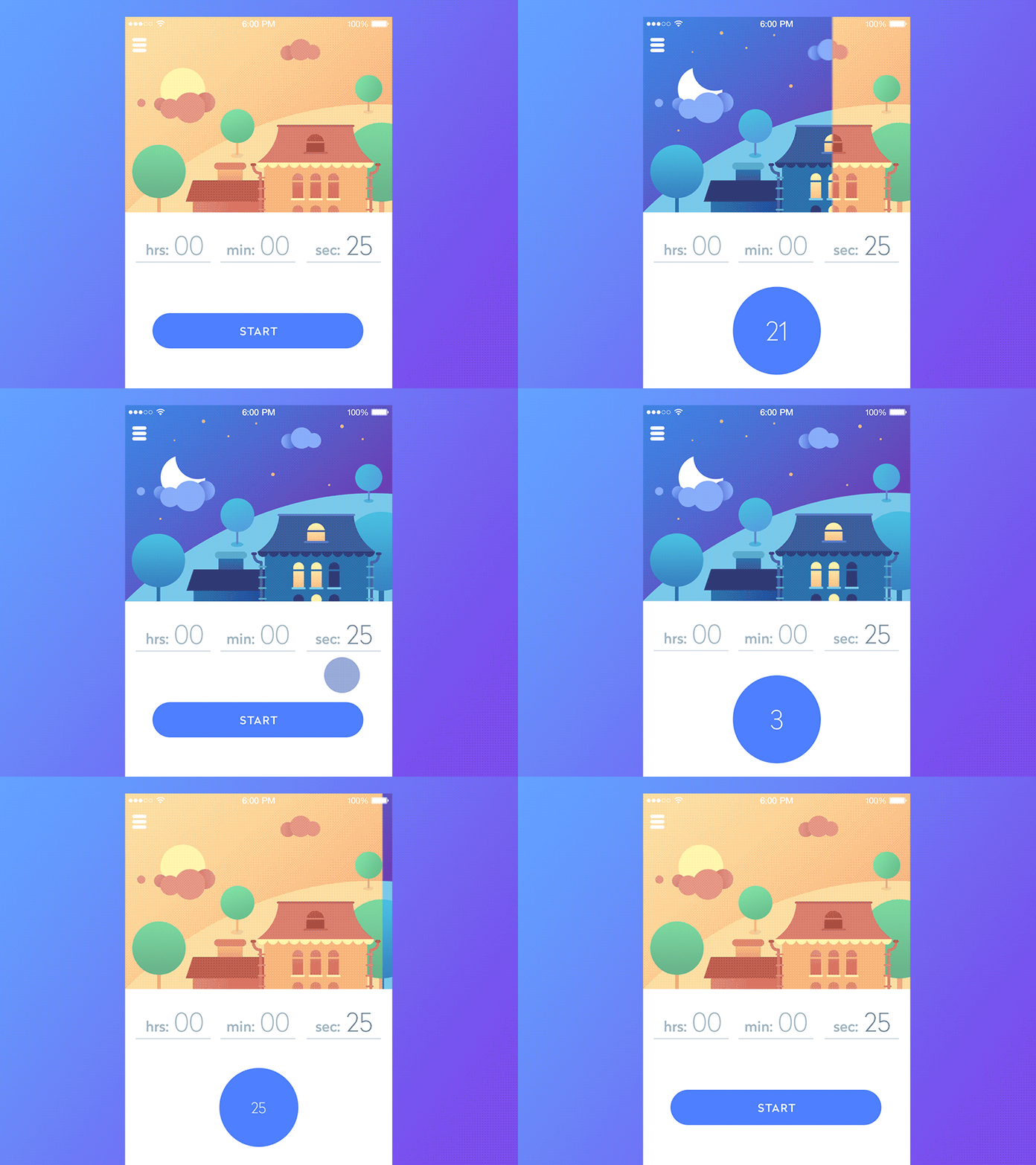
As humans, it can be pretty difficult to be entertained. We’re always after the latest and greatest, no matter what it is, all for the sake of entertainment. Web designers have taken notice of this and have started quite a trend in the past couple of years: animated web design. As I said, this trend has been picking up over the past few years, so it’s certainly nothing new. It is, however, something that you should be investing in, and here’s why:
Animation adds layers to design
For so long (as long as the internet has been around), internet goers have been used to the same old, two-dimensional displays. Sure, many of those displays featured beautiful designs and colors that grabbed our attention, but that was it. It didn’t resonate with us. Once we left the web page, that was it. We moved on.

Animating your designs adds layers to your design because it’s not just about how good it looks anymore. It went from a static design to a design that you also have to make look good while in motion. People went from briefly gazing at your designs on a screen to watch your logo spin and glow over and over again. People went from watching a normal, boring loading screen to watching a hot air balloon going from left to right as the new page loads.
Animation provides depth
Think about a few of your recent web surfing adventures. Now, think about those web pages you visited that had a non-reactive button, and compare them with the ones that did have a reactive button. These reactive buttons are probably at the forefront of the web design animation wave, and it’s by no mistake.
Buttons are satisfying to press, and for the longest time, there really wasn’t a way to give users that same satisfaction, other than the click on the mouse. Now, we have reactive buttons. This sort of animation usually doesn’t require any sort of off-the-wall skills or even outrageous design. All it really requires is giving the user a sense of accomplishment when their mouse hovers over the buttons. It lets them know that the button is ready for action, while also giving them that familiar button pressing experience.

Animation lets your creativity flower bloom
Arguably, one of the most creative and inspiring things I’ve seen on a web page is an animation. True, not all of us have that creativebug living inside of us, but it’s the ones that do that make the difference. Animation allows you to express yourself and your brand in a way that a static image, icon, or logo just can’t. It gives users the opportunity to look at your content and think, “Hm.. that was neat.”
Animation helps avoid linear movement
Again, think about how every other website out there uses a simple click and load interface. Now, think about the ones that have unique transitions or page transformations. Those are the websites that, for the moment, stand out in our minds as “a good website.” Why is that?

Well, the answer is simple. We associate those websites that took the time to think out of the box with being “good” simply because they are. Speaking honestly, it can take quite a lot of work to not only animate a web design but to make sure that the website continues to run smoothly. If a website is willing to put the time, effort, and money into making sure your experience is top notch, then they probably know what they’re doing. That being said, there are plenty of examples of bad web design animation, and for the sake of this article, we’re going to leave those out. We’re focused on the good side of web design animation here, not the side that thinks a ton of GIFs accomplishes the same thing (Hint: they don’t).
When you should use animations
We’ve gone over a few benefits of animation in web design, now let’s talk about a few ways you can use them. Believe it or not, there are a few simple applications for web design animation that can really set you apart:
- Microinteractions
Remember when we talked about reactive and non-reactive buttons? This is the same concept, but with all kinds of actions. Buttons are the most common action on a site, but you never know when you’ll be able to wiggle in a micro interaction.
- Hidden menus
This one is honestly one of my favorites, and it’s really effective for saving space. We’re all aware of the drop-down menu, but animators and designers have really gotten creative.
- Hover animations
Hover animations are a really simple way to give additional information for an image or an icon, without taking the users away from the page.

- Loading animations
Loading animations are all together highly effective at keeping the user’s attention. I mean, how many times have you closed out of a webpage because it was taking too long to load?
- Main page animation
Ok, admittedly, this one can get a little tricky, but wow, does it work. As they say, first impressions are the most important. What better way to make a good impression than to blow someone’s socks off with a cool animation as soon as they visit your web page?
- Background animation
Let’s say that you don’t want to distract someone too much, or maybe you’re a stickler for details. Regardless of the situation, a simple and smooth background animation can really help set the mood for the rest of the site.
Conclusion
Animation has been at the front of not only web design trends but tech trends as a whole. They’ve proven time and time again to make user’s experience way more enjoyable because it gives an extra sense of reality to the otherwise blank computer screen. It helps designers bring their creations to life, and it’s just plain cool.


Leave a Reply