
With so much information related to the evolution of the graphic design, I don’t think there is any designer who can deny that flat design is one of the latest and hottest trends in the graphic design world. Having its own roots in the minimalist design, this visually simple and simplistic style can have many different forms and definitions. But to clear the things right from the beginning, I think it’s a better option to describe flat design starting from what it isn’t:
- Flat design is not 3D. In simple words, the style’s name comes from its two-dimensional characteristics that are given by the usage of the flat shapes and of the details that create depth and dimension, such as shadows, textures, and highlights.
- Flat design is not skeuomorphic. It started as a reaction against skeuomorphism. Designed to suggest or to look like (resemble) the real-world objects or processes, skeuomorphism uses generously effects such as drop shadows, reflections, realistic textures, bevel and emboss, glows and so on.
Flat design started to be a recognizable style in 2012 and 2013 thanks to the release of Windows 8 and iOS 7.

Why is flat design so popular today?
There are many reasons for which the flat website design has taken the web world by storm. Easy user interface, bold colors, sharp images, simple navigation, distinctive fonts, easy to read the text, all together contribute in making flat design the best option for many designers and customers. Indeed, all designers know that flat design is two-dimensional, uses simple graphic design and icons and has some minimalist approach that makes especially the web design projects easy to manage. On the other hand, for the companies which embrace this style, it comes with attributes such as simple user interface, friendly aesthetics, clean, colorful, positive wire-framing effect, minimal, ease of use and maintenance and the list seems to continue.
We see today tons of SaaS companies and products leverage flat design for creating easy to understand and simple products. Here are a few resource management software tools to online banking apps, they all started to embrace flat design and absolutely nail it.
However, the web designers have to face these days not just the challenge of a new relative trend, but they also have to make sure the design is responsive enough to provide the user an easy access on other devices than just desktops.
Taking into consideration the flat design has been around for a few years and is still going strong, for sure it’s more than just a passing trend and it has come here to stay. As for any other trend, there are two sides of the same coin that each designer should know and not just blindly follow the trend.
So, let’s look at flat design pros and cons and also let’s see where it might head in the future.
The PROS
Flat design is trendy
As we’ve already mentioned, flat design is one of the hottest trends nowadays. You may see it everywhere, whether it’s about brand design, print, packaging or web design. Those visual projects that use flat design are on top and this style has gained the attention of many graphic designers in a very short time.


Flat design is compatible with the responsive design
Since Microsoft, Apple and other big brands have embraced the flat design, this style was also adopted as a fresh approach to delivering a great experience to the users. From its appearance until now, it has been and continues to be an excellent choice for web and mobile design – and for some good reasons.
It’s true the flat design principles fits all design categories and can be applied by all of them, but its grid-based layouts and simple visual are particularly suited to web and mobile design because they can be easily resized or rearranged to display on different devices and screen sizes.
Taking into consideration that the number of people connecting to the internet using mobile devices surpassed the number of those who access the internet using a desktop, the reason for choosing flat design website is more than obvious. According to Ryan Allen, flat design can be used to “dynamically scale to a content-appropriate size much simpler than a pixel-perfect design.”
Flexible framework
No matter how you name it – grids, cards or modules – many visuals using the flat look tend to rely their graphics on geometric shapes, especially because this type of layout is easy to scan and navigate. The grids or modules are also flexible frameworks that can be shaped into different configurations. This allows the designers to create visuals that best suits with different design projects and display their content, rather than gather the content in limiting and pre-determined layouts.
Let’s take a look at the two examples listed below:

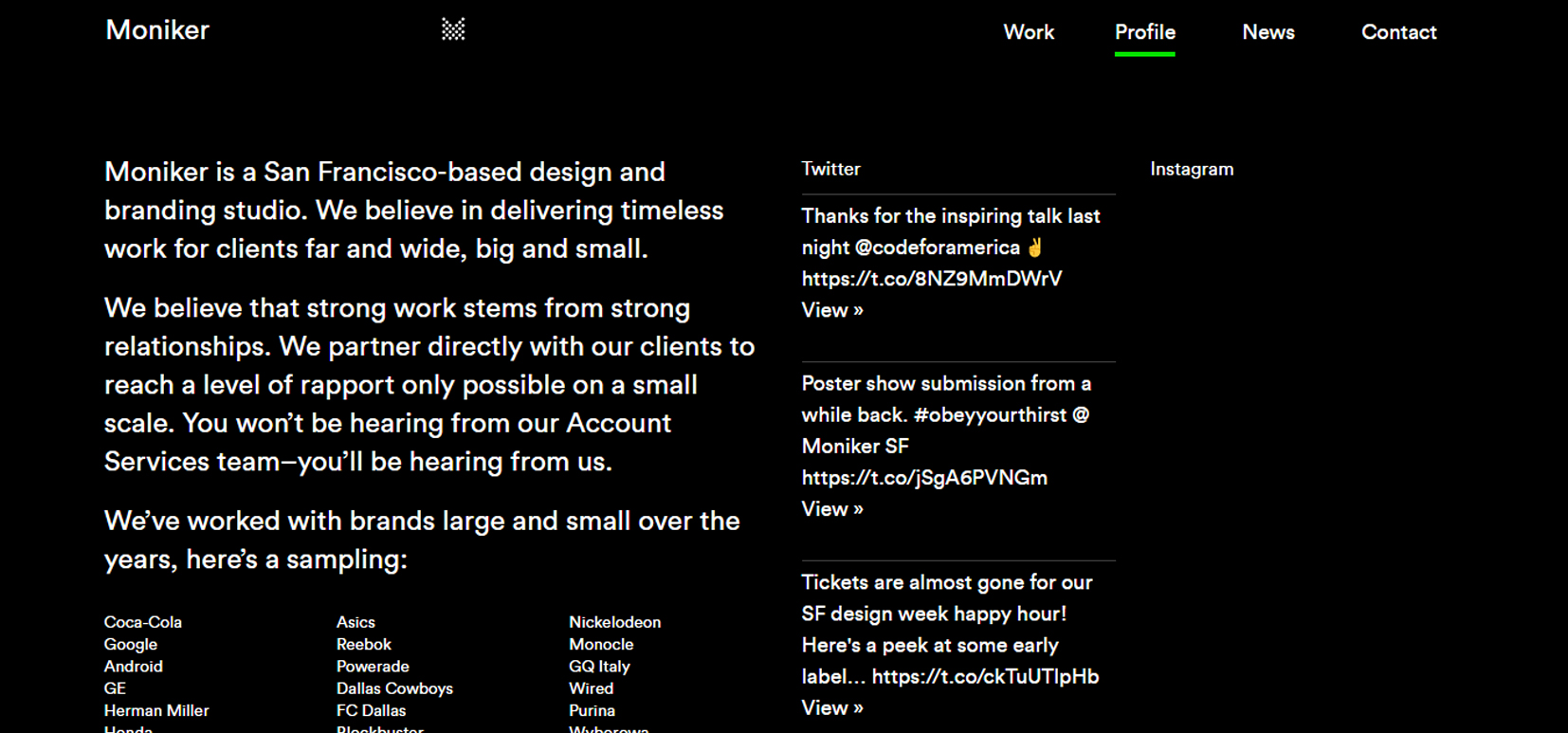
The San-Francisco based agency Moniker uses grids in different ways to show their work, profile, and news.
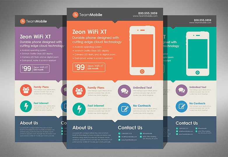

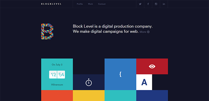
On the other hand, these brochure and flyer designs feature different geometric shapes for highlighting various design elements such as typography and icons. Also, the blocks of uniform colors and simple illustration bring the flat look for both of them.
Clean typography
Because of the lack of three-dimensional effects and of the quite simple visual, flat design also provoke the designers to approach the typesetting in a different way. Often, the result is a larger and more streamlined typography that combined with bright colors, bold and creative look makes it look absolutely stunning.

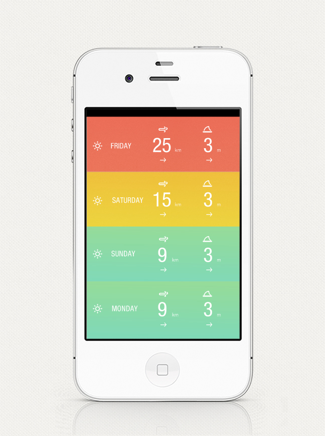
Clean and Sharp Visuals
One of the most important characteristics that make a flat design so appealing and interesting is its sharp design. The icons, shapes, lines, and buttons are all in the minimalist style, making the visual look beautiful. Also, the high-contrast features including bright colors, typography, and boldness all together make the design clean and easy to follow.

The CONS
Lack of Distinctiveness
In terms of visual communication, every business or brand wants its design to communicate their unique characteristics, whether they are using about brochures, posters, websites, apps or something else to convey their message.
One of the downsides of flat designs is the constraints imposed to designers by the minimalist approach and relatively strict rules. With a limited choice of principles to apply, combined with other current graphic design trends, we’re seeing a huge rise in generically designed visuals.
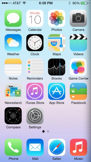
For instance, let’s take a look at the two apps listed below, which are unrelated to each other:

Both of them feature almost the same geometric shapes, use the same color scheme and overlapped white sans-serif text.
Compromised Usability
While they strive to emphasize the flat design’s clean and minimalist qualities, some designers fall into the trap of focusing too much on aesthetics to the detriment of usability. This is a particular risk for the web and mobile design.

Since everything is flat, it’s hard to say what is clickable and what is not. To keep it simple, flat design projects tend to have less “information density”, so, important features and actions can be hidden from the view. Therefore, many users don’t accept with an open heart the too much simplicity in interface design that characterizes the flat design.
Extreme minimalism
The ethos of flat design is to implement the “Swiss Style” philosophy. A philosophy that places heavy emphasis on minimalism amongst other things. But the minimalism included here is a fine line that could be easily overstepped and transform everything in a featureless site.
On the other side, it can be difficult to convey a complicated visual message in flat design. One of the arguments against flat design is the simplicity of user-interface tools. The supporters of skeuomorphic design say the effects that add a sense of realism make the tools easy to use. Frankly, I think it depends on the context.
The FUTURE
Flat 2.0
As the flat design has been around for few years with all its pros and cons, the designers decided to adjust the style according to their needs.
In its early days, the flat design was characterized by a strict visual simplicity. However, for both aesthetic and functional reasons, the recent developments have brought the subtle reintroduction of effects like shadows and textures. The result is a style named “Flat 2.0” or “almost-flat” design.
This style is more of a compromise: you still get the clean simplicity of flat design but add some subtitle 3D effects for a visual variety and improved usability.
Material Design
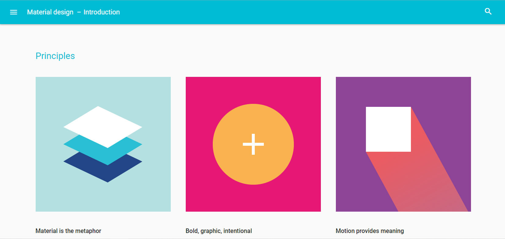
Including many common characteristics with Flat 2.0, Material Design is a visual language developed by Google that accentuates grid-based layouts and features of “deliberate color choices, edge-to-edge imagery, large-scale typography, and intentional white space” to create a “bold and graphic interface that immerse the user in the experience”.
Considering the material as a metaphor, Material Design uses a paper-inspired approach with “visual cues that are grounded in reality” and “familiar tactile attributes” for helping users to quickly understand and navigate the designs. Also, the “fundamentals of light, surface, and movement are key to conveying how objects move, interact, and exist in space and in relation to each other. Realistic lighting shows seams, divides space, and indicates moving parts.”
As Google Material Design’s guide is free, the designers are encouraged to apply it to their own work, whether they chose to follow closely these guidelines or to pick up and use the elements and techniques they like.
Join the Discussion
Whether you are an advocate of flat design or of skeuomorphism, the two can certainly co-exist. It depends on the context and content. The tricky part, as the last years has shown and for sure the next years will prove, is to find the perfect balance between them.
Where do you see flat design moving? Do you think it is here to stay or taking into consideration the last evolution of the graphic design trends, it will rather evolve to something else? Feel free to share your thoughts and insights in the comments.


I love the minimalist element of flat design but I don’t think it works for everyone.