When designing, all the visual components are essential for the public to have an accurate perception of what we want to show them. People do not usually notice, but they react differently to visual objects, affecting even their emotions and behavior. Therefore, it is important to know the meaning of each of the forms we use in our designs.
As you have probably heard mentioned before, the psychology of color is one of the essential aspects, and having a suitable color palette says a lot about the meaning of our designs. By understanding the role of the psychology of color and shapes, as designers, we can control the meaning of a logo. Each carefully chosen component helps people read the correct meaning of the logo.
Basic Types of shapes
First, we can divide the shapes into three basic groups:
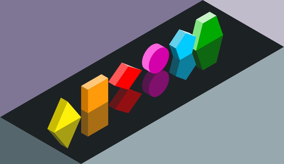
Geometric forms – these are the first things that come to mind when you think of shapes. Circles, squares, rectangles, hexagons … are formed by regular patterns, and are easily recognizable. They give us an idea of order and efficiency.
Organic forms – these are mostly irregular, with free and asymmetric shapes. They give us a more comforting feeling since they tend to be the shapes that we find in nature, such as leaves, flowers or rocks. You could also include man-made shapes forms into this category, like ink blots.
Abstract Forms – these are recognizable forms, but they are not original. They tend to be more stylized, or simplifications of organic forms. They can also represent ideas or feelings, such as emojis.
Once we have organized these categories, we will focus on the different geometric shapes and their use in graphic design. More specifically, how they have been used to create logos.
Don’t forget that these logos do not base their meaning completely on the shapes that they’re made of. It is important to make use of other composition tools that we have at our disposal.
The Forms and Their Meanings
At this point, we will make a list with some of the essential geometric shapes, and the meaning and image that each one of them gives. Accompanied by examples of recognizable logos that make good use of their principles.
Circles
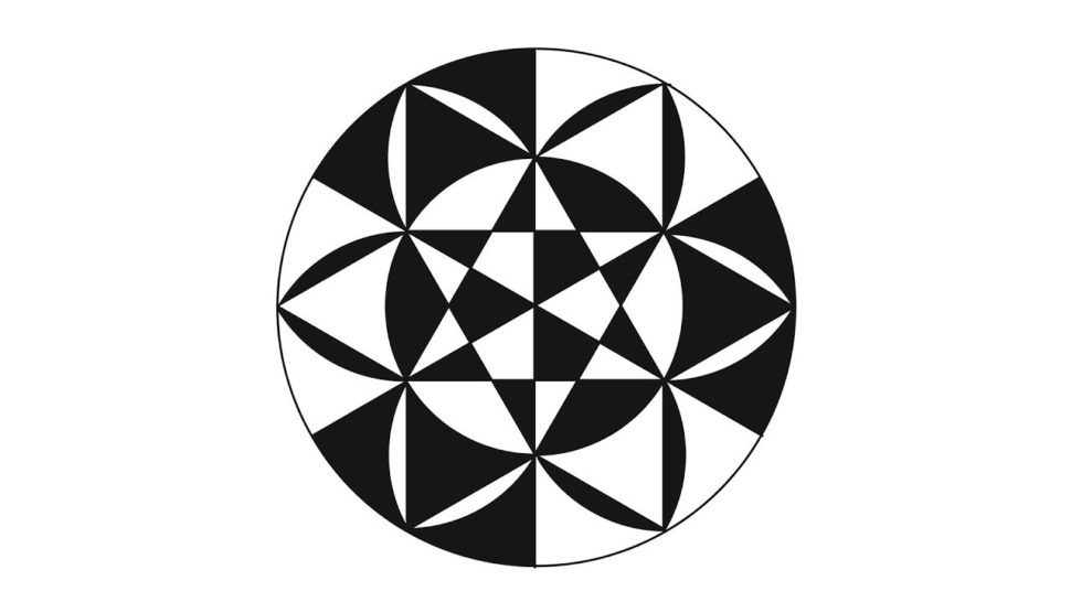
Circles give an aspect of fullness, something that has been finished. Possibly, it is the most used form in the logos, either the form of the logo itself or design around it. They can also represent constant movement.
(circular logos examples)
Squares / Rectangles

Squares portray the idea of stability. Maybe something that cannot be moved easily. That being said, if they are not used correctly they can give a boring image. For this reason, they are often filled with a color or a combination of colors. Sometimes, they’re even paired with other elements, such as letters or texts.
(Square logos examples)
Triangles

When working with triangles, a very important aspect is to decide which direction will be pointing. Triangles, same as with arrows, tell us different things according to where they point. For example, to the right means progress, while the left is a kind of return to the past.
(triangular logos examples)
Pentagons / Hexagons / Octagons
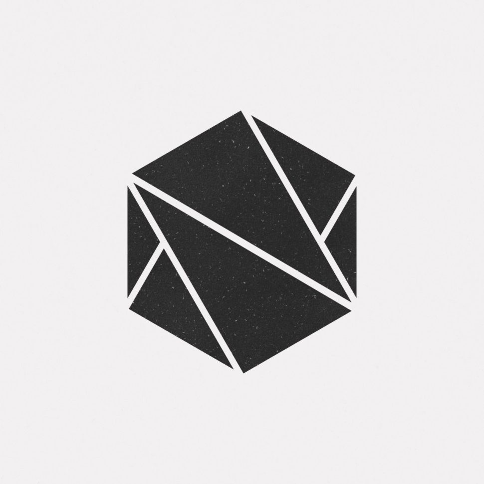
Similar to the circle, these shapes provide much more than a rounded design. On each side, you have flat edges, which provide a lot more uses in the design world. They can help signify depth or detail that most shapes wouldn’t be able to.
\
Spirals
The spirals have a very powerful format when you use them in design. That’s why we must be careful when we choose them. They portray a complex image, so they tend to grab the attention if the rest of the composition gives a calmer look. But if we use them alone, it is a very powerful form, that proves to be dynamic and intense.
(Straight-line logos examples)
Curved Shapes
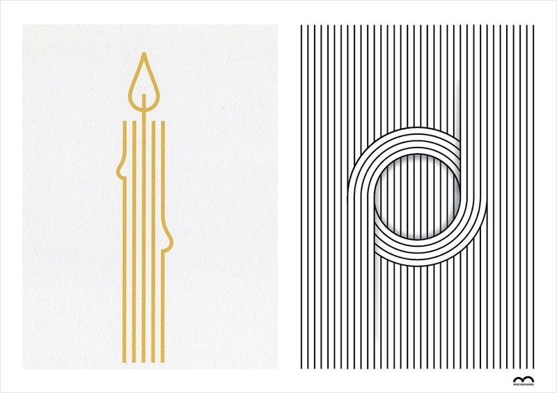
Curved shapes are associated with movement, pleasure, and generosity. They add an unexpected point to the forms. These shapes can be added to other shapes, such as squares, to give them a more relaxed look. They give a touch of softness.
Conclusion
The use of shapes and forms can be an interesting way to add meaning or create a new visual interest in your design projects. As with any other type of effect, you have to be careful with not only the application of the shape, but the overuse of them as well.
Most professional projects use forms in such a way that you aren’t even aware that they’re being used. This is how it should be, keep it simple. If you choose to play around with different shapes, try to use a variety, and never use too many.



Leave a Reply