How do people make decisions? The answer to this question requires a great deal of study and may be extremely complex but let’s discuss how they make decisions on the web. Conversion-centered design works hand-in-hand with website copywriting to convert leads to consumers and increase click-through rate. Your goal is to help your customers complete a task and reduce the leaks from your landing page.
1. The Right Choices:
When a user lands on your page, he should have a clear focus of what he should choose next. A conversion-centered design will help him make a decision. Keep the following behaviors in mind when providing choices:
Number of Choices:
A customer will get baffled and may end up not making a decision if you give him too many choices. Sheena Iyengar, a professor of business at Columbia University and the author of “The Art of Choosing”, conducted an experiment called “The Jam Study”. The first group of customers was shown six different jam jars and a second group was given a choice of twenty four. Results showed that the 30% from the first group made a purchase while only 3% of the second bought a jam jar.
Disparity between choices:
The choices you give to the customer landing on your web page should be different enough for the user to quickly decide which one he wants. You can show him a comparison of the choices as DropBox does.

Relatable Decisions:
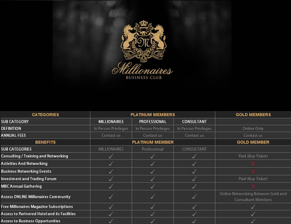
The choices that you present should be related in some way. For example: choice between a free trial and a paid premium package of Asana, choice between online-only membership and physical membership for Millionnaires’ Business Club.

2. Custom Landing Pages:
For different leads arriving from different marketing channels, it is best to create segmented landing pages for each. A landing page is also called a splash page, microsite, click page or bounce page. It creates immediacy and helps the consumer relate where he has come from to where he has landed.
For example, one customer sees your ad on Facebook and one sees your ad next to a thread in his Gmail inbox. Both have the same goal but have found you through different channels. If you take them to the same landing page, you may not be able to address them personally – and a personal touch is important to convince your customer to make a purchase.
3. Sequencing the Process:
Your landing page should provide a logical sequence of steps that leads can follow to become a consumer. Create a step-by-step story of why they should subscribe to updates or make a purchase. Then once you’ve convinced them enough, tell me how to sign up. This way, you won’t spring the decision up on unsuspecting users. If you ask them to sign up immediately without details, they’ll either look for benefits themselves cursing you for not being efficient or end up deciding not to go through the process at all. You’ll learn more about this in point five where we discuss the location of your call-to-action.
4. Balancing Logic and Emotions:
When we make decisions, we base our judgments on two things: logic and intuition. To convince a lead to convert, your website’s design must not only be logical but also appeal to the emotions of your customer.
Logically, it should be sequenced and should provide sufficient evidence for judgment. Emotionally, the design language should be according to your target audience’s profile, should reflect your brand’s values, content should evoke an emotional association with the brand, and it should guide the customer’s eye through the process.

5. The Fold:
Be careful where you place your call-to-action. If you place it above the fold, it is too soon to ask the user to make a decision. If you place it at the end of the page, it is too late. His interest has fizzled out. Ideally, your call-to-action should be directly on top after the fold. This means that whatever decision you want the user should make should be made immediately after the first scroll.
Above the fold, present your logical and emotional content to convince the user. Your content should follow the four-step process of AIDA – attention, interest and desire finally leading to action (CTA).
6. Focus on Benefits for the User:
Most websites have a form for the users landing on their page. You must provide enough motivation for users to fill out the form. One technique is to have five bullet points telling the user what he will get out of you. Notice that this is different from what we can give you. There is a slight variation in copy. For example:
What we can provide you: SEO expertise
What you will get: strategy to make your website popular in Google.
Also, your CTA (call-to-action) should describe what the user will get. Instead of having a “Submit” button for a form to get a free white paper, consider writing “Download Whitepaper Now”.
7. The Bandwagon Effect:
An experiment conducted in 1969 that showed that people tend to follow trends and mimic the actions of others around them. A man was told to stand in a busy street in New York looking skyward. Soon afterward, other people noticed him, five of whom started looking skyward themselves curious about what the man was watching. Later, eighteen more people joined the crowd. That is a 400% increase!
When you’re designing a webpage for conversion, use the bandwagon effect to your advantage. Show people who else has signed up/ bought/ subscribed. If you link it to a social network and show them a list of their friends who have opted for the same thing, that’s even better!
Design cues for conversion-centered design:
– Encapsulation (circular shapes like James Bond introductory titles)


1. Contrast and Colour
2. Directional cues: arrows, pathways, images of babies, lines, eyes
3. White space
– Psychological elements for conversion-centered design:
1. Urgency: Amazon offers discounted prices with a time limit. This alerts your frontal cortex of the brain and you recognize the need to make a quick decision.
2. Scarcity: Websites like TicketMaster and Expedia show you that there are a limited number of tickets available. This works the same as urgency.
3. Try before you buy: Giving your users a preview or demo of the product establishes their trust in your transparency and increases their will to buy from you.
What I’ve written in this blog post is from my experience and research. If I’ve missed out something or if you’ve found a technique that works for you, let me know in the comments below. Conversion-centered design can be executed in multiple ways but your goal should be to help the user make a decision. I hope this blog post will help you convince them through the language of design.


Brilliant article. Thanks, Julia, for putting accross the sensitive process of converting visitors into customers which requires analysis and tweaking in order to achieve sales targets.
Here is a little something to follow up on the topic of Bandwagon Effect which is called Groupthinking, that could keenly apply to follow up on familiar techniques in certain design to avoid alienating potential customers.
https://psychology.about.com/od/gindex/g/groupthink.htm
Some great advice in this post.
I’m always short of content when creating or updating a site for clients so using these would really help in adding to their website.
Clients are always reluctant to spend any money on marketing themselves too, hopefully using these would convince them to take the plunge.
Thanks.
Terrific – I’ve got some work to do. Thank you!
And where would you say the “fold” is? I would argue that interactive design, is not the Sunday newspaper, and the “fold” ceases to exist. At this point in the life of the internet, I think users are a little smarter than most interactive types (myself included) give them credit for. Users know there is usually content below the bottom of their screen, and know how to get to it. The percentage of users that don’t know the standard workings of how content is being distributed on a page, is probably the same percentage of users, using ie7 and ie8, although I don’t really know.
I am not arguing that call to actions, or important content should not have a higher ranking in the overall hierarchy of content within your site. I am bringing up the point that interactive types need to stop throwing around print terminology when talking about designing for interactive pieces. ^¿^