
Website navigation is one of the core experiences for browsers. An effective navigation system helps the site architecture, determining where users are lead, and how they navigate a site.
An effective web navigation panel is a map to the site, and without it, the site feels chaotic and hard to follow. Without an effective navigation system, the website becomes ineffective.

When designing a website navigation system, the design needs to be simple enough to make sense to the user, but complex enough to direct users where they need to go.
Try to map it in your mind as for a dashboard UI design. Make everything simple and easy to reach.
A vital aspect of design
An effective navigation system will keep users on your site for longer. Without this, viewers sometimes ‘bounce’ or access a single page and then leave the site.
An effective navigation panel will also make your site easy to map to Google, improving search rankings.
An intuitive website that is easy to navigate seems friendly and will encourage users to engage. Therefore, an effective navigation system is essential to the success of a website.
Navigation panels may come in creative forms, and with unusual designs, but what makes a website navigation panel interesting effective, and how would you design it?
Planning your menu
There are no set rules for creating website navigation systems. Navigation systems can be very versatile.
Some may be simple, like in the case of an app website, while others are very complex, in case of a large ecommerce site. There may be different navigation systems for users who are logged in and for those who are simply browsing.
In order to create an effective navigation system, it is important to consider what information a website will display, and how to arrange this in order of importance, creating a navigation system that will be suitable.
Design your menu around users needs
Although drop-down menus look great, they may be difficult for search engines to crawl. They might hide important information that can be hard to find at first glance.

This might mean important pages don’t get the visits they require. Worst of all, website viewers find them annoying.
This is because when they scan a page and then click a mouse, the drop-down menu appears.
Users may not understand how to sort the menu or categorize it, and it can make the website feel chaotic. This can make website navigation feel like a slow and inefficient experience.
Multiple Navigation Menus
Viewers interact with a website by searching for a way to navigate it and find their way around it.

This is why, when information becomes increasingly complex, multiple navigation tools are often used to make the user experience more effective.
This happens because not all content fits into a single menu. As a result, many websites have both primary and secondary navigation systems.
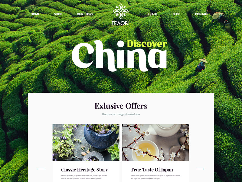
Primary navigation systems
Primary navigation systems are used for the most important information, such as About Us, or Homepages, which ensures that the user gets all the information needed as quickly as possible.
The content placed in the primary navigation system of a website is always relative, however, and is determined by the site.
Secondary website navigation systems
Secondary navigation can be placed anywhere on the site, and often comes in the form of subheadings.
It may include topics such as Frequently Asked Questions, help, or client area pages, which don’t give the user a broad introduction to the site but still contain relevant information, and the user might search for the information nevertheless.

Areas selected for secondary navigation would be determined by the purpose of the site.
Ensure your site is easily accessed
When creating your website navigation, avoid using programs (Flash, JavaScript, jQuery) which may limit access to certain users.
The more people can access your site easily and without any complication, the more effective your design.
Keep it Traditional
Designing an effective website is about making the process as familiar as possible to your users. This makes a website feel intuitive and easy to use.
Follow standard expectations when designing your website navigation system. If users expect navigation along the top or left-hand side of a site, use these standard spaces.
This gives users the opportunity to engage with the site, reducing ‘bounce rate’ or users who leave the site quickly.
Although uniqueness and quirkiness provide an important element to website design, making your site appear more interesting and unique, this shouldn’t be incorporated into the navigation panel.
Keep up to date
Despite traditional navigation systems appearing along the top and side of the site, however, there is room for discovery.

New and different navigation systems are starting to emerge which use a slide-in effect to bring menus into view, and take users where they want to go.
Hidden navigation elements such as a hamburger icon in the top corner, or hover effect links, focus on both the design and usability of a website.
Designers use the intuitive placement of icons to guide users to the navigation panel, which is simple and easy to use.
One page scrolling websites may also be effective for viewers by presenting information as one long, continuous page instead of multiple pages which may be more complicated to use.
When designing with innovative navigation systems, ensure that your design will be responsive to mobile devices and that users will still be able to effectively negotiate the navigation panel on a smaller screen.
Getting back to the top of the page
Instead of automatically scrolling to the top of the page, some websites offer a menu on the footer of the page, to allow the user to choose where to go next. Consider whether this would be an effective navigation tool for your site.
Responsive menus
Responsive menus adjust and adapt to different styles and sizes of screen, and navigation can be difficult to design while keeping a consistent feel.
However, with mobile devices plotting the way to the future, being highly personal and constantly accessible, ensure that your site is easy to navigate on small screens so that you keep viewers interested.
If you liked this article and you’ve learned a lot, you will probably find our second to last article helpful, as well.

Pingback: 4 Visually Powerful Website Image Hacks to Make a Splash on Launch Day - Web Design Ledger