
Despite the minimalism being present in almost every form of art and the concept of minimalism has been quite around for centuries, it became a specific form of art in the 20th century. Starting then, like vintage or retro design, it has never in or out of a trend – it was just there, regardless of time.
In simple words, the minimalism is defined as eliminating all the unnecessary elements and retain just the fundamental, in order to allow the content pop. The “less is more” philosophy is a well-loved style of design among web designers, who are increasingly appreciating it. Even if the minimalism offers the websites that embrace it many advantages, maybe the most important are faster loading times, a better compatibility between the different screen sizes, the clean and beautiful visuals and the efficiency in conveying the message to the audience. Moreover, a simple UI design is attuned to mobile browsing, without harming the desktop experience.
In terms of design, the minimalist aesthetic is the visual representation of this concept. Even if in the early days of this style it was very difficult for the designers to achieve its simplicity and clean lines, they have learned to “declutter” the visual to the point of it being the second nature. However, some of the designers take it a step further and cut out almost everything from the design.
Indeed, even if the latest web designs with loud color, trendy headers, and stunning imagery are really attractive, sometimes, it’s nice to see and admire the everlasting minimalist style. The ultra-minimalist websites in this list focus on composition and typography to create clean and simple visuals, and the naked designs are as beautiful as those full of glamour.
Rubrasonic

The website uses changing dark backgrounds that harm the eyes a little bit. Otherwise, the extreme simplicity defines the whole design. For the home page, the white centered logo shows some music-related quotes, such as: “I call architecture frozen music” (Johann Wolfgang von Goethe), “After silence, that which comes closest to expressing the inexpressible is music” (Aldous Huxley) and so on. The navigation menu is represented by the white dots on the left of the screen and hovering the mouse over them brings up the category title.
Leen Heyne

Besides its jewelry, Leen Heyne’s monochrome logo and company name are the only significant visual elements on its homepage. The surrounding expanse of gray space and white texts make it a safe bet, the user’s eyes going back and forth between the two core visual elements.
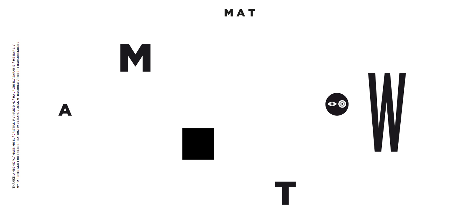
Wmat.it

Here is an extremely minimalist homepage design. Most of the elements on this page do something – the letters are the navigation menu and show the categories on mouse over. The solid black square shows some video clips when you hover the mouse over it. The only element that does nothing is the circle.
Wildflower

Seeing this page, it’s no wonder that this joyful little website is ultra-minimalist as there really isn’t much content throughout! The home page has black text on a white background, the only accent of color being the pink heart in the text. The next page is similar, just asking you for your name and the name of the person you want to give a flower to, then you get your flower, which you can change if you wish.
Hunkwot
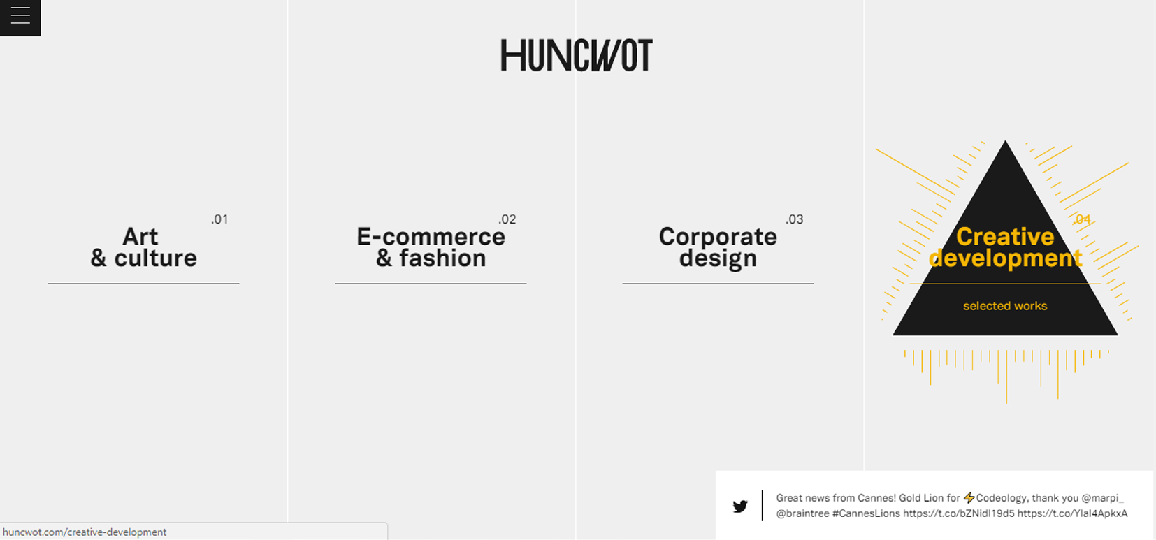
This site uses the ultra-minimalist concept in a very beautiful way. The home page has a very pale gray background with thin, hardly-visible white lines separating the categories that are displayed in black text across the page. When you hover over any of the links, a shape with colored lines/arrows appears, adding a lovely splash of color to the page.
The Post Family

Discover the full layout of this ultra-minimalist website. It begins with a black & white screen which showcases a big heading, the menu, and the logo design. Also, you can navigate through the site using your keyboard.
Velvet Hammer

Velvet Hammer’s site demonstrates the value of composition in minimalism. The two dominating visuals are poised symmetrically, all four corners are occupied, the entire scene is framed by a thick black border, and thin lines bisect the vertical and horizontal halves. At the center of the screen – though not the composition – is the brand name. The whole site has the same ultra-minimalist design.
Symbolset
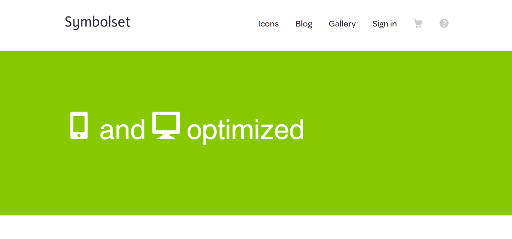
Icon font vendor Symbolset attracts attention to the interactive area in the middle of its site by minimizing the competing elements and adding a brightly colored, ever-changing background. An inspired demonstration of minimalist design.
Huggable.io

This is a real expression of extreme minimalism. The website is, in fact, an app that will tell you when a flight is due to arrive. You enter the airline, then you are asked for the flight number – if that flight number is relevant to more than one flight you will be offered the days of the flight to choose from, then finally you are shown the departure and arrival times – or when your ‘huggable’ time is! This is great if you are waiting at an airport for a delayed flight – as long as the airline actually has some idea of arrival time, you can get the info.
We Ain’t Plastic
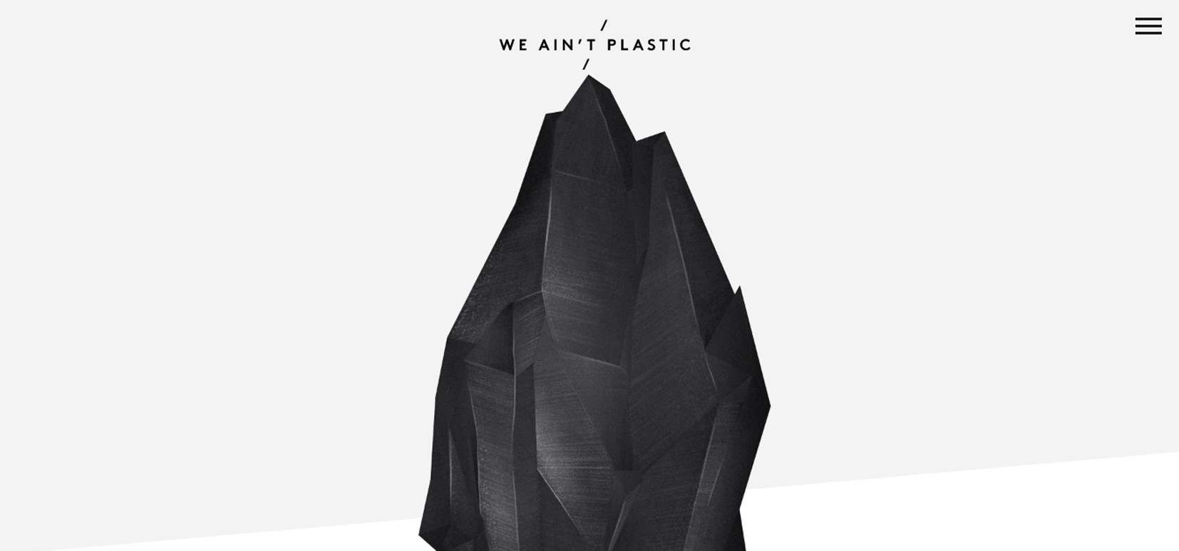
We Ain’t Plastic website uses the philosophy “less is more” in a very classic way. Contrast is another useful visual tactic for keeping minimalist designs interesting. German UX engineer Roland Lösslein’s website We Ain’t Plastic sets up a stark contrast in size between the central image and the text and icons above.
Brian Nathan Hartwell

The homepage is dominated by the black background, the only accent being “gold” and white typography. This website is well-organized into a grid layout which includes a certain project. Each one has an amazing animation which comes to life when you hover over.
Carlo Barberis

The Italian jeweler Carlo Barberis takes the advantage of the high-end attributes of ultra minimalism, with little more than a hero image on each screen. As usual, an image speaks more than one thousand words.
Why we explore

Created by the Swiss interaction designer Nicolas Lanthemann, Why We Explore is a blog about space that follows an interesting format. Although the topic is vast, the information is given plenty of space to breathe; each new theme being announced as the viewer scrolls horizontally across the page.
The Office of Jason James
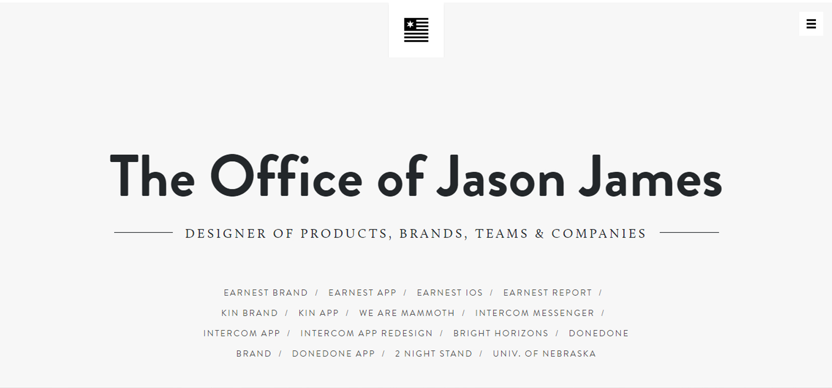
In terms of design, a minimalist approach can say a lot about your website. This is a stunning portfolio website that uses a side menu and a creative clean design. The light gray background accompanies beautifully the dark-gray typography and the stunning pictures, leaving the information room to breathe.
Elite Model

Modelling agency Elite takes the minimalist design to its extreme. In terms of navigation, the focus is on only two main pathways, and all the others tucked away in a hamburger menu. In terms of visual design, the website has the classic black and white color scheme, excepting the “Become a model” section. Another website where the photos speak for themselves.
Werkling Brand Design Agency

For sure, you can express more with less! The Werklig agency knows this! Their website uses a large white background and the classic black and white color scheme for the part that is designated for their presentation. On the other side, for their portfolio, they used a grid layout to showcase each project.
Lunar Gravity

This website includes a neat parallax effect which makes everything come to life, giving another dimension to the entire layout.
Scytale
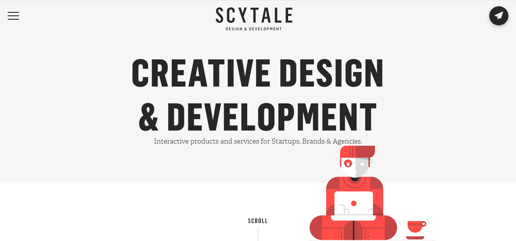
Scytale is another defining website for the concept of minimalism in web design. They use very large white and light gray background and big and bold typography, helping the user to focus on the main message. The red color used for some flat design and typography are the only color accents used here.
Thrive
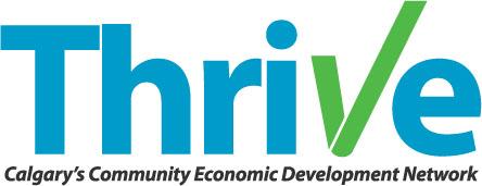
Simple design on a subtle grid. Garnished with flat design and simple, bright blue color via scrolling. A fun, clean, good interaction!
Yaron Schoen

You only need a message and a creative way to showcase it to the public. This minimalist website also includes a full-screen menu design which can be accessed from the sticky logo design on the top left.


Leave a Reply