When it comes to web design trends, minimalism has risen to the top and shows no signs of losing its current popularity. There are many reasons why the style has been so embraced of late: not only does it mesh well with the tenets of web design, it also can be effortlessly combined with other popular design trends. Visual styles like color blocking or large photography, and functional trends like innovative navigational structures all can be combined with the methods and goals behind minimal design.
But all of these benefits don’t mean that minimalism is particularly easy to work with. In fact, despite the deceptive simplicity of their construction, really good minimalist designs actually require just as complex of a creative process as any other style. A good way to approach a minimalist project would be to build up a complex site and refine it down to the essentials. But what are the essentials? Read on to find out.
Concept
The first mistake designers can fall into is deciding to use minimalism for the wrong reasons; either because it’s popular, or because it looks like it’s easy to do. But don’t be misled by the hype; minimalism is just one stylistic choice among many; it doesn’t and shouldn’t work with every type of website.
- Minimalism works best when combined with a modern aesthetic and naturally sparse content.
- It’s at its worst when used with complex content, conventional audiences, and a traditional aesthetic.
Minimalism wouldn’t work on a content-rich site like The Verge, despite the obviously modern aesthetic and audience. The trouble is that it has too many elements; the ads, social media, buttons, articles, and so on all add up to an unwieldy total. This is not a failure to of simplification; all those elements are essential and cannot be further reduced without negative consequences. And while the website is comparatively busy and full, it’s also quite effective. Make sure that you have a good reason for using minimalism, or else choose another style.
Execution
Another common mistake that designers make is taking reductions too far. This results in a site design that is either lifeless and unappealing, or difficult to understand and interact with.
- Minimal sites almost always need to feature either beautiful imagery, interesting type choices, or great balance and contrast. Otherwise they look too plain.
- The entire purpose of minimalism is to bring clarity through simplification. But if navigational elements are reduced to a point where users can’t immediately understand them, then this purpose has not been upheld.
For example, while other portions of Pixelsapien’s site have interesting elements, the “Our Work” section exemplifies how throwing flat, refined icons on page really isn’t a successful implementation of minimalism. It’s very easy to understand, but it’s also boring and lifeless. The imagery, type, and colors are all very plain, and the layout is centered and simple. If just one of these features were tweaked and enhanced, then the look of the page would be immeasurably improved.
In contrast, Grain and Gram is beautifully designed. But minimalism’s primary emphasis on good communication isn’t being upheld as strictly as it should be; many of the icons and navigational elements are ambiguous and need further clarification.
Design Elements
A Modern Style for a Modern Audience
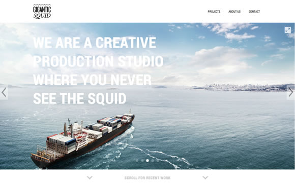
As a creative production studio, minimalism fits perfectly with the target audience of Gigantic Squid. A low profile user interface lets their imagery do all the talking.
Simple Content Fits a Simple Presentation
A website like the Minimalist Music Quiz has just one purpose; to make a fun game out of guessing song titles and artists through minimalist art. As previously discussed, minimalism is a great choice for such a simple site; it’s made more functional as well as more attractive by paring it down to the bare minimum.
Contrast
By overlapping aqua triangles with black and white photography, Case 3D shows just one example of how their website design succeeds at creating interest through contrasting shapes, textures, and colors.
Balance
This essential can be achieved in many ways, just one of them being seen in Hennessy’s homepage design. A classical gridbased arrangement like this is a good choice for a company with a historical feel, but something edgier and more complex could be attempted with another type of site.
Detail
It’s the little things, like the exquisitely intriguing rollovers to be found on Stronghold’s website, that make minimalist designs feel special. Thoughtful touches like this (that don’t interfere with functionality) are the hallmark of a quality minimalist website.
Typography
The textural, handwritten typography on MailChimp 2012’s homepage is all that was needed to make this large-scale photo come alive; it makes a statement by contrasting the rough, flat texture of the text with the smooth, dimensional look of the image.
Consistency
A necessity that ties into both the visual and the interactive experience can be seen in Adam Rudzki’s portfolio, where shapes, movements, and lines are carried throughout the site to make it feel like a seamless experience.
Although all of these components should be considered and incorporated into a good minimalist design, the essential purpose of the style can be boiled down to just one statement: minimalism is meant to elevate communication by simplification. By using as few tools and options and possible, good minimal designs should provide an interactively streamlined and visually appealing user experience. Many websites stand to vastly benefit from this treatment, so it’s a good bet that minimalism will be here to stay.


A great article. Minimalism’s so easy to get wrong. Thanks for posting.
Amazing article, thats what we call a simple design.
The stronghold website may have exquisite rollovers but it’s a bit hard to tell if you go there and haven’t got whatever font they are using for their reams of esoteric characters, you just end up with a lot of garbage text.
Everyone thinks they can do simplicity, but often it’s an artform in itself. Great step by step breakdown of a often overlooked process.
It’s about designing for the user. If they cannot determine how to access the site information in a matter of seconds they won’t. great article on how to avoid the pitfalls of simplicity.