As the number of smartphones continues to skyrocket, the importance of mobile web design grows alongside it. Web designers are now forced to take into account mobile users and mobile devices when designing websites. The smaller screen size of smartphones forces designers to take a new approach to user interface elements. Elements and styles that work well on desktop can appear broken when viewed on smartphones. User friendly form inputs that encourage completion and submission are essential when designing an effective mobile friendly website. Today we will look into how you can design attractive and user friendly form elements and inputs.
Labels
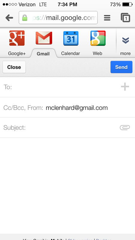
First we will start with designing and choosing an appropriate location for your input’s labels. Choosing a location for your mobile input labels is important and if you are not careful they may not be visible or may present problems to your mobile user. Labels to the left or right can easily be cut off so it is often best to top or bottom align mobile input labels. Field zoom can exacerbate the problem by cutting off labels when zooming in. Short labels are also recommended as screen size is an important asset and long labels will often be compromised by field zooming. As the image below shows google aligns their input labels on top to ensure they are not cut off.

Elements
Due to the smaller screen size of mobile devices it is essential to keep the form as simple as possible. One way to achieve this by combing elements into one field or by removing unnecessary ones. For example instead of requiring street, city and zip you could simply ask for the address. By reducing the number of elements and simplifying the form you are able to quickly and easily improve your user’s mobile experience. Another strategy to simplify your mobile form is by removing unnecessary inputs and keeping only what is truly needed for the form. For example if you have a form that asks for name, email, message and how you heard about us consider removing the how you heard about us field. It is unnecessary and only complicates the form. Removing it allows the user to complete the form easier and increase the chance of the form being submitted. Descriptive tags and links can also be removed as a way to free screen space and improve your forms usability.
Orientation
The orientation of a mobile device drastically changes the viewing dimensions and it is important to take changes in orientation into account when designing your mobile forms. It’s essential to test your form in both orientations to make sure your users won’t face any problems when filling out your mobile form. Google does this well in their Gmail web application and when your phone changes to portrait landscape the screen adapts to give a wider text box.


LinkedIn shows you what can go wrong when designing inputs for mobile devices. After clicking on an input and then switching orientations the keyboard dominates the screen and you can no longer see what you are entering.


As mobile device usage continues to grow innovations will be made in mobile web. The mobile web is still in its infancy and it is exciting to see what is to come.


Good tips… 🙂
Nice article.
I am very curious on how to prevent the keyboard from taking up all the space, as in the linked in example you gave.
Off the top of my head, I would probably set a restriction in the @media query and make it a portrait mode only. I think landscape has it’s uses and I would imagine that’s more for viewing images and pics.
Some good little reminders in here either way.
nice tips 🙂