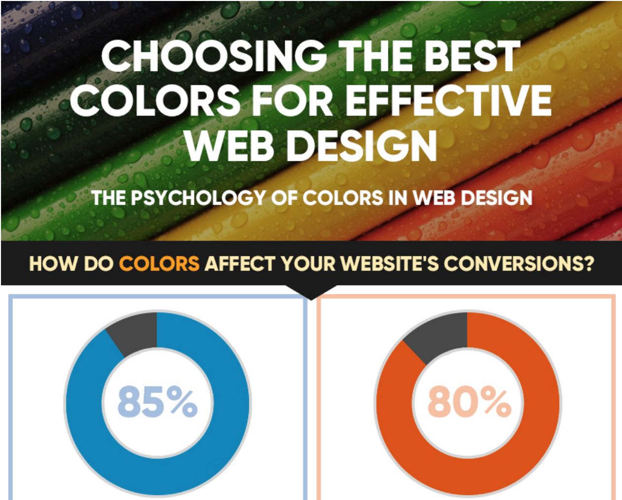
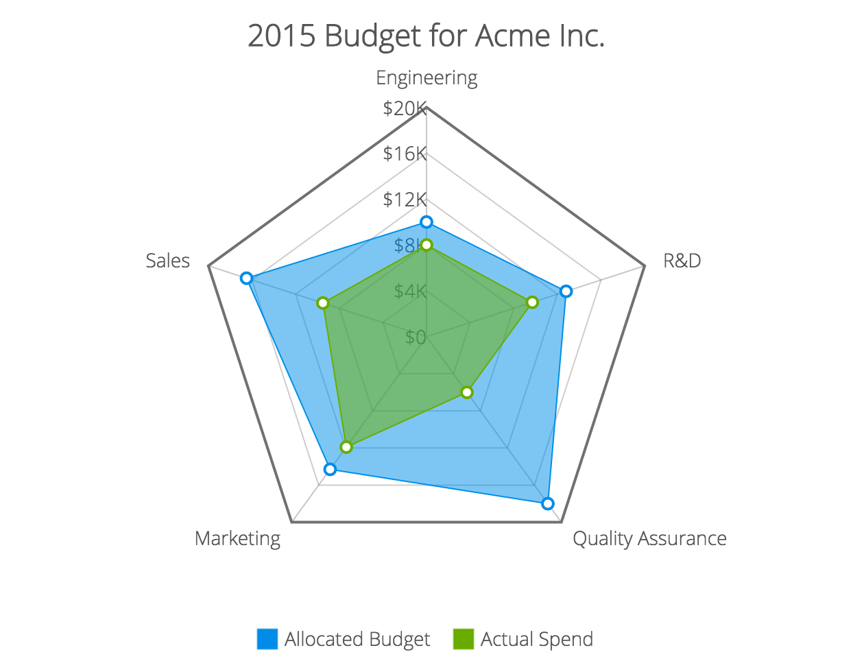
A web design is made up of various components, all working together to accomplish a goal – whether it be building a community or selling a product. These parts must compliment each other in a way that creates a good experience for the user. Miss the mark on one element and potential subscribers or sales could be lost, but execute correctly on all parts and chances are you will have created an effective web design. Here’s an infographic that helps break it down for you.
Share
Dona Collins
Dona Collins is a financial writer for CreditLoan.com and you can visit CreditLoan blog to find more of her work.


Wow, what an awesome infographic!
Nice infographics…
Excellent!
Clean, beauty and smart infographic.
Very nice! The one thing I don’t fully understand though are the salary sections at the end. Is the first one supposed to be for salaries in the past and the second one for salaries in the future?
Very nice Infographic 🙂 but to get back to your question, yes the first one shows the salaries from the past and the second one the salaries in the future
Very informative, thanks. Seems that lots of web designers used to be waiters/waitresses!
very interesting, one more i want to know most used color in website design
This is really interesting. I did enjoy the part about salaries and experience, etc. However, I do feel that it was a little off topic. 😐 Unless I was missing something.
Figures 1 and 2 serve as brief yet very useful basic guide.
After reading lots of blog posts its refreshing to see this. Some colour, minimal text, and straight to the point!
You lose points for reminding me how bad my wage is though 😛
Thanks
yes i agree lol… however good info-graphics… thank you
Muito bom esse infográfico
parabéns
amazing stuff!!
lol, on there you talk about having a link visited state… your site doesn’t have it… hhmmmm…
Nice infographics for beginners! I think it could be broken into two topics though, because the second part is about industry stats.
The second part of the infographic has little to do with effective web design. It’s about web designers. This is nice, but should be broken into two separate infographs with more information in the 1st/original.
Excellent job!
Thanks for sharing!