
If you are into front-end development, you can’t escape from two things – jQuery and data visualization. jQuery is one of the most popular JavaScript libraries which is being used by more than 70% of top one million websites (source). And with the increasing amount of data, sooner or later you will have to get your hands dirty with making charts.
That’s why this article combines both – jQuery and creating charts. I am going to walk you through the process of creating beautiful charts using FusionCharts and its jQuery charts plugin. Although I am going to make a radar chart, you can use this process to make any other chart that is part of FusionCharts’ library of 90+ charts as well.
Creating a Radar Chart – 4 Step Process
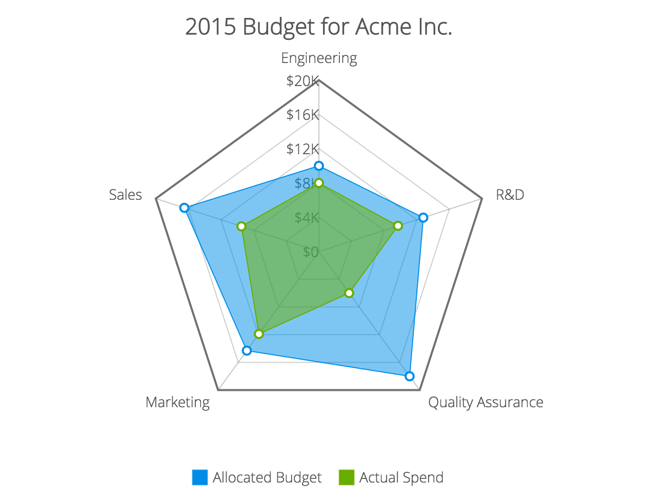
I have divided the process of making our chart into four easy-to-follow steps. But before we begin, here is a quick look into what we are trying to make:

You can see the live version at this JSFiddle. To view the source-code, click the ‘Edit in JSFiddle’ button on top right of the screen.
Step-1: Get the Data
This is usually the first step for making any kind of chart or graph. For the purpose of this tutorial, I am going to to use dummy data representing allocated budget and actual spending of a company (Acme Inc.).
FusionCharts accepts both JSON and XML data formats. I am going to use JSON as it has now become the standard data exchange format of the web. First we need to define a category array which will contain all the categories under which budget was allocated. It will be an array of objects like this:
"categories": [{
  "category": [{
      "label": "Engineering"
    }, {
      "label": "Sales"
    }
    // more categories
  ]
}]
Next we need to put the data that we want to plot in dataset array. Inside dataset you can have one object for each series of data you want to plot. In our case we have two series – Allocated Budget and Actual Spend.
"dataset": [{
  "seriesname": "Allocated Budget",
  "data": [{
      "value": "10000"
    }, {
      "value": "16500"
    }
    // more data points for first series
  ]
}, {
  "seriesname": "Actual Spend",
  "data": [{
      "value": "8000"
    }, {
      "value": "9500"
    }
    // more data points for first series
  ]
}]
Step-2: Include Dependencies
Our project is dependent on following JavaScript files:
- jQuery – download it from here or include it via CDN.
- 3 FusionCharts JS files:
fusioncharts.js,fusioncharts.charts.jsandpowercharts.js. You can download all the files from this page (see under JS folder). - jQuery charts plugin – download it from plugin page.
<!-- jQuery -->
<script type="text/javascript" src="jquery.js"></script>

<!-- FusionCharts files-->
<script type="text/javascript" src="fusioncharts.js"></script>
<script type="text/javascript" src="fusioncharts.charts.js"></script>
<script type="text/javascript" src="powercharts.js"></script>

<!-- jQuery plugin -->
<script type="text/javascript" src="jquery-plugin.js"></script>
Step-3: Create and Select a Chart Container
HTML <div> elements work best for housing a chart. You should have a separate <div> container for each chart on you page. This is how we define a container and select it via jQuery’s $ selector:
HTML:
<div id="radar-chart">Radar chart will load here.</div>Selecting it via jQuery:
$("#radar-chart")Step-4: Insert the Chart
We are almost there. Now we just need to use the insertFusionCharts method provided by the plugin to insert the chart into our page. Here is how we do it (explanation after code snippet):
$("#radar-chart").insertFusionCharts({
  type: 'radar',
  width: '100%',
  height: '500',
  dataFormat: 'json',
  dataSource: {
    "chart": {
      "caption": "2015 Budget for Acme Inc.",
      "captionFontSize": "22",
      // more chart configuration options
    },
    "categories": [
      // explained in step-1
    ],
    "dataset": [
      // explained in step-1
    ]
  }
});
Most of the terms in the above code snippet are self-explanatory, so I will keep the description short and to the point:
typesets the type of chart we want to plot.widthandheightdefine the dimension of the chart.dataFormatsets the format in which we will pass the data (json or xml).dataSourcecontains chart configuration options and the data we want to plot. Chart configuration options will go insidechartobject and are technically known as chart attributes (in FusionCharts).datasetandcategoriesarrays were covered in step-1.
Quick Note on Improving Design
If you notice the above code snippet carefully, you will see that our chart object only had two chart attributes, while the source code for the chart has more than 20!
What is happening here?
Well, in reality there are more than 100 different attributes you can use to customize a chart. Since it is not possible to cover everything, I am going to leave you with a resource that will be immensely helpful if you try to customize a chart.
Open this page and type the name of the chart you want to customize. It will open up complete list of attributes that can be used on that chart, along with their short descriptions and acceptable values. For example, to customize a radar chart you will reference radar chart’s page.
That’s it! If you were following along and did everything I described above, you must have got a working chart by now. If not, head over to the JSFiddle demo I created and take few mins to understand where you went wrong.
Have any questions? Leave a comment below and I will be glad to help!


Leave a Reply