
Birthed in May 2010 in an article by Ethan Marcotte published on A List Apart called “Responsive Web Design“, this device-independent design philosophy has spread like wild fire amongst the design and development community. Evidence of the larger business community embracing responsive web design began in 2011 with notable redesigns of Starbucks, Time Magazine and Boston Globe websites. It’s no surprise given the rapid increase in the number of different devices used to surf the web – phones, tablets, handheld gaming devices, consoles, refrigerators and who knows what else in the near future. Our recent article “21 Fresh Examples of Responsive Web Design” highlights some fantastic websites that showcase the beauty and capability of Responsive Web Design.
However, the resource cost compared to “traditional” web design is definitely comparatively higher, there are claims that it will cost at least 50% more to design and develop a responsive website. Although there is a growing amount of resources, templates and frameworks for responsive web design to combat this, as designers and developers how do we optimize our workflow efficiently? Just as responsive web design is evolving continuously, so will the responsive web design workflow. This article will cover some main considerations of responsive web design workflow.
Why Change our Workflow?
By increasing efficiency, it obviously saves time. Whether you’re into making more money, spending more time on your Playstation or innovating better web design – moving away from the classic web design workflow is a must. Discovery > Wireframe > Design > Development > Launch, this rough step by step “waterfall process” for web design and development has been proven and most websites would be created in this manner about three or four years ago.

There are glaring flaws involved with using this traditional approach with responsive web design. The first time I was involved in a responsive web design project, the time spent was approximately five times compared to the old-school fixed width website projects. Imagine handing over bitmap designs for every single page and viewport layout size of a website. Whether it’d be using prototyping, visual patterns, designing in the browser or making responsive design decisions promptly – every little bit of time saved adds up. Think of responsive web design workflow to be flexible, just like the design itself.
Content First
Content has always been important on any website, but more than ever now with responsive web design. Regardless of the structure in your planning and brainstorming sessions, it is absolutely crucial to determine the order of priority for content. One of the biggest differences between using a responsive design and a dedicated or mobile-only website design is in the content delivery. All users should have access to all the content a website has to offer – this is the philosophy behind responsive web design and hopefully one of the reasons you or your client prefer a responsive website.

In responsive design, understanding the weight of importance on any piece of content is critical due to the possibility of content order variance depending on device. Overflowing of content is a common problem in responsive web design due to the requirement of fitting the same amount of content on a desktop screen and a mobile device. Consider additional questions in your client questionnaires during initial engagement or during early workshops to mitigate possible issues later on in the life of your responsive web project.
Device Planning
“How come you don’t have a layout design for the iPhone? Fifty perfect of our users view our website on an iPhone”, as a client shook his head disappointed – that was one of the first mistakes I had to learn from. With a firm grasp on the project’s requirements and the amount of content, hopefully it won’t be too difficult to decide upon which device widths and how many different widths to design for. This simple device diagram for responsive design planning is a downloadable Photoshop file with ideal widths for three to six layout designs. This decision should undoubtedly be one of the first you make when designing responsively.

Designing in Browser vs Photoshop and Fireworks
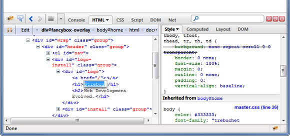
The advantages of designing in the browser have been amplified with responsive web design, “Using photoshop/fireworks for responsive design is like bringing a knife to a gunfight.” – Andy Clarke(@malarkey). For some projects this will undeniably provide quicker results and real, “on the spot” testing. Familiar tools such as Firebug and Firesass would be the “guns” in this “gunfight”, designers who can take advantage of HTML5 and CSS3 will find prototyping extremely fast. Making decisions such as colors and font size in the browser can be extremely efficient.
Personally I appreciate many benefits of designing in the browser. I’ve tried this approach on several occasions, but found that I still prefer to start in Photoshop. I prefer Jeremy Girard‘s “designing to the extremes” method, by starting with the desktop version of the website. Once I am satisfied with the typography, imagery, style and overall design direction of the desktop website, I work on the smallest layout or “mobile” version of the website using similar visual direction but adjusting the layout appropriately. I prefer this workflow as well due to possibility of the client requiring a complete overhaul of any given design. However, my preference will most definitely not suit everyone and every project.
Sketches
“By spending a short time sketching you can save yourself hours on the computer. Not only will you save yourself hours, you may even afford yourself some peace of mind. Whenever that evil monster of ‘designer’s block’ creeps in, it inevitably leaves a path of destructive self doubt in its wake. I challenge you to start employing sketching as a part of your process and you will see a dramatic decrease in the amount of times you hit that virtual wall of nothingness.”
– Tara Roskell (@designbloguk). I’m sure sketches are already a big part of most designers’ workflow, it is now more important than ever in the age of responsive web design.

Considering many responsive web designers jump straight into the browser, it is especially important to test ideas on paper first prior to committing hours into HTML/CSS. I use responsive design sketchbooks to make sketching life a breeze; I go through these sketchbooks extremely quickly. You will be surprised at the amount of issues and content placement challenges you did not think of as you sketch out your design and ideas.
Mood Boards and Style Tiles
Mood boards have long existed in the world of graphic design. The concept of collecting imagery to guide the overall “feel” of a website design is perfect for responsive web design since it is entirely possible to have six visually completely different layouts (although rare). A regular exercise I do with clients is present them with three slightly different mood boards to determine which style resonates with the client’s requirements the most, prior to commencing design. This eliminates much guesswork from the responsive web design workflow to minimize the chances of multiple design revisions.

Style Tiles are a design deliverable consisting of fonts, colors and interface elements that easily communicates visually the website design without being a complete web design. This eliminates the need for delivering three to six different webpage mockups whilst being able to clearly show visual direction to a project manager or client. The image below shows the Style Tile deliverable (left) compared to the final website design (right). I’ve had much success using Style Tiles in communicating designs very effectively, especially for websites that have clear separation between elements. This “design language” is definitely a time saver if you can work it into your responsive web design workflow.

Design > Prototype > Test Cycle
This is possibly the most important point to take away from this article. This cycle is typically the “black hole” when it comes to time spent for responsive web design, given the number of different devices possible to be tested on and the amount of visual deviations that can occur. Prototyping early is the only way to truly see how a given layout will respond to different viewport sizes. Testing on actual devices is sometimes the only way to see how a prototype will display and behave. Regardless of how stringent your design, prototype and testing cycle is it will likely look cause your design workflow to be similar to the below.

You might argue that the traditional web design workflow is already similar to this, but a big difference is that the responsive web design has a dramatically higher probability to evolve as the prototyping and testing reveals new challenges on various devices and viewport layouts. It’s generally a good idea to give your client realistic expectations in terms of device testing well in advance, as increasing amounts of new devices enter the mobile device market every day.

Final Thoughts
There are still many unknowns as responsive web design is an ever evolving beast. With different display sizes, resolutions, browsers, devices and device capabilities are introduced on a near daily basis it is impossible to predict what the future holds for responsive web design. The workflow for this type of web design will most likely mature as the web design and web development community adapt to the changing web climate and new technologies. At least for next few months, I wouldn’t be surprised if the community divides on the designing in browser vs Photoshop discussion.
There is no “best” responsive web design workflow as different agencies and designers adapt various methodologies to accomplish responsiveness in website projects. What have you found to be valuable in your responsive web design workflow?

Great article! I got a huge responsive project ahead and this really helps (especially tools like Style Tiles).
You did not mention working by scrum method, I think a big problem lays working the ‘old waterfall’ method. Designers and Developers should start a project simultaneously I think.
The Article of The Year! Great!!
Thanks for sharing all these tools. I’m agree with all your methods, except one. Maybe I prefer “Mobile First Design”. In my opinion when I start with the design on a mobile device, I start, “unconsciously”, with a very important work of synthesis of the content and design. I think that this allows you to make a faster, cleaner and usable website. Then (In the fullsceen design) and depending on the website, you can add all what you want to make a powerfull and atractive website.
But it’s only my humble opinion.
Cheers from Catalunya!
Hey, Josh, thank you for the workflow. Totally agree to Andy Clarke about the knife and the gunfight. We are also working on another “gun” for the fight – http://www.froont.com. Have you checked it out? Would be great to hear your opinion and feedback!
Enjoyed this article tremendously. If only we could get away from all these apps that are being built at present and use responsive sites more. It’s not that there is not a place for apps – but responsive sites are much easier to maintain and update.