
We all know about the importance of great copy on the web. It’s often easy to capture attention with visuals but strenuous to capture attention with verbiage. So if the word “copy” refers to the overall page text, then what’s microcopy? Well much like finding a great parking spot in a crowded plaza, microcopy refers to the little things that make a big impact.
Microcopy is littered throughout every website to explain features, interfaces, and minute details. The exact diction used in a signup form can make a world of difference. In this post I’d like to cover a brief overview of microcopy and how you can design better interfaces by focusing more on the unique pattern of words.
Effective Microcopy
The most important thing to remember is that people actually do read this stuff. The iTunes Terms of Service is so heavily ignored that you could hide a dead body in there and nobody would ever find it. But when talking about real interactive page elements the text matters. Think about loading screens, signup forms, confirmation or thank you e-mails. Even if people don’t read every word they usually skim to at least capture the essence of the message.
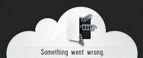
Crafting effective microcopy is about staying true to the website’s theme while delivering information. A 404 page could be funny, charismatic, detailed, or pragmatic and straightforward. The style of writing also defines how much should be written. Sometimes a little humor can alleviate the potential stress of an error message. When used in the right context it becomes a memorable experience for the user.
Another thing to remember is that context really does matter. When writing page copy it’s more about location, design, formatting, and really conveying the message. With microcopy you also want to get the message across but it’s more contextual. This means you could use almost any design style(within reason) as long as the text is relatable to the situation.
There’s also a reason this text is called “micro” copy. Yes the obvious answer is because the text is used in smaller areas of the page. But purposefully or ironically the text itself is typically microsized. Keep the word count low because users are more easily drawn towards quick snippets of text than large paragraphs.
It shouldn’t matter whether you’re a published novelist or if you barely understand the difference between “you’re” and “your”. Stay in the mindset of a new user and think of what message would be the most useful in certain contexts. This train of thought will help you detach from the design and focus more on usability.
Write for Common Sense
Something that may be common sense to the designer or developer of a website is not always common sense to the user. Microcopy is made up of phrases – a few words or a sentence which completely changes the tone of user interaction. Clarification only gets annoying when it’s done repeatedly copying the same advice over and over.
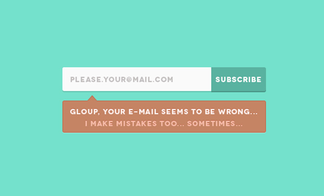
But clarifying a potentially confusing interface only reaps benefits. You might skim a related and useful microcopy article written by Joshua Porter which expands on a few ideas. The gist is to sleuth out problems with the experience that might cause users to hesitate or back out of the interaction. This could be with any type of webform from a signup page to a search field or profile update screen.
Microcopy always relates to decision making. It’s a volatile moment when someone is debating whether to checkout with their shopping cart or just leave the page and purchase another day. Great microcopy will help customers build confidence with each purchase and leave with a smile on their face. It’s about building UX confidence and offering clarity to some of the more daunting tasks.
Reducing Concerns
Users who are more confident about their choices will leave your site with a delicious taste in their mouth. In contradistinction users who are concerned or confused with their actions might leave with a more anxious, bitter taste. Can you guess which option is better?
The goal of microcopy is to streamline the user experience. This in turn builds confidence with each click or keystroke because the user’s concerns have been put to rest. Well-written microcopy will mitigate problems ranging from all areas of miscommunication. Remember to stay out of your head and get into the head of a typical visitor.

If you’re researching ideas try interacting with a few different websites. You might try signing up for an account then editing your new profile to look for any problematic areas. Interact with a website that behaves similarly to your own – look at what they do right and what they do wrong. Avoiding bad microcopy is easier said than done. But once you recognize great microcopy it all becomes much clearer.
Be efficient with your word choices and have a purpose for each phrase. You don’t need grammatically complete sentences for each piece of microcopy as long as you’re improving the user experience. We’re not writing a scientific dissertation on dark matter so there are no sacred grammatical rules when it comes to microcopy structure.
Are You Human?
We all love CAPTCHAs right? Well perhaps love isn’t the right word… more like tolerable. They’re tolerable because they provide a real solution to spam management. While there are other solutions beyond CAPTCHAs they aren’t as effective at stopping spam. However the problem with CAPTCHAs is that they’re not great at communicating with the user.
If someone can’t read the CAPTCHA text they just need to guess and hope for the best. When it comes back incorrect they’ll need to guess again in a vicious cycle to complete a form they might not even care about. Spam management techniques may not be up for debate, but for every other part of a form you should endeavor towards a more humane experience.

The best microcopy doesn’t sound like a computer-generated response. Quick little messages shouldn’t evoke frustration in the same vein of a PC load letter. Writing microcopy that relates to a user is as simple as treating them like humans. Write phrases and sentences that talk to the user as if they’re having a conversation with the interface.
While this style of writing is relatable to the user it also provides evidence that a real human took the time to write and build the website. In our age of technological attachment sometimes it feels like our lives are surrounded by machines. It’s easy to forget that real people with feelings and underwear drawers created all of these machine interfaces. Microcopy written from the perspective of a human being provides a more authentic connection to the interface and user experience.
Closing
Overall the practice of writing microcopy is more intuitive than analytical. Yes there is a need to analyze each situation to find problematic areas. But thinking about what to write is difficult if you only focus on logic and rule out emotions. I hope these ideas can provide a springboard for designers looking to craft less bewildering and more usable interfaces. Microcopy isn’t always given the appreciation it deserves but it still plays a big part in the creation of usable websites.


This is so awesome, thanks for the share! I really like your idea of the 404 page- its totally true, everyone can add a little humor and fun into what is suppose to be a boring page. It still will be useful and maybe give your audience a giggle. Again, great share. I will share with my team and copy writer.
All this information is very useful for a good UX on each website or application. We also promoted microcopy in our posts, for example https://designmodo.com/microcopy/ Functional microcopy is the first step because it will make you stand out, something not enough websites take advantage of. If your site is memorable, you win.