
Creating a brilliant website design can be a daunting task sometimes. Not just because of all the steps involved in this process, but also because of all things you should take into consideration and the direction your website design should take on.
And a good website, which accommodates effectively plenty of content with an excellent user experience is often a tricky balancing act to pull off. Should you attempt to present the user the whole information in a clean, organized manner, or you should reveal it bit-by-bit, to create an engaging trip that tugs the visitor on the road to the enlightenment?
If you get it wrong, and you will overwhelm your visitors, they’ll leave your website without retaining anything from what they’ve just read. And maybe they will not come back again, as long as their experience on your website was not exactly what they expected.
But if you get it right, you’ll gain a new audience, who not only understand your message, but they will come back again and again, and even bring few friends with them.
If there is one thing true about the website design, it’s that it is always evolving. The design is dynamic, and it must adjust to accommodate the form and the function. And because of its ever-changing nature, it can be a challenge not only to keep up with the newest design trends but also to follow few principles that should live in every website design.
- Color – the site’s color should always match your brand’s color scheme and have consistency through the site. Colors evoke emotions for your website visitors and sustain your brand messages. Therefore you should take it into consideration when choosing the colors for your website. Also, you keep in mind that the colors on your website should be easy to read and pleasant to the eyes.
- White Space – by using the white space for your website design, you will allow the content and the visitors’ eyes room to breathe
- Font – the site’s font doesn’t necessary match your logo but it should fit in your brand. Aside from this, making sure that the font is legible, is one of the most important things. You can vary and mix different fonts through the site, to increase the visual intrigue and add visual appeal, but make sure they complement each other well. Also, keeping the body font consistent across the whole site is essential.
- Simplicity – the simpler, the better. Keeping your website design simple allows that “clean” look your visitors are looking for.
- Consistency – keep the design consistent. The website colors, fonts, button styles, heading and subheading sizes and styles, image styles and sizes and backgrounds are among the pieces to keep your site consistent.
- Usability – make the functionality the key of your website. An appealing visual website shouldn’t sacrifice the ease of usage for a better visual. Creating user-friendly websites with easy to understand navigation and page layout is what determines how your visitors will interact with your website.
- Visual hierarchy – the relative importance of different content areas and elements can be visually implied in many ways, ranging from the typography (headlines, sub-headings, body text, quotes, etc.) to image size, style, and saturation, placement, etc.
We gathered 15 website designs for your inspiration. Some of them are new, some of them you’ve seen before. In all of them, you’ll see some of the best practices mentioned before. These sites are, in my humble opinion, well-designed for their clearness, usability, aesthetics and user experience and for sure, they will give you inspiration for the next project you’ll be working on.
-
Bienville Capital Management
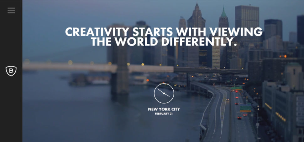
https://www.bienvillecapital.com
This is a very simple responsive design that transitions to mobile perfectly. They kept the information concise and focused, taking into consideration that you don’t need walls of text for attracting and engaging your visitors. Give them the most important information first. In the same time, the navigation menu is very friendly, letting you drive easily through the website.
-
Brooklyn Soap Company

One of my favorites in the list. The website design is clean and bold, using the white space very well and allowing the visitor’s eyes to rest. The company makes quality products and they don’t need to astonish with a lot of sparkly or complicated graphics and animation to get your interest. Both the website and soaps have an undeniable classy feel, underlined by the black and white color scheme.
-
Emblem


This website is entirely funky and funny. The visitor’s curiosity is caused by bright, vivid and sparkly colors, lots of eye-catching imagery, icons, and fonts you wouldn’t usually find in a law company’s website. In the same time, they offer a great user experience, especially with the services section. And guess what? It’s responsive!
-
Auger
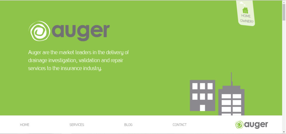
I like this mostly flat website, which is responsive and looks good on any device. The solid bold and contrasting colors, combined with vector images and the photos from this website seamlessly melt between devices.
-
Falve

This site is a carousel of color-rich full pages images, combined with a lot of white space and clean serif font. The general design is clean, bold and simple, and the overall feeling modern and undoubtedly classy. A site where you are welcomed from the homepage and which implores you to stay.
-
Brave People

Check out this website, and you will be rewarded with a brave experience! Simple, clean and bold design, color-rich photography are complemented nicely by the simplicity of the typography. The last, but not the least, the videos from this site tell you the story of this fast-growing digital creative agency in a way you can’t resist!
-
GC Watches

Take a look on this website, and you’ll convince yourself (if it was still necessary) that timeless designs always stand out! Clear copy next to bold and vivid images, in a white and black color scheme, pass the test of the time and become more valuable over the time. Besides, the website is responsive, and its usability gives a great user experience to the visitors.

Feed presents us an interesting concept, with a stunning execution that challenges our understanding of what could be possible on the internet. Using the contrast in the best way possible and blending creatively animation and video, the site provides the users a very engaging experience. A totally atypical site, which contains several unique usability elements, including a navigation that doubles as a scroll progress bar.
-
ETQ

ETQ takes a minimalistic approach to e-commerce with their clear and bold website, with big and compelling visuals for their products. Simple, flat, mixing the powerful and endless elegance of the white and black visuals with a color-based background, the imagery is accompanied by strong and simple typography that helps users to focus on what they want to see: shoes.
-
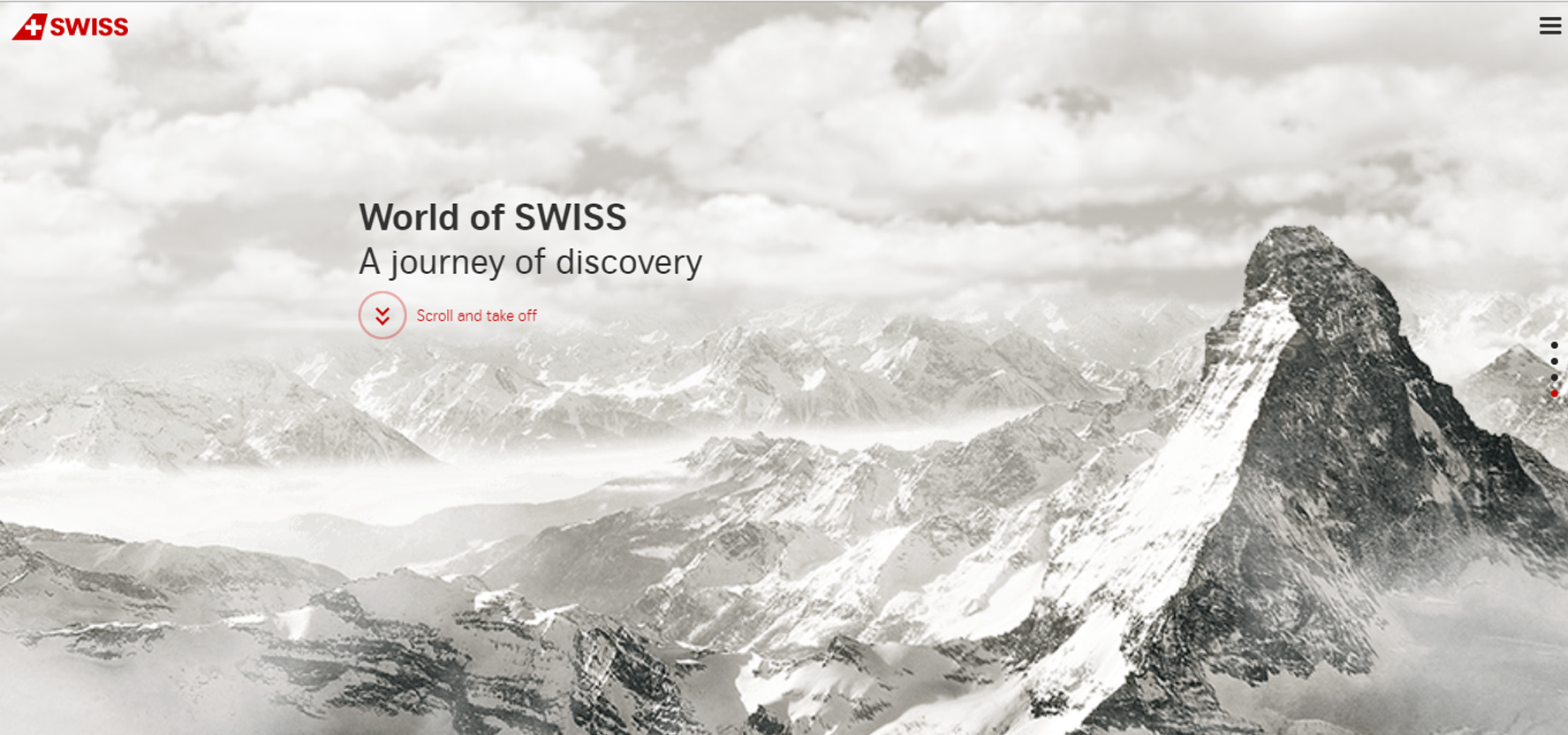
World of Swiss

Swiss Airlines built a thrilling website that tells their story and describes how it’s like to fly with them in a powerful and engaging way, by captivating their visitors from the first glance. The strong visuals and animation introduce the users to the different sections of the site, which are packed in an unusual sales and marketing pitch.
-
IWC Schaffhausen
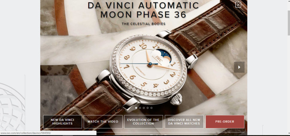
A timeless classic elegance, perfect for this premium brand. That’s what IWC Schaffhausen’s website offers to their visitors through a refreshingly clean and unexpected design for a watch manufacturer. A simple, clear and bold design, determined by the strong contrast between the neutral colors of the background and the rich-colors photography.
-
Jack Daniels

Once you pass the age verification, the Jack Daniels’ website offers you an incredible experience and tells a great story! A stunning design, rich in colors and contrasts. Once you open the “Our History” page, you are transposed in a world full of history and passion. And you experience the same feelings while you are greeted with a carousel featuring different varieties of whiskey.
-
Juliana Bicycles

https://www.julianabicycles.com/
If you prefer a photography-infused web design, you should take your inspiration from this site! It is a good inspiration for people who are both goods in photography and web design, as the photos are exquisite and manifest the magnificence in the simplest way possible. Also, like many other websites, this is a responsive one, which makes it good also for tablets and smart phones.
-
JOHO’s Bean
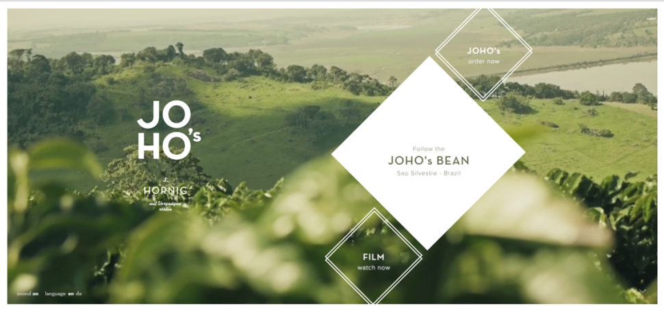
This website tells the story of a coffee bean’s journey in a compelling, emotional and engaging way. Storytelling, incredible imagery, animation, interactivity, visual design and sound engineering (which you find out from the very first moment you came up on the home page). These all come together and offer the users a unique experience.
-
Ogilvy One Worldwide

The simplicity of this website is amazing, the main focus being on the content and how it could be delivered in the simplest yet prettiest way. The flat design and the minimalistic approach present the content in a readable and logical way, while the very easy navigation makes it better. All these ensure that the content is properly delivered and understood by the user. The site is also responsive, and this makes it even more beautiful and friendly.
Bonus: Here are 8 names every graphic designer should know.


That Feed website is pretty cool and different!
Inspirig web designs indeed. I wasn’t overly impressed with the Brooklyn Soap website though.
These are really good designs. Thanks for sharing such good designs.