
With so many new brands, it is increasingly difficult to design a logo that draws attention and stands out from others. The trends are changing and if we do not want to fall behind, we have to update our logo. The problem is that it must be unique and not resemble any competitors.
Sometimes, the trends change so much that we are tempted to redesign our logo so that it doesn’t follow any of them, but you have to keep in mind that the important thing is that your brand becomes recognizable. Therefore, your brand logo should remain timeless.
It is very important, in addition to knowing the trends, to check how your logo can be adapted to said trends. If you already have it, you must remember that you can not lose the essence of your brand. If you’re ready for a redesign, try to take the following trends into account.
1. The serif works
We have always talked about “less is more” and that logos do not have to be complicated to work. But this does not mean that you have to leave serif typefaces aside, but rather the opposite. The serif works, and in some cases, it fits perfectly. We just have to take some details into account.
The structure sometimes prints too much personality and can get to obstruct “the message”, so it can be a good idea to choose a serif in which the structure is a smaller size.
There are many sans serif fonts, so if you decide on a serif you will be giving a point of difference and distinction to your brand.
2. Logos with great details
Minimalism is and most likely always be a big trend, but it seems that this trend may begin to step aside to make way for one in which the logos become more complex.
We are talking about logos that include different lines and colors. Small elements that unite everything. This has to be perfectly thought out and designed since, in the end, we have more of a work of art than a logo.
Clearly, because of their complexity, they are not suitable for all brands. But for the ones they pair well with, they work wonders.
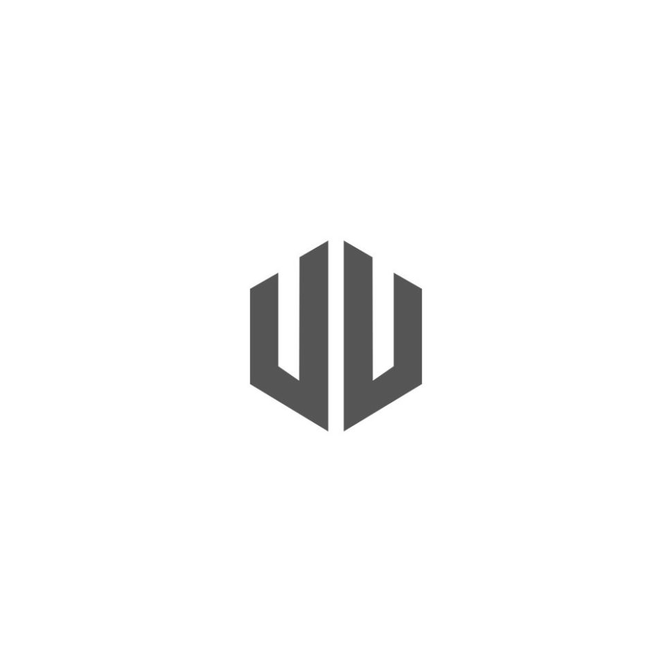
3. Overlapping elements
When you overlap the elements, it gives this sort of 3-D effect. This effect provides a dimension where there normally isn’t any. It takes the user out of their normal, boring, 2-D scape, and places them in a fresh, eye-catching one.
4. Lowercase typography
A few years ago the use of capital letters was almost mandatory in the design of logos. This year, we will see the opposite, logos that are designed only with lowercase letters. Until now, it hasn’t really been done, so designing with lowercase letters will make your logo more original and creative.
Of course, the choice of typography is very important here, too. You need one with strength and elegance and that provides a contrast between typography and background to make sure that it is read correctly.
5. Initials
Initials are fashionable. At a time when we try to economize in written language, this trend goes well with logos. You can take the initials of anything; three or four characters and with them, you can develop the logo.
This option is more popular among professionals whose brand is themselves and use their initials to make themselves known, but it is not just for them.
6. Shapes and simple lines
Although we say that t complex and different lines and shapes in a logo is a trend, the logos in which the simple lines are responsible for designing it are still fashionable.
In the end, many logos could benefit from a simpler design. Certainly, in most cases, simple shapes and lines would help draw the attention towards the content that really matters. But, not all logos call for simple shapes and lines. It’s all about finding out what works best with your name, and your brand’s icons.
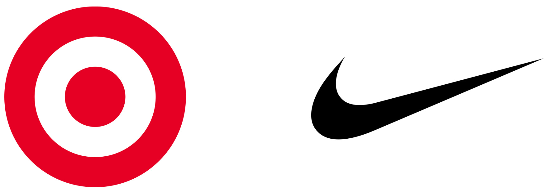
7. Circles
True, circles are considered a simple shape, as we discussed above, but they deserve their own slot. Circles aren’t any new trend. In fact, they’ve been a huge trend as far as logos go for many years. Even if the logo itself isn’t a circle, the sign the logo is on is.

Circles, whether we realize it or not, represent fulfillment and movement. The completely rounded shape shows no end and signifies moving forward.
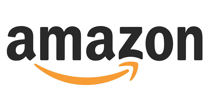
8. Logotypes of one color
You already know that you have to be very careful in the color combinations and that normally when we design, we should not do it with more than three colors, so it is not surprising that one of the trends is the use of one color.
This has an additional benefit. Ideally, your brand will be recognized with that one color. That being said, you have to pick your color wisely. If your brand gets associated with that single color, you’re stuck with it for life.
The conclusion
As with any trend, these logo trends in 2019 won’t last forever. Sure, some of them will stick around, and these are only a few of the many that will show up, but that doesn’t mean that they aren’t worth exploring. If you’re in need a logo redesign, try giving a few of these trends a shot, and see where it takes your brand.


Leave a Reply