
Each year, trends change. That statement doesn’t change, no matter what industry you’re in. For designers, this statement is extra important because design trends of any kind are what draw the people in. So, whether you’re working on your personal website or the website of a client, it’s important to know what these trends are.
When you have a new project, it is a pretty normal practice to look at the trends of that year and use them to your advantage. Other times, you may be working on an old project to which you want to give a facelift and you use a typographic change for that purpose. Sometimes just changing the typography of a header or a title, we give whatever you’re working on a completely fresh look.
We’ve preached it before that you don’t want to just blindly follow trends. While following a trend will almost certainly work, for the time being, they don’t always stand the test of time. Another great reason why you should always keep up with current design trends.
For this article, we’re going to be getting specific and looking at 8 typography trends to start 2019 off right:
1. Decreased text size
You probably won’t need a magnifying glass to read the text, but decreasing the size of text has actually become pretty popular this year. Of course, titles will continue to be larger – we have to rank decently after all. But, it’s because of the necessity to have larger headers and titles that small text has become more popular.
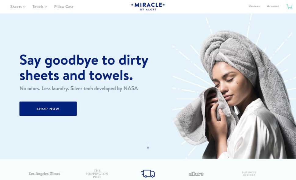
The most important thing to remember in this case, as well as any typography related trend, is to keep it readable. You have to constantly remind yourself that it’s not all about how it looks aesthetically, but how useable it is, as well. You also want to control your spacing very well. The smaller the text, the bigger the spacing needs to be in order to avoid it all looking like one word.
You might have already guessed why this is such a trend, but we’ll mention it anyway. To put it simply, mobile browsing is on the rise, and so is any trend that can make that experience better. Therefore, smaller devices require smaller texts.
2. The return of serifs
Typically speaking, serif texts stay with printed projects and don’t venture too far out of that realm. This year, we’re starting to see more and more serif style typography great us on web pages.
All that being said, there is lots of typography out there to choose from. Just because it’s a trend doesn’t mean it’s the perfect fit. Play around with different styles until you find the one that sets your project off.
3. Animated fonts
Animation has become a design trend in general, and it’s not just limited to one specific area. Animated fonts have become an easy way to stand out and get the attention of viewers, while also providing insane interaction possibilities between user and interface.
You can choose characters that dance, disappear, or simply move. But be careful! We all have to use the animations in moderation and understand where and how the user will access that animation.
It is a complicated task, so it must be fully thought out and reasoned. You also have to pay extremely close attention to the loading time of the overall website.
4. Cuts and overlays
Cuts and overlays are very useful especially if you opted for large typefaces. You can make cuts on layers so that hidden messages come to the surface.
It’s a nice way to superimpose images and text and get them to become one. You must monitor the sizes and thicknesses of them because too many layers and cuts can result in a message that is unreadable.
If you go too crazy with the cuts, thickness, and layers, two images might soon merge into one. While your intentions might be good, and the design in your head even better, it doesn’t always mean that it will work out exactly as you planned. Basically, you just want to keep a close eye on this particular trend if you choose to implement it yourself.

5. Block design
A block-like design in typography hasn’t always been a trend, but it’s most certainly nothing new. There’s something aesthetically pleasing about seeing letters line up perfectly in shape and size.
Not to mention, this sort of block-like design can pay compliments to any brand that’s trying to portray organization. Of course, not all brands need to be as in-line and uniform, but it’s certainly something to consider for a few of you out there.
6. Typography with color and gradients
This isn’t the first time we’ve talked about color gradients, and it probably won’t be the last. It seems like each year, there are new ways to implement gradients, and it always seems to end up as a trend.
It’s all for pretty good reason, though. No longer are we limited to plain black, white, and the occasional neutral grey. We have had options and variety. Variety makes us as designers happy, so why wouldn’t it make our viewers happy, too.
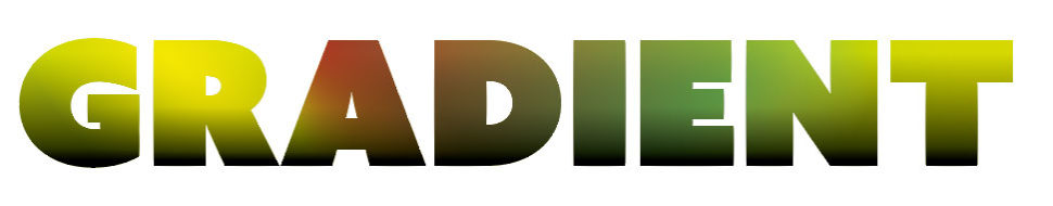
Color gradients can get a bit tricky if you’re inexperienced, but they’re not hard to master. Just make sure you don’t have any clashing colors, and each color fits the theme of your brand, and you will come out on top.
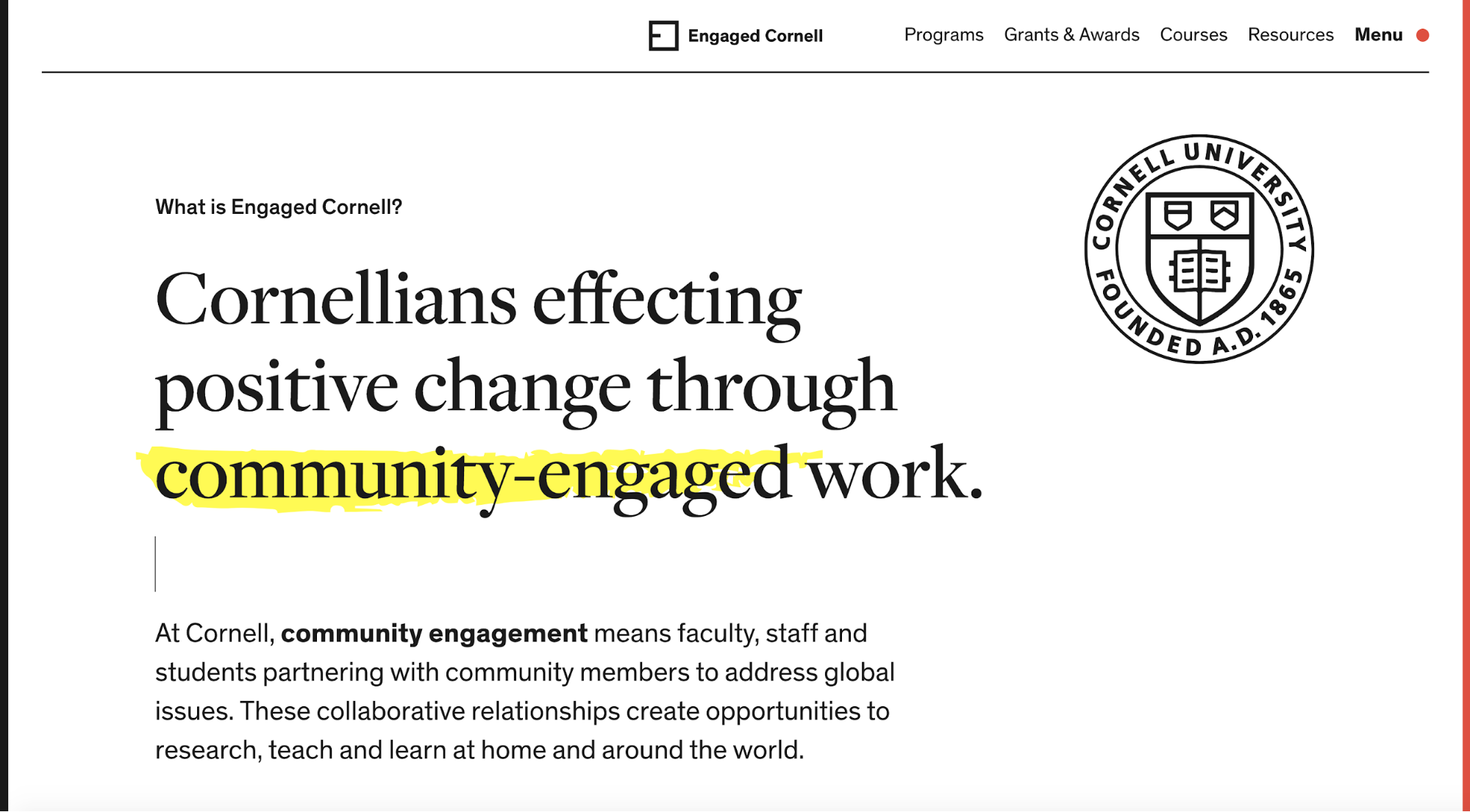
7. Highlights fonts
Highlighting fonts has been a trend for at least a few years now. It’s not something you see very often, but it’s always a warm welcome when you do.
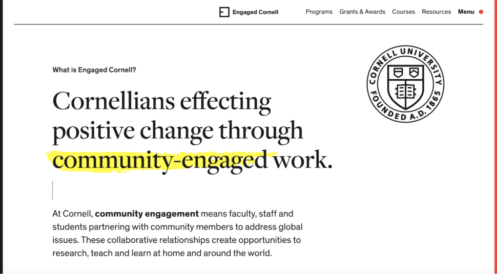
Highlighting certain text helps break up the uniform look of the typical web page, all while literally highlighting the text that we want people to notice most. It’s such a simple technique, but it’s proven to be effective time and time again.
8. Personalized fonts
Everyone likes a little custom touch. With design, there really aren’t any rules. Sure, you can set a trend, and people can follow those trends, but it’s your own style that sets you apart from the rest.
With that said, we’ll end it on this one. Customized typography might prove to be a little pricey. It will certainly be more pricey than a premade font, but it can be equally as rewarding as it is expensive.
The golden rule behind this trend and any other is to make sure it fits well with your brand. It could be the most popular trend in the world, but if it doesn’t compliment your brand and what you stand for, then it should be avoided at all costs.


Leave a Reply