
Composition and balance are two major properties of great design work. Contrast often accompanies these two visual properties where the designer creates certain areas that draw more attention than others.
Crisp contrasting areas should be used sparingly but appropriately. I’d like to cover a few uses of contrast in relation to web design and how this can affect the overall layout design style.
It takes years of practice to reach a level of competency that best suits your vision. But the more you practice the better you’ll get and the quicker you’ll recognize problems in a design. When using contrast seek a visual balance to create some areas that require more attention that others.
The Merits of Contrast
When the word “contrast” appears in design talk most people think of black & white. These two colors provide heavy contrast no matter if they’re used for buttons or typography.
But contrast can be much more than just color. It can be shapes, sizes, and placements of elements on the page. A larger button draws more attention when placed alongside regular hyperlinks. Color does play a role but other visual cues will add greater levels of contrast.
The largest merit of contrast relates to user attention. Some elements should bring more attention while others may need significantly less attention. It’s crucial to use this effect sparingly or you’ll end up with a chaotic & confusing layout.
Also when contrast is used sparingly you tend to make a bigger statement. If only one button on the page is oversized compared to other elements then it really stands out.

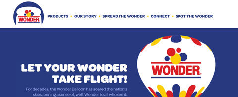
Let’s take an example from the homepage of Wonder Bread. It relies on the traditional brand colors of purple and yellow which create a natural sense of contrast.
Designers may compare dark purple to black and light yellow to white – they both create a very similar effect.
Each element in the homepage serves a purpose in relation to the user. Notice the first 2 block areas use colorful backgrounds to draw attention as needed. Graphics add to this effect but the captivation primarily occurs from colors and relationships.
Natural White Space
So far I’ve explained contrast based on properties of the element, such as designing an oversized button or giving it a brighter background color.
However contrast may also be manipulated based on the white space surrounding an element. Natural white space makes the page feel roomy and easy to browse. The homepage design of Treehouse does an excellent job maintaining consistent white space among elements on the page.

Color & size do play a role but there’s a lot to be said about the space between different areas.
Space between blocks of text allows for easier reading. Space between links for each learning track gives equal significance to each choice.
Think carefully about what message you want to convey and how that can best be accomplished. Different CSS styles are great but consistent white space can also prove useful.

Another example is the Envy homepage with a slight focus on block-level elements. Areas of the page almost fall into a grid of content styles that relate solely to the Envy branding.
Colors are very minimalist and typography is used to draw attention. The grid design style is increasingly popular amongst designers who want to stay simple but also offer consistency within a layout.
Blocked Page Sections
Small grids provide excellent contrast but so do large fullscreen page sections. Many parallax layouts use these sections to define individual areas of content.
A homepage can do just as well with this type of design if it’s built correctly. Stripe Connect has a lengthy landing page with a lot of information. It uses horizontal block elements to space out content and create visual divides while scrolling.

Colors and patterns are used in the background to differentiate each section. But you’ll notice a consistent theme of typography and iconography maintained throughout the entire page.
The background contrast alone is enough to get the message across.
A very similar technique has been used on the dConstruct 2015 conference website.

This layout style follows more of a 1950’s futuristic Jetsons-esque design. Textures and vector graphics are used throughout the page with each section broken up through background colors.
Conspicuity Drives Action
To be conspicuous is to “stand out so as to be clearly visible”. This is a great way to draw attention & drive user interaction towards certain areas of the page, and the secret is contrast.

Take a look at the Adobe Illustrator landing page specifically in the top-right corner. It uses a very brief navigation with only a few links covering important info about the program.
You’ll notice the “buy now” button has a light blue background which isn’t found on any other link. This is meant to draw attention and get people to recognize Adobe’s most preferred action: purchasing their software. If you scroll down towards the footer you’ll find a couple other blue buttons with similar styles that also bring visitors to the purchase page.
Alternatively there are sites that don’t sell anything but still wish to drive interaction. These are often networks or communities that want to bring in more users.

On the homepage of Delicious everything follows the brand colors of white, black, and blue. However the sign-up button is colored orange and happens to be the only orange element on the homepage.
Orange naturally stands out against cooler colors and offers a contrasting effect that works exactly as designed.
Contrasted Typography
Don’t forget that text is still the most common method of transferring information on a website. Contrast should be used for different styles of text ranging from bulleted lists, headers, and of course block paragraphs.
Differences in size and color should be used if you need to build high levels of contrast. Take a look at the articles published on A List Apart to see what I mean.
Readability can improve when typography is made to contrast against the background & against other blocks of text. But you need to remember what you’re designing and how visitors should be reading.
The homepage of Chick’s Fry House is just a large menu designed in HTML/CSS. Amazingly the page actually renders and looks just like you’d expect with a traditional print menu.

Hopefully you’re starting to understand the value of contrast at every level – from backgrounds to blocks of text, everything plays a role. The smaller items make up the big picture so when designing any website pay attention to everything from all perspectives.
Balancing your Layouts
There is no ultimate key or secret to perfect layout contrast. Professional designers learn these skills through trial-and-error which is your best approach as well.
Learn how to balance layouts by studying live examples and mastering the techniques. Then you can apply this knowledge to projects and over time these techniques will all roll together into one amalgamation of ideas known as UI design.


Leave a Reply