

General Mills is a major manufacturer of breakfast(and other) foods in the US with a rather interesting website design. It feels modern and distinguished yet simple and usable at the same time.
There’s a lot to learn from such a site and I want to break down a some common features in this post. General Mills is a fairly large company with a lot of employees and products. Most of the time these websites are horrific but I’m happy to say that General Mills’ website is clean, timely, and best of all responsive!
Dynamic Content Slider
One of the first things you’ll notice is the large content slider. This uses photos for background content along with text blocks to share info about General Mills.
Content sliders play a huge role in modern web design because they convey information quickly and efficiently. Everything in the slider is animated and connected to the small navigation panel on the right-hand side.

Each text box links out to a page on the site explaining more about General Mills and what they do. This first struck me as odd but after a few seconds I recognized the design as classy and rather well-suited to the layout.
Plus the compositional choices for this slider are phenomenal.

Great color scheme, excellent photo quality, and text that’s large enough to read without overtaking the whole page. And did I mention it’s responsive?
Trim Navigation Menu
Try hovering over any of the navigation links and you’ll be presented with an exceptional dropdown menu. Not too complex, not too flashy. It all seems to work and blends perfectly with the General Mills branding.
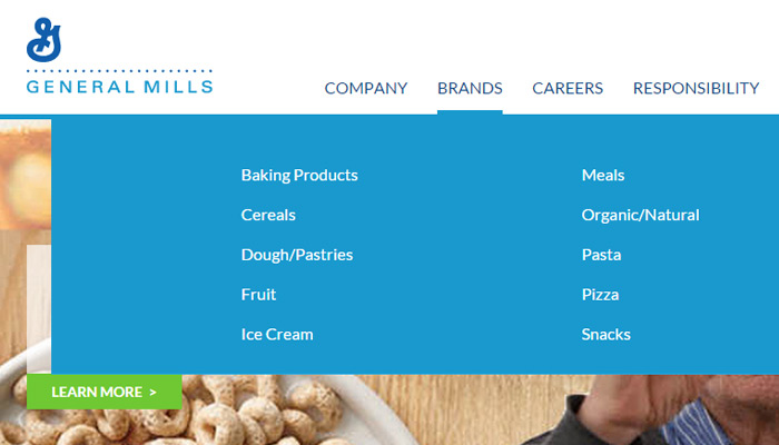
Typographic design styles are noticeable right away since they match with everything else in the site. Navigation links are large enough and resize appropriately when the screen size is reduced.
White space is also utilized between elements in the dropdown menu. Larger screens have a much easier time accessing these links since they take up so much space. It all feels very corporate, but not in a stuffy way.

If the site is viewed on a very small screen the navigation turns into a toggleable sliding menu. This includes all the same links and behaves much in the same manner.
Focus on News & Videos
Beyond the header are some areas of content for showcasing General Mills’ latest updates. Some are blog posts, others are videos, but they’re all useful tidbits of news for customers and clients alike.
Most links are hosted internally with some videos embedded from YouTube. General Mills does an excellent job of blending content together so it all feels natural in the same layout.

It’s worth noting that many news articles lead out to larger publications discussing the latest buzz about General Mills’ products. All of these news posts connect together with corporate headlines & an updated ticker from the NY Stock Exchange.
Big Blue Branding
Every company relies on its logo & identity to bring attention. General Mills uses this to its advantage by incorporating its big blue logomark in a few places.
First you’ll notice their logo positioned atop the header bar. It’s not meant to be overly flamboyant since the only goal is to let people know what website they’re visiting. While scrolling the navbar stays fixed and the logo updates to a more minimalist style.

But as you move lower into the footer you’ll see the large mark embedded into the dark blue color scheme. It looks exquisite and seamlessly blends with the flat blue tones.

Every large brand should rely on these branded features without too much restraint. Visitors like design aesthetics because they don’t get in the way of content yet they still deliver a purpose of recognition to any website layout.
Wrap-Up
While it’s doubtful you’ll be creating a food conglomerate’s website in the near future, there’s a lot to take away from General Mills’ design strategy. Simplicity wins in the end since the goal is to deliver a quality interaction with the inclusion of minor yet eminent design aesthetics.


Amazing