This article is the third in a series devoted to the understanding of minimalism in web design. During the time, this trend has become very popular among the graphic designers and it will still be on top for the years that will come, regardless the influences it will have.
You might assume minimalism is easy – after all, fewer elements mean less work, right? In fact, the opposite is more accurate. Because you are restricted to a usage of few elements, they must be chosen and used with care and thoroughness, having a specific purpose as a starting point. If it’s done properly, minimalist design can be a stunning masterpiece, in terms of UI, visual design, UX and conveying your message to the users.
It may seem ironic, but in the context of web design, simplicity is a little more complex to define. It’s not just the site looks like; it’s about the user’s overall experience while interacting with the site. From this perspective, minimal design is not made by mistake. It is intentional. It is an approach that strips the unnecessary elements from a framework to leave only what is required. Most minimalist websites will not include a lot of colors, textures, shapes or accents. They are defined by fearless usage of negative space in neutral colors, dramatic typography, large and vivid photography, very simple navigation tools and visual balance.
Minimalism works because it does what all design should do – it puts the emphasis on content.
The advantages of minimalism in web design and the reasons for its popularity include:
- It’s a natural fit with responsive design frameworks;
- It reduces the information for browsers to process, causing faster site load times and better site performance; this leads to a better usability and user experience;
- It needs less CSS and Html rules and elements;
- The concept is content-driven, which coincides impeccably with the growth of content-first design processes and trends;
- It is suitable for a variety of businesses, from architecture, interior design, fashion, photography, creative studios, to e-commerce, web app development, furniture, HoReCa and so on.
Using the minimalist concept in web design represents modern design. By only focusing on the content and branding, the web design will reflect its main goal and mission without any other distracting elements.
Below are listed some websites from different industries, which use minimalist design concept for conveying their message and provide a great UX:
Minimalism in photography portfolios
Running a photography business is not common. Beyond stunning photos, it requires much creativity and refinement when it comes to communication with the potential customers. If you want to learn more about running a photography business, you may find more information in Braveen Kumar’s article (link to www.shopify.com/blog/how-to-sell-photos-online)
In terms of web design, minimalism is the preferred choice for the photographers who want to let their work speaking for itself. The style gives an air of elegance and sophistication that lends itself to this industry.
Christine Szczupak Photography

The stylized arrows and subtle drop-shadow are important details that increase the visual appeal of this website.
Ryan Willms
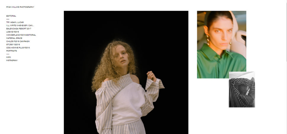
The spacing and arrangement of content here, along with the elegant typography and simple lines, give the feeling of a fresh design.
Caitlin Worthington Photography

The white background is the perfect canvas for the large and vivid photographs that are perfectly balanced by the typography. A classic example of minimalist design.
Jonathan Glynn Smith

A dramatic splash screen and beautifully minimalist design.
Bruce Percy

A very simple design that leaves the viewer no doubt what he’s seeing. A quick glance is enough to see what the photographer does. Navigation is again clear and simple. The black background works well with the minimalist design.
Minimalism in the creative industry
Exponent PR

To highlight their video montage (and photos as you scroll), Exponent’s site features simple colors and fonts that make everything pop.
Bark PR

Like Exponent PR, the previous PR company on our list, you’ll see flat UI and bold colors. But in Bark PR’s case, the yellow is much more than a simple accent.
Oh My! Digital Design Studio

Oh My! uses a large white background for some high-contrast effect and a very simple navigation to provide a great UX.
AuthenitDesigns
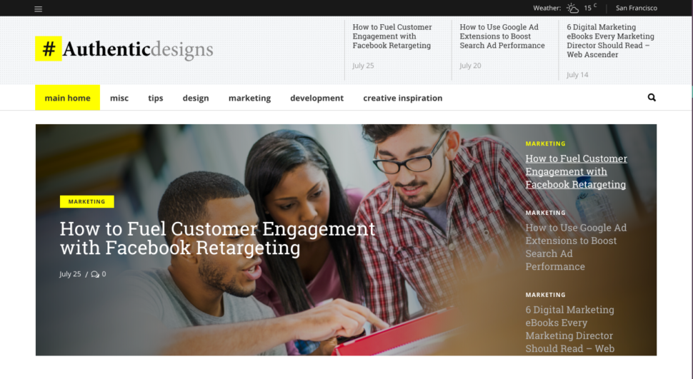
AuthenticDesigns is a design blog that uses simplicity and minimalism to make images stand out and make content easier to read.
Brave Little Tank

Like Oh My!, Brave Little Tank also uses a large white background for getting a high-contrast effect with the website content. The accents of colors are given by pictures and the green color of highlighted text. The navigation is simple, letting the users dive in quick and easy through the whole site. With its website, Brave Little Tank has created a simple, impactful solution (what they also have promised to their clients).
Brian Danaher

Another website that opts for a single column and bold typography. If you take a closer look, you will notice the classic mix for the minimalist concept: a lot of negative space, large and vivid photos, typography that perfectly balances the images.
Callens

Minimalism is the preferred choice for fashion websites and those selling luxury items, like Italian brand Callens. This design concept gives an air of elegance and sophistication that lends itself to certain industries.
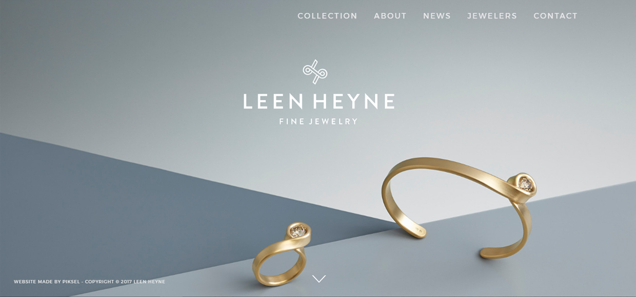
Leen Heyne
Besides its jewelry, Leen Heyne‘s monochrome logo and company name are the only significant visual elements on its homepage. The surrounding expanse of gray space and white texts make it a safe bet, the user’s eyes going back and forth between the two core visual elements.
Bulgari

Italian luxury goods brand Bulgari is another company that uses creative techniques to keep its site interesting within its minimal framework. Side-to-side scrolling combines with an ingenious page-turning animation and high-quality photos.
Yield

Lots of space, soft pastels, middle to dark gray colors for text, large photos and keeping buttons to a minimum make Yield’s site delicate and easy to navigate.
Conspiracy

Conspiracy’s homepage bundles necessary buttons on top then puts the product on a clean canvas.
NTN

This site is traditionally minimal. Design brand NTN uses the abundant white space, personality-infused typography, and a reduced number of elements that the minimalist style is known for.
Minimalism in website and app development
Squarespace

This screenshot from website-building service Squarespace illustrates the idea of one focal point per screen. The site explains everything it needs in screen-by-screen images, and groups together relevant blurbs on the same screen.
Scytale

Scytale is another defining website for the concept of minimalism in web design. They use very large white and light gray background and big and bold typography, helping the user to focus on the main message. The red color used for some flat design and typography are the only color accents used here.
Thrive
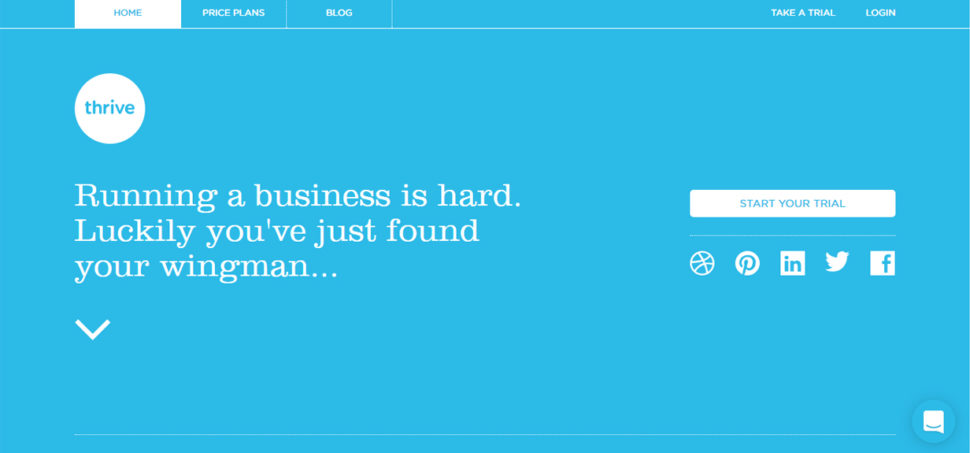
Simple design on a subtle grid. Garnished with flat design and simple bright blue color via scrolling. A fun, clean, good interaction!
iPad mini 4

Apple is no stranger to minimalism. The web page for the iPad mini 4 uses lots of literal white space to draw attention to the product’s sleek design. The clear top bar, also featuring an abundance of space, helps the user to navigate.
Château d’Yquem
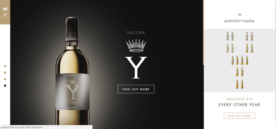
Winemaker Château d’Yquem combines minimalism and subdivision in its site. Each section follows the minimalist philosophy with only a few elements revolving around a single concept. When combined, the sections’ size and location on screen create a visual hierarchy.
Maemo

The website for double-Michelin-starred Norwegian restaurant Maaemo uses minimalism to create a sense of class. The visual treatment is perfect for storytelling, as the site demonstrates with HD photos used for each page.
Bottom line
We know you have a lot of information to offer to your visitors and you’d like to feature all of them on your website, but you should keep in mind that will also throw your visitors into an information overload.
Before anything else, make sure your website features only the most important information and link the additional stuff. And don’t worry, if people are interested in learning more about your company, they will look for links or they will contact you.
Most of all, make sure your brand and your target audience fit the concept of minimalism before going for this website design concept. Because unfitting use of colors, typography, and visuals will not bring the same results for your business.
Even if it’s not suitable for all business websites, minimalist design style comes with plenty of great advantages that make it more effective than any other design style in the web design industry.



Hmmm. I suppose it’s disingenuous of me to comment that your page on minimalist design is a nightmare of different elements … and that the page jumps around like a prawn on a griddle whilst all the ghastly ads load.