
Nowadays, when target audiences formulate their own opinions related to a specific brand or a company, a website is a focal point of exposure for all organizations. With so many website styles and trends to choose from, knowing which layout will be the most effective could be an overwhelming and daunting task.
Minimalism is one of those lasting design concepts that are always on top, no matter how trends come and go. Within the span of the last few years, it has become increasingly popular not just thanks to the many websites showcasing this basic philosophy, but also because of the growing use of mobile devices.
In the same time, just because minimalist web design principles and rules sound simple, that doesn’t mean they actually are. Despite the fact there are not so many elements in a minimalist website, you still have to provide the same amount of usability (or even better) with less interface.
If in the first article about minimalism in web design we displayed the main reasons for which it is loved by both designers and customers and has become such a popular trend, in this piece we’ll review the best practices for using it effectively.
In order to balance the aesthetics and functionality, minimalist web designs are defined by few core elements:
- overall focus on content
- fearless usage of space
- stunning visuals
- simple navigation style
HOW TO ACHIEVE MINIMALISM?
The easiest way to answer this question is the following: the best way to achieve minimalism is by reducing your design only to the elements that are absolutely essential for it. We can find various minimalistic expressions in many industries and art forms. Still, in terms of web design, minimalism could be something very hard to accomplish.
At the same time, it’s very easy for anyone to master and use properly this concept. All you need to do is to learn how to break things down and take them away until there is nothing left to eliminate. All these, while not disturbing the design’s overall purpose and functionality in any way. We call these techniques the pillar of minimalism – and it’s no surprise that minimalism has become so popular in the last years. It makes the most complex things simple, being directly related to many of the latest web design trends. You will recognize many of them here, although we have already written about modern website design trends.
HOW DO YOU BEGIN THE DESIGN PROCESS OF A MINIMALIST WEBSITE?
The first step is to define very clearly your website’s general purpose, in order to avoid any unintended confusion. In other words, you should determine exactly few aspects, such as: What your website will be used for the most?; Do you want to open an online store? Do you want a portfolio website? Do you also want to add a blog? Who is your target audience?; What is the message you want to convey? And so on.
No matter what your intention is, the purpose of this website must be very clearly defined. This is the ground base for any website, but especially for the minimalist one.
Always remember: “Less is more”. At some point in your lifetime, you’ve certainly heard the phrase “Less is more”. It may mean many things and is applicable to many industries, but it is absolutely essential when it comes to web design. Especially now, when responsive design is one of the most important trends.
As I mentioned before, the best way to accomplish this is to use just elements that are absolutely necessary to your overall design concept and the message you want to convey to your users.
Fearless usage of negative space
Fearless usage of space is a positive thing. Space is the first element that people associate with minimalist design. Mainly, the negative space… a lot of it.

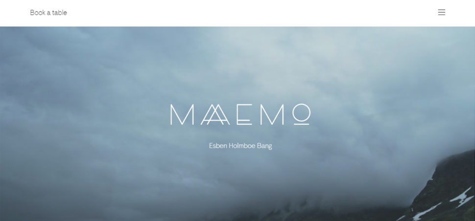
Anyway, minimalist design is not just about using the negative space in neutral colors. This style also encourages the use of any full-color space in order to attract the user’s attention. Even if the white, black, gray or very dark backgrounds are the most popular, some designers also explore and use the negative space through colorful backgrounds.
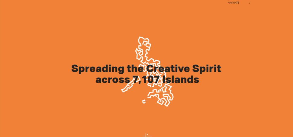
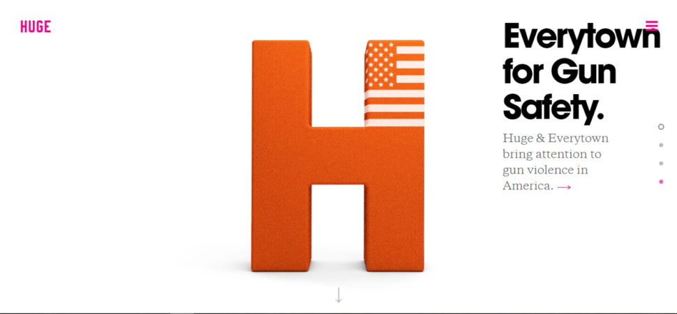
For example, Design Co.Mission (link to http://plus63.org) uses a bright orange background along with simple navigation and other minimalist elements to delight and attract the users.
As you see in the examples listed above, the negative space also helps to organize the space better, manipulate the visual flow and gives a sense of luxury. As a rule, as more negative space is used around an element, the more attention will draw to it. This, combined with strong visual elements, is one of the most powerful tools that define minimalism.
Stunning Visuals
Stunning visuals represent some of the most powerful tools used in minimalist web, being defined by a few elements:
- visual harmony
- beautiful contrast
- big, bold and vivid photography
- effective typography
Visual Harmony is a solid backbone of any minimal design framework. The key components of any efficient visual organization include a solid grid, visual balance and a close attention paid to alignment.
A strong grid – built using a large negative space – lets you place and arrange all the visual elements in a way that conveys the best your message and also sets the purpose of the website. I’ve seen many websites aligning the content in the center of the layout and I think it’s important to remind you this is not the only solution. The visual elements included in a minimalist design can be aligned anywhere in the layout (center, right or left), as long as they keep the balance and form a unified design.

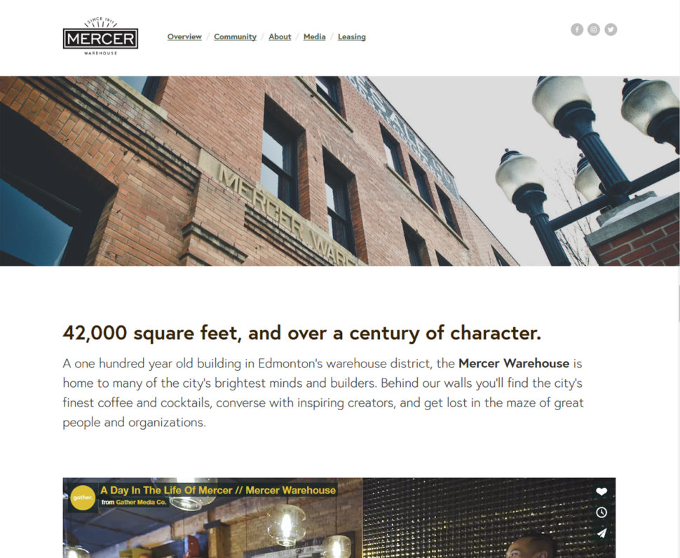
For example, Arko and Mercer Warehouse make a very good job mixing and matching different alignment styles and a very large white space, for getting visual interest and balance.
When it comes to minimalist website design, most of the designers use just visuals having the same size, centered and aligned symmetrically. But you will create the same visual effect if you use elements of different sizes that perfectly balance each other.


Big, Bold and Vivid Photography
For some designers, minimalist style could seem pretty distant. In order to avoid this and have a comfortable feeling of familiarity without dominating the foreground, you can use oversized and vivid photos, both for the homepage and the inside pages. When selecting the photos, you should choose high-resolution pictures that have ample negative space.
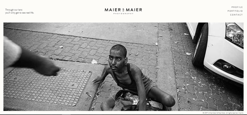
Minimalistic layouts are the best visual solutions for photographers who want to build a clean and modern portfolio, letting the photos to speak for themselves. (www.shopify.com/blog/how-to-sell-photos-online#DisqusComments – here you find more information related to transforming your passion into a profitable business).
Beautiful contrast
Using contrast will bring attention to certain design elements and will help create a recognizable visual hierarchy. Because they are a perfect canvas for contrast, white, black and dark backgrounds are very popular choices among minimalist graphic designers. Using contrasting typography and pictures is a distinctive sign of this style.


Effective Typography
Designing a clean and simple website that includes just very few images is not so difficult; but creating an effective one, that looks good and grabs the attention, could be a challenge. Because typography brings immediate focus on the words and content while crafting a much more intriguing and interesting visual, it is even more critical in a minimalist design.

Therefore, beautiful, sharp and even custom typography is a perfect focal point in a minimal framework. For getting a more impressive visual, you could include in your design bold typography styles (with thick strokes) and interesting letterforms (such as a dominant typeface for headlines paired with a neutral typeface for other content).

Simple Navigation
As a drop down menu would be considered too complex for a minimal design, it must be paired with the simplest navigation tools. In order to simplify your UI design, you may use a simple horizontal top-level menu and no right sidebar or centered menus. Also, the hidden menu works very well for minimalist designs, the hamburger menu being very popular among the website designers.
Before deciding which navigation menu makes sense, remember you should always know your users and the context. You shouldn’t use one or other navigation tool just because it looks trendy, but because it integrates perfectly in your design and gives the best UX to your users.

The Art of Taking Away
Minimalism is obviously defined by the lack of anything that isn’t necessary. In other words, don’t include needless elements in your design. You should think what’s absolutely necessary to the content and function of your website. Focus just on those things and take away anything that doesn’t contribute directly either to content or function. This way, what’s left has more impact on your users.
Bottom line
To conclude, minimalist design is all about creativity and the use of all those elements that have blended in well enough not to make the design busy, but rather minimal and modern. It requires a sharp eye and expertise, and if it is handled properly, you will have a stunning content-focused website.


Leave a Reply