If you’ve lived outside of the US, then you’ve probably heard of or even used OLX at least once in your lifetime.
OLX is a pretty big deal.
OLX is a platform where you can buy and sell anything; services and goods alike.
You want to get rid of that old scarf hanging in the back of your closet? Awesome. Snap a pic and post it to OLX and wait for someone to buy it off of you.
Looking for a job or want to hire someone? Post about it.
OLX was established back in 2006 in Amsterdam but has since spread worldwide.
This buy-and-sell platform is now in 45 different countries and I personally browse through it every. single. day.
Their logo has always been a little different though, and their new one is no exception.
Today we’re talking about OLX’s new logo and app design.
Before…
After…
This is the first time that OLX has ever changed their logo, and if I’m completely honest, when I first saw it, I wasn’t sure how I felt about it.
The first logo was very colorful, and although the colors weren’t necessarily bad, they did make you wonder “why”.
This new logo has a very interesting font. The “L” could easily be mistaken for a bar and be read as “O|X”.
OLX did take a step into the right direction, though.
It is much more modern and it is unique.
Even though there is no symmetry whatsoever in the logo, I can’t say that I hate it.
I actually really like it.
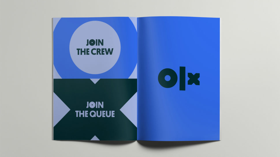
It has a very strong presence, and although the “L” is very thick and the “x” seems too small, I like it.
The fact that each letter is unique is a great representation of how everyone has different needs and that this app has been accommodated to fit the needs of every buyer.

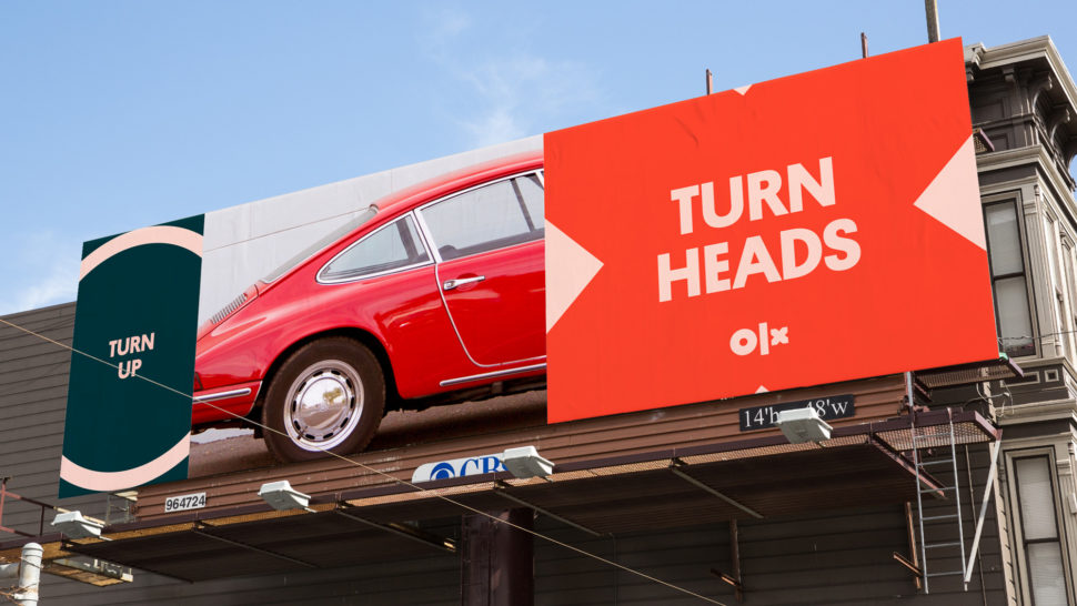

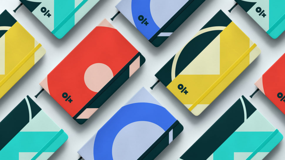
Overall, even though this new transformation may be a little bit all over the place and the ads don’t really explain what OLX actually stands for, it definitely was a step in the right direction.
The app was in need of some modernisation and that’s what they gave it.
With a few tweaks here and there, it could be the perfect fit for them.
What do you make of their new logo and platform?
Let us know in the comments.
Until next time,
Stay creative, folks!


Leave a Reply