Although the company that we’ve grown to know and love, Tesla, hasn’t been around for long, the name certainly has. The famous car brand was named after the genius electrical engineer, Nikola Tesla, who invented alternating electrical current. As he worked alongside Thomas Edison, they came up with the most efficient way to transport electricity long distances. It’s because of this rich history that’s tied to the name that it was important to knock the Tesla logo out of the park, and so they did.
Tesla’s influence
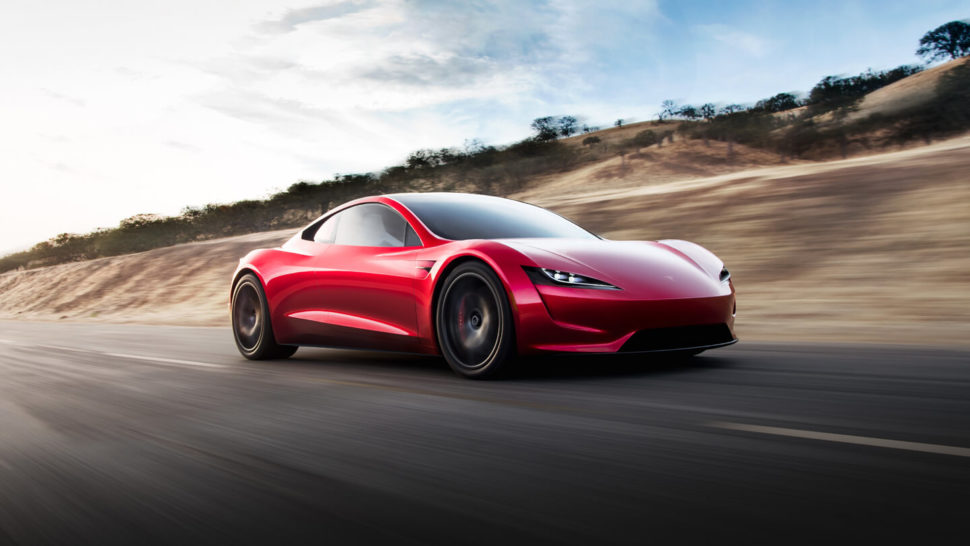
Believe it or not, much of the tech that Nikola invented back in the 1880s is still used by Tesla today. For instance, the AC engine that he invented is used in Tesla roadsters.
Nikola’s dream was to have clean and sustainable energy. That idea has been the focal point in all of the car brand’s innovations and projects.
The birth of the Famous T
Even though Tesla is a one of a kind car brand, they still had a lot of competition, and they needed their own identity. This was a great challenge for the design team because they needed something that their customers could relate to, while also keeping it up to the Tesla standard.
As we all know, your logo is the face of your company. Everything identified with Tesla is known for being cutting-edge, sleek, and ahead of its time, so the logo had to be the same way. That’s where the famous T logo was born.

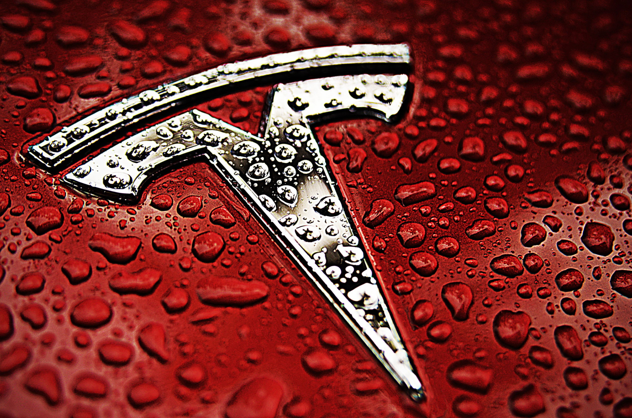
The main logo identified with Tesla is a simple yet powerful one. The idea behind the design was to symbolize the efficiency of the electric cars that the company was creating.
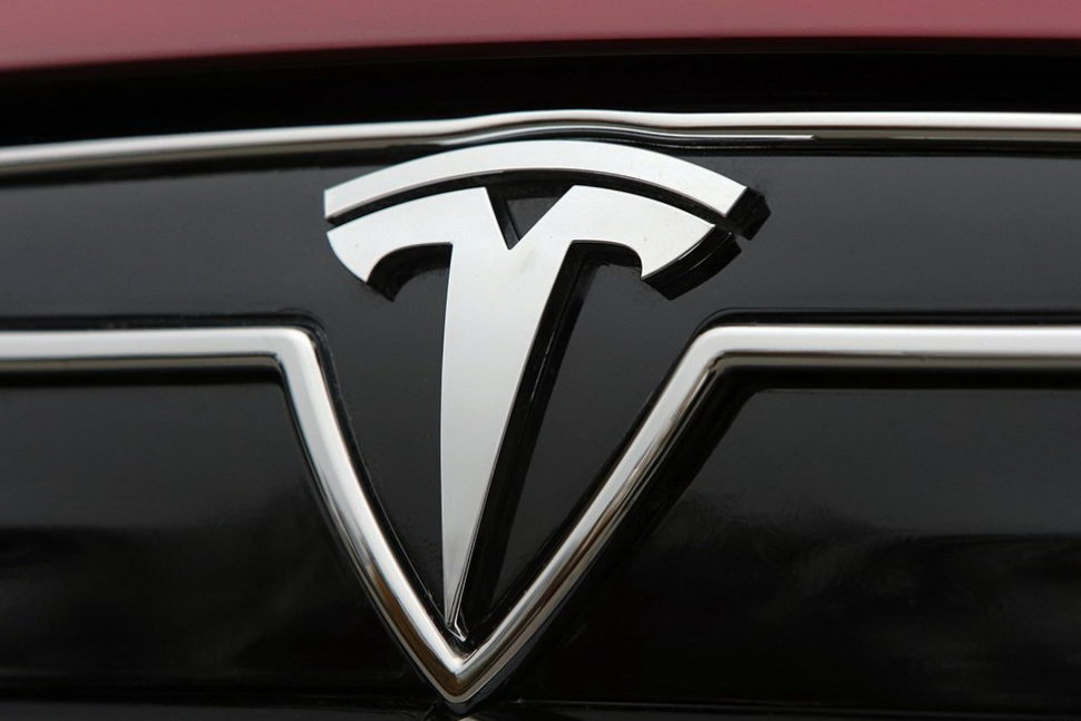
The main focus of the logo is in the letter T, which stands for the name of the company. But, if you look a little closer, you’ll notice a formed shape around the T. This shape, in combination with the T itself, is meant to resemble a shield. The shield, according to Tesla, is meant to depict reliability and safety – two things we all look for in a car. The fact that they can portray these features into the logo is simply genius.
As time goes on, I expect big things from Tesla. As far as technology goes, we can all expect them to always be ahead of the pack. But, as a company that needs to evolve with their clients, it’ll be interesting to see what sort of logo designs they come up with in the future.



You missed a huge part of the story. The T logo represents a cross section of an electric motor. Musk tweeted about it and it was in the news years ago.