
People approach fonts differently. There are those who don’t even know what they are or how they are made, and then there are those who follow fonts’ progress and study them intensely.
There are fonts out there that have become so wildly successful that you might even say that they have gathered a cult around themselves.
We could say that these are the fonts preferred by designers. These are the ones that we see more often simply because they’re enjoyed by the masses. To draw up this list, I relied on various sources, including my personal experience, my readings, and the opinions of other designers scattered on the web.
Let’s get into it.
The 7 fonts that designers love most
Drumroll, please! Here are the 7 fonts preferred by designers, in no particular order of quality or preference.
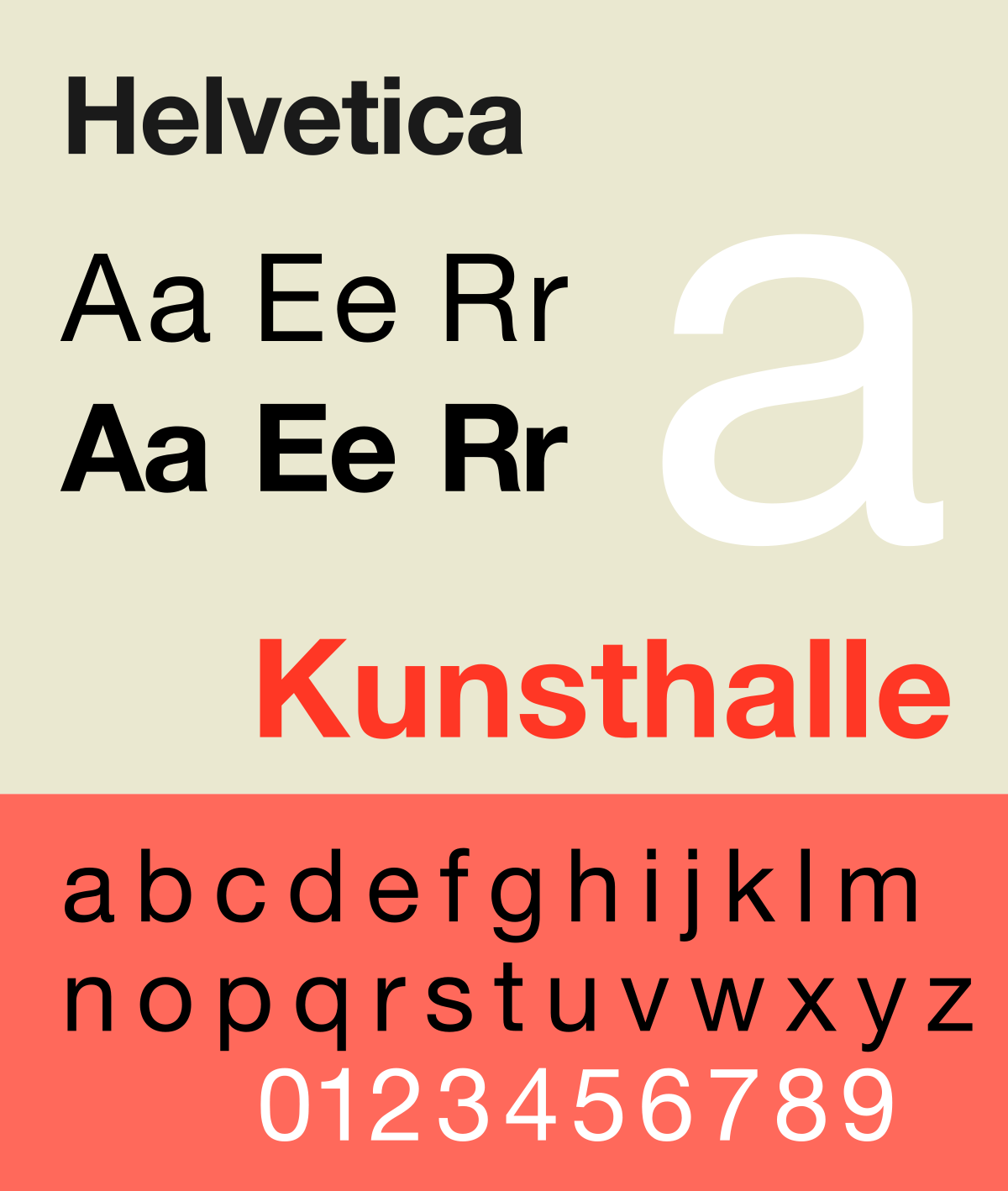
Helvetica
Helvetica was created in Switzerland. In 1957, Eduard Hoffmann designed Helvetica for the Haas Foundry of Munchenstein in Basel, Switzerland. In the beginning, it was called Neue Haas Grotesk because it was born as a revisitation of the Akzidenz-Grotesk (a font we see later in this article). Initially, it existed only in the light and medium versions, but then, when there was the addition of Italic, Bold and numerous other weights, it began to colonize the world.

Helvetica is an extremely versatile and objectively beautiful font. In the ’60s, it became omnipresent in the western world and even turned into a cult phenomenon.
Helvetica is undoubtedly the favorite character of most designers and at the same time, one of the most hated, precisely because, seriously, it is just everywhere! Deservedly? In my opinion, yes.
Futura
Futura is another one of those fonts considered “immortal” and is certainly among the fonts preferred by the graphic designers. Created by Paul Renner in 1928, in Germany, it was inspired by the artistic theories developed at the time.
Futura is considered the forefather of geometric sans serif fonts. If you take a look a little further, it makes sense. Looking closely, you’ll start to see near-perfect circles, triangles, and squares. These shapes were certainly an inspiration.
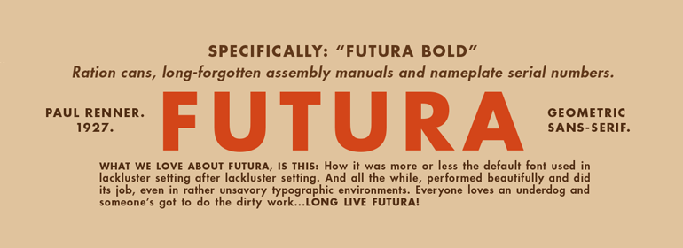
It is a statuary, clean and elegant font. After its creation, it soon became a perfect compromise between traditions and modernity.
Over the past 80 years, it has been used consistently for countless graphic projects. For example, the logo for Volkswagen is Futura. You can even find traces of this legendary font in space.
Oh yes, the famous plaque left on the moon after the first landing in July 1969, was in fact engraved in the Futura. Who knows, maybe it was chosen for its characteristics, or perhaps for the evocative name. Regardless of why it was chosen, it will be up there watching over us for some time.
Frutiger
The Frutiger comes from the skillful hands of Adrian Frutiger, who also lent his name. Frutiger is a very particular character, extremely readable, clean, simple and recognizable. Legibility, in particular, is an important feature of this font, as Frutiger himself says:
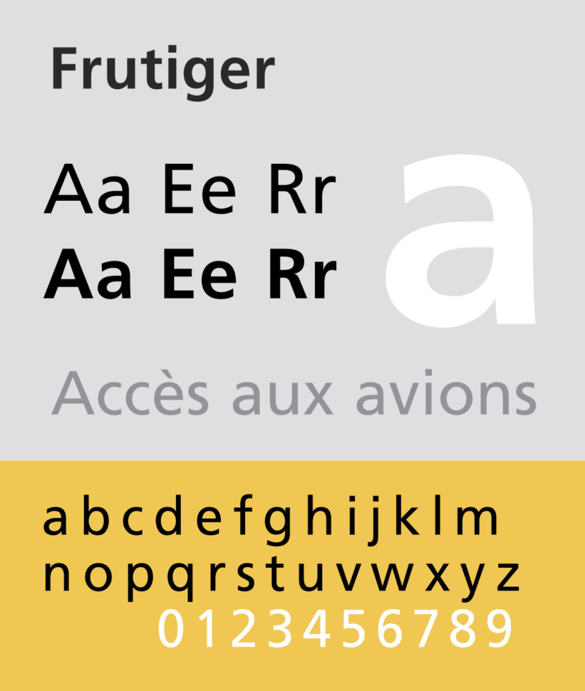
And, beyond all these features, it’s really beautiful.
Gotham
Honest, objective, discreet, durable and sincere. Write anything in Gotham and every reader’s attention will all be on your message. It’s that expressive!
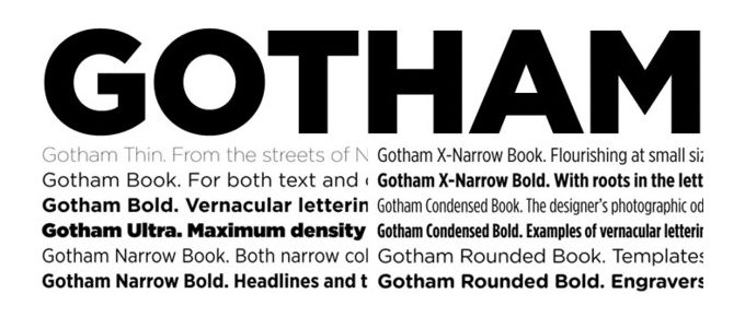
Gotham, Barack Obama
Created in 2000 by Tobias Frere-Jones for the Hoefler Frere-Johnson of New York, it immediately became an important and decisive novelty in the world of typography and graphic design. Its strong and clear lines but also its wide weight variations make Gotham, Barak Obama a versatile font (it is available in 40 varieties, from thin to ultra).
It became famous all over the world starting from 2008, during the presidential campaign of Barack Obama when it was used for the electoral posters, in which the following words were written in Gotham “HOPE”, “CHANGE”, “YES WE CAN”. these words accompanied the image stylized by the presidential candidate.
Today it continues to be used more and more as time goes on.
You can see this world-famous font in the Discovery Channel’s logo redesign, and in the film poster for Clint Eastwood’s movie “Gran Torino.”
Baskerville
Let’s jump back a couple of centuries. We’re jumping back to 1757 when the classic font Baskerville was created. A gracious font named after its creator, John Baskerville.
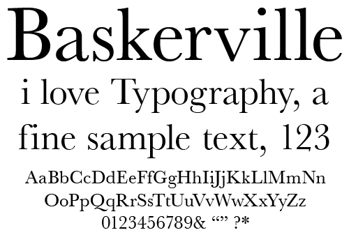
Baskerville, historically, is a mix of the Old Styles (ancient Romans), such as the Caslon, and the modern Romans, Bodoni and Didot. In short, it is part of the category of transitional serif fonts.
Akzidenz-Grotesk
According to The Guardian, Akzidenz-Grotesk is the best font in history. The so-called sans-serif realist was originally created on commission at the Berthold foundry in Germany in 1896. It was then revisited and modernized in the 1950s by Gunter Gerhard Lange, who introduced, among other things, different weights, while maintaining its original features.
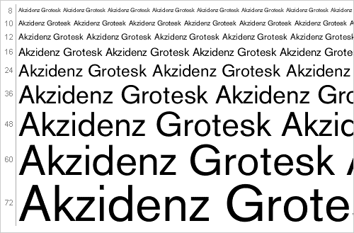
It was this font that served as an inspiration to some of the best fonts in history such as Helvetica and the Univers, and through them also to Frutiger. And just for this alone it deserves all the praise it gets.
Many believe that Akzidenz was the first sans-serif to be used regularly. The characteristics of neutrality and impersonal beauty allow it to be used for an incredible number of applications, remaining elegantly aloof and leaving the designer free to create.
Gill Sans
Gill Sans, which takes its name from the engraver Eric Gill, who designed it in 1928, is certainly one of the most famous and appreciated fonts in the world.
He began to take shape on a shop sign in Bristol, the Douglas Cleverdon, which was a bookstore. Subsequently, he was commissioned to produce the entire alphabet from Monotype.
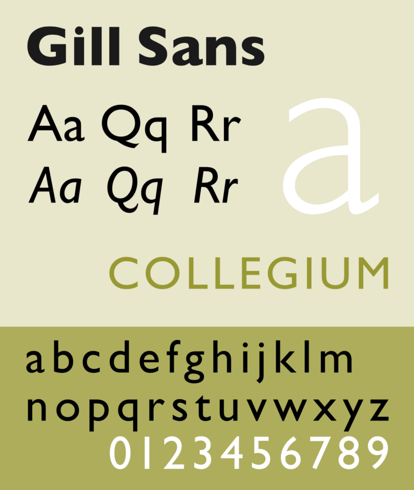
According to many, it is the most British inspired character that exists. Both for the proud and decorous appearance, but above all for the way it was used throughout its life. The Church of England, the BBC and all the coordinated images of the British Railways were just some of the applications of the character.
Today it is still very used and much appreciated by most (even if hated by many), thanks to its characteristics of extreme versatility and practicality and for the total absence of frills.
Conclusion
There are 6 sans serifs and only 1 serif. This might be pure coincidence, or it might be that sans serifs are just super popular right now.
In reality, there are thousands and thousands of popular fonts out there. It really only takes one big brand or one great application to turn a standard, page 20 font into the next Coca-cola logo.
This article was meant to give you inspiration. Whether it’s to design a new font or to use one that really makes your projects pop is up to you.


Leave a Reply