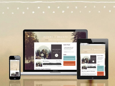
Web design isn’t what it used to be. Web design used to be a fixed process. Except for some browser quirks here and there, and for the regular lockdown of creativity of course, it was a fairly straightforward operation. It used to be the defining of a canvas and as long as we kept the design within the 960 horizontal pixels of a grid, everything would be safe and sound.
That was during the time when the web only lived on the desktop, behind the monitor of a computer. But as all of us know things have changed. Since then, we have deliberately taken the web out of the desktop and placed it in basically every screen we could imagine. We’ve put it in our hands, we’ve put it in our laps, we’ve put it in every space where we can find use for it.
The web as we know it today doesn’t live in a physical location, it’s finding its way out to wherever it can be useful. Independently of where it will be, the web live through the screens.
The screens are of a varying nature with different sizes and resolutions. The only constant we have in todays web design equation is the certainty of uncertainty. Designing for the web now means designing for a wide diversity of screens consisting of irregular scales, densities and resolutions. It means that we can’t provide a neatly wrapped canvas to our visitors anymore, there’s no way of knowing beforehand what kind of screen they’ll use.
A website used to be a painting, even if it wasn’t print design, let’s say it was kind of an interactively made painting. And since we also had, at least, a hunch of how peoples experience of the website would be like, we had some control over the situation. With versatile features of ubiquitous displays, now stretching out like an octopus throughout every area in our lives; that control is gone.
There’s no way of knowing about peoples preferences of gadgets and screens anymore. When I’m designing for the web I try to imagine what it would be like if I could grab the edges of my screen, stretch it out, and with just the touch of my fingers, blow it up to let’s say 70 inches. The same would go the other way around, so I can compress the screen until it would comfortably be able to sit in the palm of my hand. Visualizing this stretchable, malleable and undefinable screen which can be adjusted whenever I like, helps me thinking in how to design for a flexible web.
Designing for the web nowadays is all about creating elastic interrelationships between objects. Every element on a web page should be defined relatively to its surrounding elements. I can’t say that the websites header should have a margin of 60 pixels downwards to the main content. That space, good looking as it might be on the big and wide screen I’m using for the moment, would probably mean a minor calamity on the narrow screen of a smartphone. The header in this case, needs to have a relative margin towards its environment based on the current size of the screen.
I’ve stopped using pixels as a defining unit since it’s basically no good for anything that has to do with the modern way of creating websites. Pixels do not scale. Percentages and em’s do. Make way for those units if you want to have a truly scalable website.
Responsive web design is not about using media queries to switch between predefined sets of fixed layouts. Responsive web design is about building a foundation, paving up a flexible groundwork that scales properly with the resolution. Then, at the points where the layout is actually breaking, I can lap it up with media queries.
Forget about creating a design for the iPhone, a design for the iPad and a design for the laptop. If you’re designing correctly, you’ll have a website that stretches beyond that and into devices that haven’t even seen the light of day yet. Who knows what screens will be lurking for us in the future? If we’re designing for a flexible web today it’ll have no problem adapting to the technical gadgets waiting for us tomorrow.
A greatly designed website is like water, no matter what container you’re pouring it into, it always has the ability to adjust. Trying to achieve that with as less code and with as few redundant media queries as possible is a beautiful feat worth striving for. It’s something that will pay off in the long run, for you as designer and for the people who can make use of your content no matter what screen they’ll pick for the day.

 Image from
  Image from
  Image from
  Image from


Thanks for this very interesting article. Responsive Webdesign was part of the redesign of my personal new website, I have launched 1 week ago.
Regards
Frank from Germany
Our website WebHugh was not responsive earlier. Then we redesigned, totally custom. We used HTML5, CSS3, Jquery, Javascript for front END and PHP5, MySQL for backend. This week we are again updating it to WordPress. After so much work it is up now. Hope by today all issues are fixed. Redesigning your website into responsive is totally worth because for obvious my sales have increased 10 times when organic SEO also start paying off.
Thanks for the nice share. I liked the designs especially which have been used in the blog.
Has anybody worked with Adobe Edge Reflow for responsive web design? I was wondering if the code is bloated and terrible, such as sites designed using Adobe Muse. Thanks!
The problem is even worse with everybody jumping on this dumb app bandwagon and how ridiculously specific the design has to be for the five million different types of devices. Even big names like Instagram and Yahoo have apps only for iPhones and viewing them on iPads are completely broken unless your are nostalgic for Super Mario Brother’s graphics. And don’t forget about retina displays.
We still find responsive designs a challenge. Anybody know of any themes or framework that we can work with?