

Every year in December, Pantone, a color categorizing company, nominates their color of the year. Typically speaking, these colors are meant to represent something significant going on in the world. But the Pantone color of the year 2019 has stirred up quite a controversy.
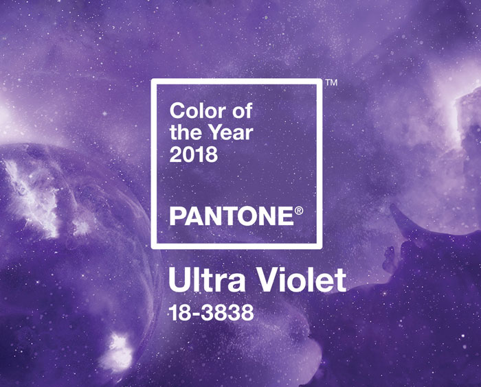
Let’s start by mentioning last year’s color: ultraviolet. This wild shade of purple was chosen because it stands for originality, ingenuity, and visionary thinking.
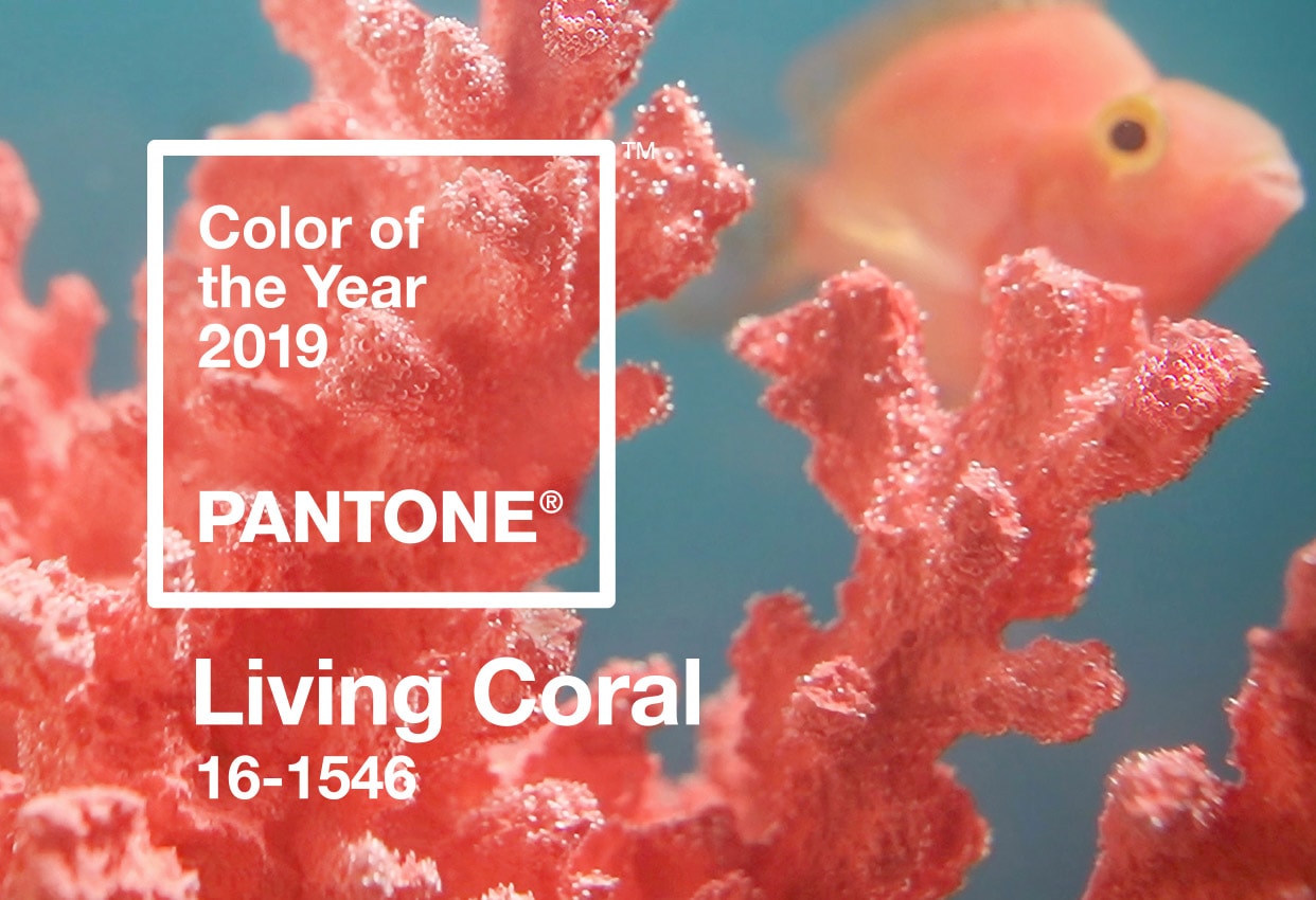
Now, fast forward to Pantone color of the year 2019, they’ve decided on a lush red called living coral.
What’s wrong with Pantone color of the year 2019?
As I mentioned before, these colors are chosen to represent something significant. According to Melbourne based design agency Jack and Huei, this “living coral” glosses over the fact that corals are dying at an alarming rate all over the world.
Being from Australia, Jack Railton-Woodstock and Huei Yin Wong, owners of Jank and Huei are greatly concerned. You see, Australia’s waters are home to some of the most beautiful and endangered coral species on the Earth.
The unofficial Pantone color of the year
In protest to the official choice from Pantone, Jack and Huei have taken it upon themselves to create a new color of the year.

During their search for a more appropriate color, the duo came across Pantone sample #F0F6F7. This is a very pale, washed out blue that perfectly matches the dead stems of the coral being affected.
The process of coral dying is called bleaching. As the coral begins to die, it’s exposed skeleton loses all color, and becomes nothing more than a glorified stone.
In light of this color, and the name of the process, Jack and Huei decided to call the unofficial Pantone color of the year “Bleached coral” instead.
This is an issue we care about deeply and we think the creative industry has an opportunity to bring this global issue from the depths of the ocean to the surface of our screens. – Jack and Huei
Pantone’s reaction
As of right now, Pantone has yet to have any sort of reaction to this sort of protest. Most likely, they won’t have much to say.
But, the good news is that artists and designers just like Jack and Huei are using their talents and skills to bring more awareness to issues just like this one.
It’s the responsibility of all of us, creative or otherwise, to find creative solutions to big problems, and right now there aren’t many problems facing humanity that are bigger than climate change. – Jack and Huei
What’s next?
Jack and Huei’s plans are to continue their efforts well into 2020. They’ve begun to brand their newly proposed color using Pantone’s style in order to help bring in more awareness.
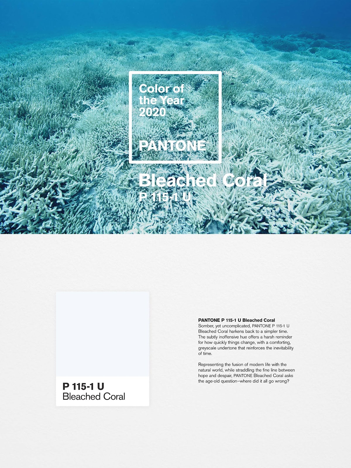
“Somber, yet uncomplicated, PANTONE P 115-1 U Bleached Coral harkens back to a simpler time. The subtly inoffensive hue offers a harsh reminder for how quickly things change, with a comforting, greyscale undertone that reinforces the inevitability of time.
Representing the fusion of modern life with the natural world, while straddling the fine line between hope and despair, PANTONE Bleached Coral asks the age-old question – where did it all go wrong?”
These are powerful words that bring a powerful message with them. Hopefully, the efforts of Jack and Huei, as well as others around the world will begin a new age for our planet. One where we value the natural beauty and wonders that we’re surrounded by each and every day. One where all life is valued and fought to be protected, instead of ignored. One where we can look at the issues we face, and overcome them together. We only have one Earth, it’s about time we started to treat it with respect.


Leave a Reply