
The national airline of Turkey, which flies to 122 countries around the world, has updated its branding hand in hand with the Imagination studio.
Airlines always look for the best design that defines their identity. Therefore, Turkish Airlines has renewed its image, refining its traditional bird symbol and adopting a new wave that seeks to reflect the seven continents of the world to which the company travels.
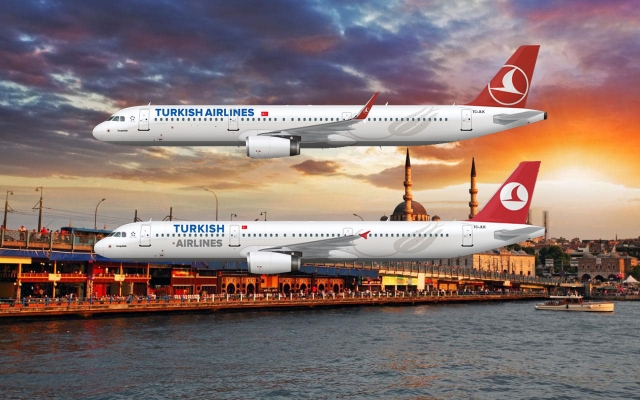
The previous logo showed the name of the airline in bold, typography sans serif in blue on the left, with a red circle and an abstract image of a bird in the center on the right. According to the Turkish airline, the shape of a bird drawn on a line represents a “wild goose”. This has been chosen as his mascot, since geese are well known for traveling great distances.
The new brand presents a refined version of the goose symbol encapsulated within the circle, which is now red in color. The goose has been adjusted, now placed at a more diagonal angle, and is smaller in size, as it does not reach the edges of the circle.

The logo is now configured in white within the circumference, created with a palette of colors in red and white. The typography has been modified and now has rounded corners in some characters. The logo is accompanied by a wave chart composed of seven horizontal lines, which seek to refer to the seven continents of the world, in an attempt to transmit the airline as an international entity.
The logo is located at the point of convergence, or center of the graphic line, which appears to represent “Turkish Airlines at the center of global travel,” the design consultancy mentioned.
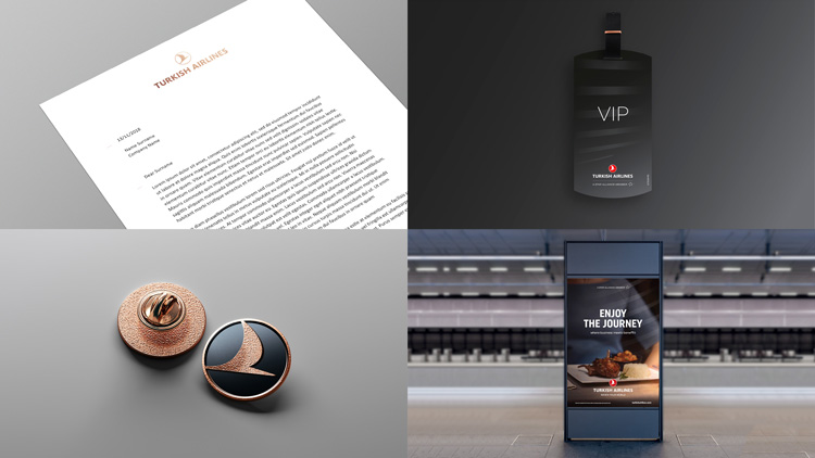
Red and white are the main corporate colors of the brand, and have been used to represent the economy class, while a combination of golden and black rose is the main palette of the business class, to create a more “premium” feeling and “distinctive” look.
In addition, a new set of graphic icons has been designed, representing different elements of the airline’s experience, including hold baggage and items that are restricted by airport security.
The presentation of this new image coincides with the launch of the new Istanbul airport in Turkey, which will become the new center of Turkish Airlines operations and which will open its doors in April. The current hubs of the airline are Istanbul-Atatürk Airport and Ankara Airport.
The new brand has begun to expand, starting with signage, positioning, billing counters and other interior points of contact at the new airport.
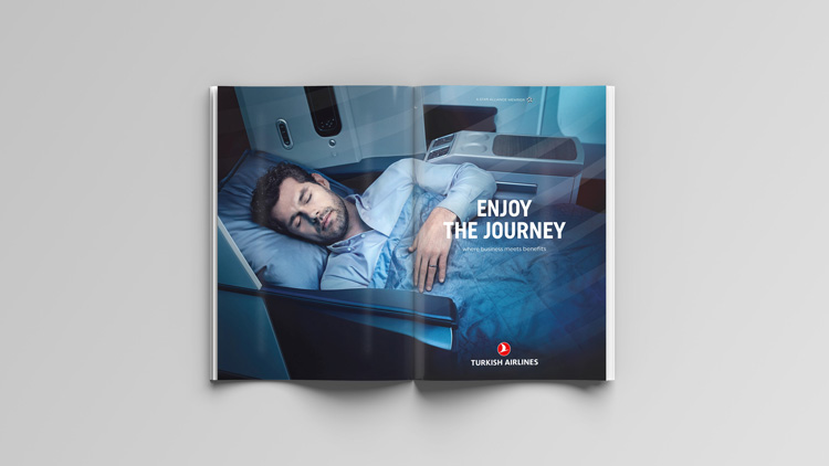
This new rebranding will continue to be implemented over the next few months in interior aircraft designs, digital platforms that include the website and social networks, printed advertising materials and merchandise.
Imagination has also created a set of guidelines for Turkish Airlines, so that the company can continue to produce branded products in the future, such as signs, shoes and blankets in the cabin.


Leave a Reply