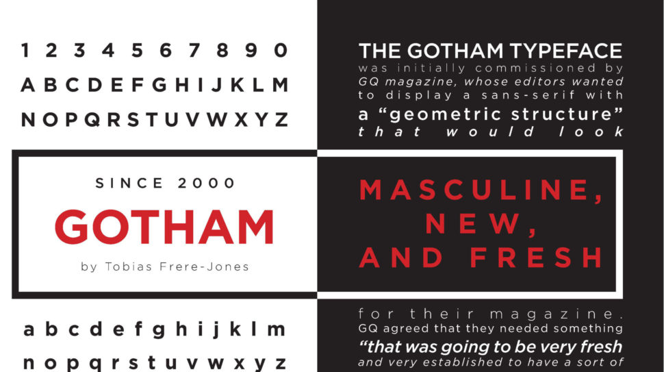
Gotham has become one of the most ubiquitous typographies of the 21st century. Its versatility and, undoubtedly, its good design makes it useable in many spaces. Even more, since it became the official typography of the campaign that led Obama to become president. However, in the typographic universe, there are hundreds and hundreds of typefaces to choose from. Since we live in a world that loves variety, here are 10 alternative typefaces to the Gotham.
1. Proxima Nova
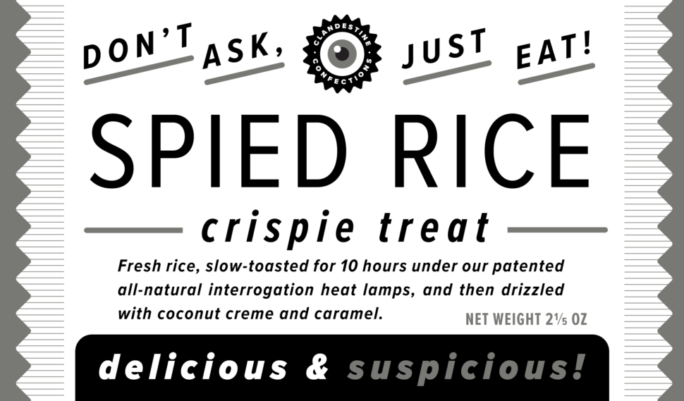
Designed by Mark Simonson, Proxima Nova is perhaps one of the fonts that best presents itself as an alternative to the Gotham family. According to the author, this source “closes the gap between fonts such as Futura and Akzidenz Grotesk.” The result is a hybrid that combines modern proportions with a geometric appearance. It is a balanced and versatile source – the complete family includes 48 sources, eight pesos in three widths with their italics – the result of extensive work dating back to 1994. In recent years, Proxima Nova has become of the most popular web sources.
2. Montserrat
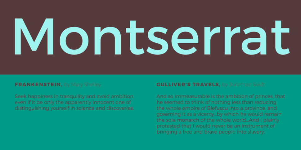
Montserrat was created by the designer Julieta Ulanovsky. He took inspiration from the architecture, the old posters, the luminous signs and the canopies of the neighborhood named after him in Buenos Aires. Ulanovsky’s intention was to rescue the beauty of urban typography from the first half of the 20th century. This inspiration taken from the local signs and architectural ques bring it closer to Gotham. Even so, the Montserrat forms are a little broader, giving a less solemn and more relaxed feeling that Gotham doesn’t provide. Montserrat was chosen to be among the 10 best fonts of Google Fonts in 2017.
3. Nexa
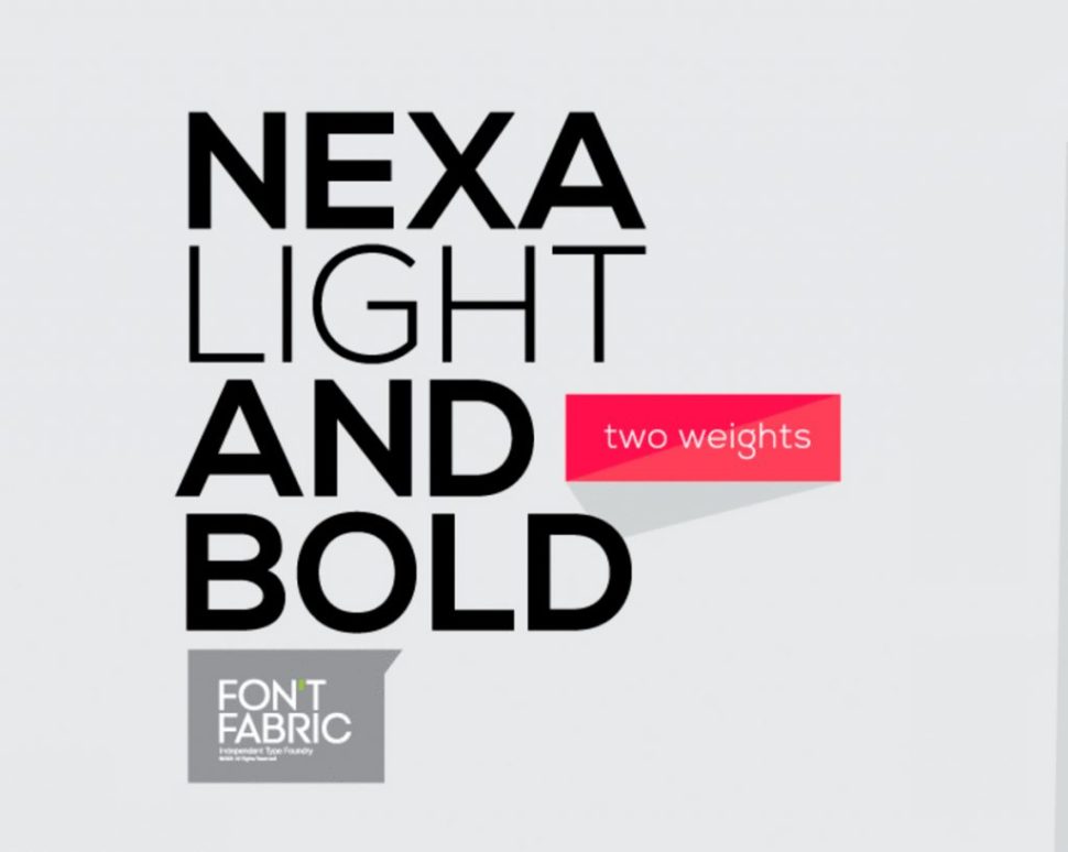
Directly from FontFabric comes Nexa, a sans serif font available in Light & Bold. This alternative to Gotham is possibly more expressive typography than some of the fonts that appear in this list. For example, the lowercase letter ‘g’ and the capital letters ‘J’ and ‘Q’ are far more expressive. In terms of its uses and applications, Nexa is perfect for branding and packaging projects. Nexa Light & Bold is freely available for download.
4. Sans Museo
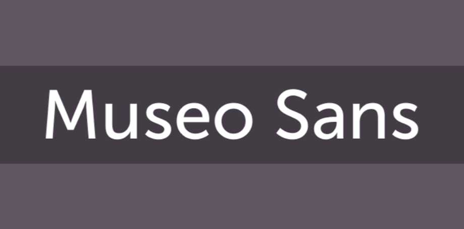
Sans Museo coems directly from Exljbris foundry. This type of sans serif is robust, geometric, low contrast and highly readable; very suitable for use on any screen or for any text. This family of OpenType fonts is in all the languages of the European Union and even in Esperanto. The Sans Museo package contains 10 fonts, 5 pesos, and their respective italics.
5. Pier Sans
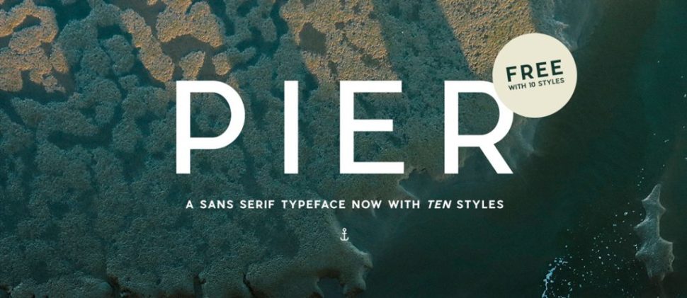
According to Mathieu Desjardins, the designer of Pier Sans, it is a modern and geometric typeface, specially designed to be able to adapt to any size of text without losing legibility. This font, besides being a good alternative to Gotham typography, is quite useful for projects of all kinds, since it is able to cover the needs of any text.
6. Vision
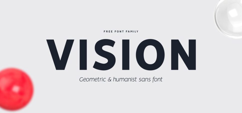
Vision is a complete typographic package. It is elegant and offers very good readability, both on screen and in the text. It consists of 12 free sources available for commercial and non-commercial work. As an alternative to Gotham, it presents a more humanistic invoice, especially in its lowercase. It was born to be versatile, a clear and modern font with great readability in large and short texts. In addition, it has ligatures, alternative glyphs and OpenType features that provide flexibility and uniqueness wherever they are placed.
7. Avenir

Designed by Adrian Frutiger in 1988 and published by Linotype, Avenir is one of the best-known sans serif typefaces from the Swiss typographer. The word ‘Avenir’ comes from the French and means ‘future’. Frutiger wanted Avenir to convey a more organic interpretation of the geometric style. He wanted it to be more uniform for extensive texts, with details reminiscent of more traditional typefaces, such as ‘a’ and ‘t’ – two letters with a curl at the bottom, and letters like the ‘o’ that are not exact or perfect circles, but with optical correction. Avenir is not purely geometric. The vertical strokes are thicker than their horizontal ones, the ascending ones are shortened and the ‘o’ is not perfectly round, adjustments that help readability and give the typeface a more harmonious appearance.
8. Lato
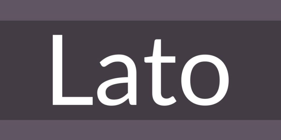
Lato is the most popular font from Łukasz Dziedzic, a designer based in Warsaw. Designed in 2010, this free font contains more than 3,000 glyphs in 18 styles. It offers solutions to virtually everything a designer may need. Lato, which means ‘summer’ in Polish, is a semi-rounded sans serif that, like Gotham, achieves a convincing balance between what can be a serious and friendly conversation.
9. Foundry Sterling
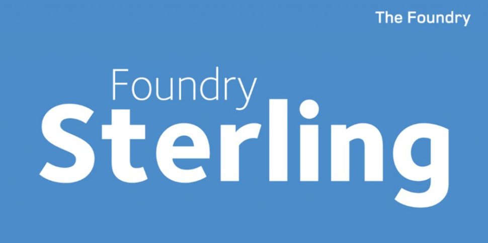
Foundry Sterling is a functional and eloquent typographic family. It was born from the desire to create a modern sans serif with an essentially English flavor. It has been designed by paying special attention to the classical proportion and the purity of the forms, which has resulted in the creation of functional, beautiful and elegant typography. Like Gotham, Foundry Sterling has a wide range of weights that make it very versatile in its applications, whether for identity, editorial, signage or other uses.
10. Gothvetica
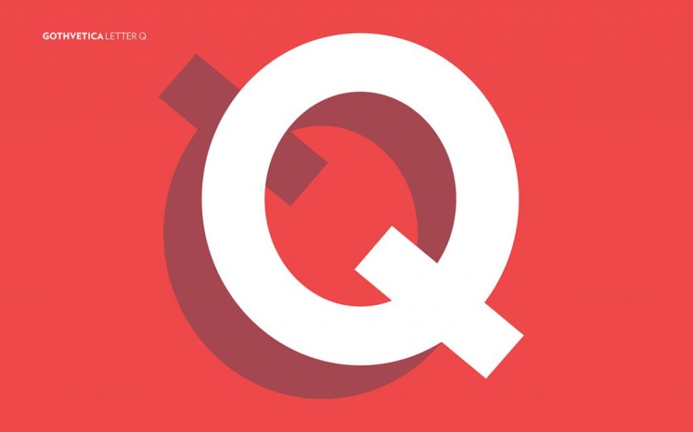
Its name says it all. Gothvetica is a hybrid between Gotham and Helvetica. This MarkStudio typographic exercise began as a question: How similar are Gotham and Helvetica? What would happen if they both merged? The result is this typographic mix, a kind of Frankenstein font, and we must admit that it works as alternative typography to Gotham and can give a solution to certain projects. Oh! and, by the way, it’s free.
Conclusion
Although Gotham is one of the most popular fonts on the market today, it doesn’t mean we all have to follow its trends. There are plenty of alternatives out there, and we shouldn’t limit ourselves. Try out one or all of the fonts above and let your creative spirit fly.



Leave a Reply