

Studies have shown that the first impression a user gets when visiting a site is strictly influenced by the design of the page they are reaching. Design is a very subjective element, just like user preferences. Using these elements, some UX rules have been created. If we abide by these rules, we can pretty much expect a massive change in the way users view and use our sites.
Each site has a well-defined purpose. It usually involves sales. In order to sell, a site must guide the user, and urge them to act. This is done by action buttons. The more convincing they are, the easier it will be to attract the user and get them to act. But the attractiveness of the buttons is not the only factor at play here.
Here are some UX rules that we can apply to make sure our site is successful.
How do we design attractive web buttons?
The most important thing in designing an action button is the color of the button. The negative space (the space around the button) is also important. There must be a strong contrast between the two so that the action button stands out.
Thus, the Contrast Rule is paramount in this case.
The most contrasting color schemes are:
- yellow on black/black on yellow
- blue on white
- red on white
Using these color schemes between the button and the negative space can ensure the success of that button. Thus, it can help the user interact with the button.
Negative space is extremely important. Another rule that applies in this step is the Rule of the Laws of Gestalt. If a form is extremely close to another form, they will be perceived as a unity. Thus, if the action button is not effectively isolated in the negative space, it can be perceived as a unit of another section. In this case, the button will lose its relevance and will certainly affect the conversion in a negative way.
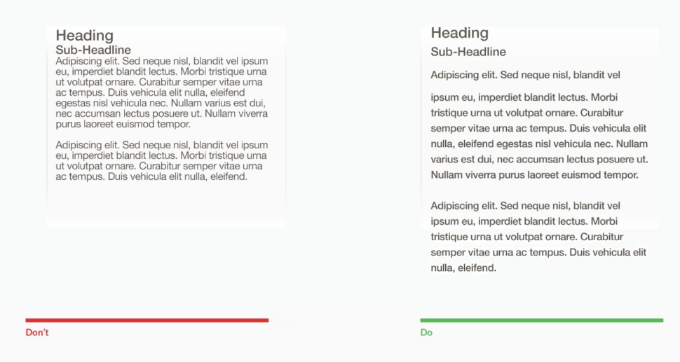
White space of web design is extremely important. White space items should include:
- margins, padding, gutters
- white spaces between sections
- line spacing and background – negative space
UX Rules: Why should the negative space always be white?

White is a non-color. So every color placed above the white will contrast. It’s twice as easy to identify an action button placed on white than any other color. The white spaces of the sites should not be seen as simply background but as a negative element. They should be used strategically to isolate CTA buttons and clearly delimit sections of the site.
White will help the site look tidier but, most importantly, will help the visitor understand the purpose of each section.
According to specialists, pages with a lot of white space helped up to 20% more users to read content and interact with the site. Why do you think most online stores have a white background? Because administrators want to highlight products, purchase sections, and action buttons. And it really works.
How important is content for action buttons?
The content is EVERYTHING in this case. You have 2 to 3 words to push the user to click on the button. Here’s what you need to consider: Less is More. This also applies to design. Less color more clarity. But as far as content is concerned, it is the first rule that we should take into account.
The fewer words the stronger and more convincing the button will be. It always starts with a verb and keeps an imperative tone. These are the buttons that convert, according to the specialists.
There you have it
Just to recap, the 3 very important rules for creating and designing the perfect CTA button are:
- Use contrast
- Optimize your white space
- Less is more
The idea is to get people to see the button, distinguish it from everything else on the page, and convince them to click it. In most cases, you only have a few seconds to show them why it’s worth it, so make it count.


Leave a Reply