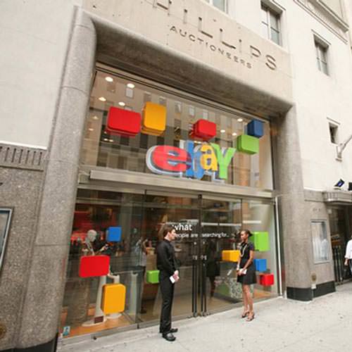
‘People buy with their eyes’ – It might be a little cliché, but to some extent it’s true. In the majority of cases, consumers make decisions about the type of product they want to buy, whether it’s a pair of shoes or a new shirt, but it is the way these products look on the shelves that determine where they make their purchase from. That’s why high street shops employ merchandisers – to make their products look as appealing as they can.

The same approach should be taken with your eBay store. You can rest assured that the products you sell online will be available elsewhere, possibly even at a better price, so it’s essential you do everything you can to tempt customers in with an attractive store design. Here are 7 tips to help you seal the deal.
1. Dare to be different
When designing your eBay storefront, the easy option is to play it safe and blend in with the crowd. This approach is certainly understandable, but it’s not necessarily the best decision for your business. Branding plays an extremely important part in retail, and consumers buy into a brand as much as they do the product. Going the extra mile in terms of your design can help to create something prospective customers want to buy into. The result will be a boost to your bottom line.
2. Usability is key
As soon as the word ‘design’ is mentioned, we all start to think about the aesthetics, but the usability of your store is far more important than the way it looks. Your store must be easy to navigate, with a clear menu system to help customers find their way around. We’ve all heard those stories of eBay millionaires, but it’s essential you don’t try to run before you can walk. Broken links, spelling mistakes and cluttered design all turn prospective customers off, so make sure you put the solid foundations in place.
3. Perfect your product listings
Prospective customers visit your eBay store for one reason and one reason only: to buy a product. Before they commit to making a purchase, they understandably want to make sure that the product meets their needs. You have 80 characters at your disposal to show them your product is everything they want it to be. Product descriptions should include keywords, an accurate description of the product, and high quality photographs (from different angles if necessary).
4. Less is more
The temptation for amateur eBay store designers is to cram in as many different design elements as possible to capture the attention of prospective customers. In reality, this approach is more likely to drive customers away than tempt them in. Research has shown that ‘visually complex’ websites are consistently rated as less attractive than their simpler counterparts. By reducing the information on each page, you give customers the brain space they need to process the information and think. The use of whitespace is central to creating a simple but attractive website.

5. Create a brand
Consistency is the key to creating a memorable and cohesive brand. eBay provides plenty of tools to help you customise your pages. There are also a huge number of merchandising apps and themes out there that can help you fine tune the look of storefront. With up to 15 customisable pages to play with, it’s essential you retain the same message and aesthetic throughout to communicate clearly with your customers.
Do you have any eBay store design tips of your own? We’d love to hear your thoughts in the comments section below.
Author bio: Sam Butterworth is a design lover and writer working for British design firm JTI. You can find Sam on Twitter @sjtbutt


Leave a Reply