There are so many different topics to cover under the umbrella term of interface design. Both web and mobile designers are professionals at balancing between aesthetics vs interactions. One balancing tool in this arsenal is motion. When elements move and react naturally to user input, it gives the interface a sense of life.
For this article I’d like to share a few handy concepts for designing interfaces with clear-cut animation. Although animated effects can prove useful and exceptionally powerful, there is such a thing as “going overboard”.
But everything should turn out fine as long as you stay true to the design and keep a focus on the user experience. It’s vitally important to manage a consistent user experience by placing a focus on how people interact with the site, and how animated effects improve the interaction.
Content in Motion
Perhaps the most subtle addition of animation is within page content. Animated page elements could range from navigation links to photo galleries. Most websites don’t even bother with animation so including any type of motion in your design is already a huge benefit.
But it is important to consider how the interface actually feels while in use. Never sacrifice usability for cute little animation effects. This is a surefire way to push visitors off your website and leave visitors confused. Instead, opt to include animation when it enriches the experience or draws attention to a particular segment of the page.
For example the creative agency Graf Miville has lots of moving content on their homepage. Some are graphics and hover effects found within bits of content. Others are animated numbers which display statistical information about the company.
Perhaps my favorite part of this website is the navigation hover effect. When moving your mouse cursor along the links a small red border will follow your motion. The animation uses a bouncy easing effect as if the red border was made of a stretchable material. This naturally gives off a sense of vitality and life in an otherwise professional layout.
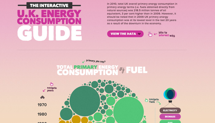
A starkly contrasted example can be found on the UK Energy Guide webpage. This page uses a series of gradients and colorful imagery to instantly draw attention. The whole layout reads like a dynamic infographic coded into HTML/CSS. There are so many different moving parts that it’d be difficult to expound upon all of them.
But instead of looking at each individual animation I’d like to point out a bigger perspective. Try to see the forest for the trees, AKA look over the composition as a whole for each of its parts. This site does an excellent job with background transitions, animated graphics, and content animation. Everything comes together into one seamless experience that just feels great.
Animated Graphics
Looking beyond typical page content there’s also a case to be made for animated page graphics. These are less common in typical web design because the technique requires a very particular set of skills. However animated graphic design can prove very useful for in-site branding effects.
I love the homepage design of Blue Acorn which is already such a fabulous website. The header and color scheme is organized and easy to use. At the top of the page you’ll notice an animated vector graphic of a cityscape. The whole thing is built using layered PNG images animated through JavaScript. Try hovering over the individual blips in the graphic or switching between tabbed links at the top.
Although this doesn’t add a whole lot into the branding, it does add a sense of professionalism. The graphic draws attention and offers some detail that Blue Acorn has a very competent design team. Since graphics are meant to enhance content there is no absolute right or wrong when it comes to animation. Ss long as the page still functions, you could apply motion graphics into any part of a website.
Mobile Touch Effects
In the realm of mobile app design there’s a much more substantial focus on animation. This almost becomes the lifeblood of an application interface because users want to feel the interactivity. With a mouse & keyboard there’s a greater sense of reassured confidence with each motion.
But mobile apps rely solely on touch. Taps, swipes, flicks, and other interactions are the only way to communicate. This means that animation should become a by-product of this interactivity. Let a user know that their swipe effect was recognized by animating an element across the screen.
Touch effects should be used to your advantage through colors, tones, shadows, and of course motion. If you’re not into mobile design these ideas won’t always translate nicely onto the web. But keep this in mind when designing a touch-sensitive responsive layout because users always want to feel in control of the experience – and the quickest method of expressing control is through a reactionary animation effect.
Parallax Layouts
Naturally I have to cover parallax design since it’s such a popular trend. Animated parallax interfaces have become a staple among single-page layouts. If all of a website’s content can be squeezed down into a single page, then why not? It’ll save the visitor’s time and make everything easier to access.
When talking about parallax animation the subject is varied and full of differing opinions. Some designers like the extravagant animations that take up most of the page. Others prefer a much simpler experience that focuses primarily on the content. As with a lot of things you really need to take these ideas on a case-by-case basis.
For example the Kraftwerk homepage uses a lot of parallax scrolling and animation within the background. Content is readable and stands out clearly against the dark background. Yet I still feel a little distracted by the interface as a whole. Not that there’s too much animation, but the animation wants my attention more than the content.
To see a different style check out the Resanova website. Their layout uses parallax scrolling with individual sections split up by different background colors. The animated elements add onto the content and don’t seem as distracting. To phrase this another way, the layout behaves more like a traditional website compared with other parallax designs.
I certainly wouldn’t claim there’s a right or wrong process to this. Ultimately it comes down to the userbase and how they feel about the design. Parallax layouts can get tricky but as long as the animation is relatable then it should rarely become a problem.
Prototyping Features
If you’re a designer then learning how to design for animation is a huge plus on your resume. Most professionals who have worked in web animation would recommend After Effects as the premiere editing suite. This is some truly powerful software that can generate animated effects for videos, vectors, or just animated GIFs.
In fact Dribbble is full of these cool effects for mobile and website layouts. If you plan to work with a team or creative agency then it’s worth learning how to use After Effects. Designers who already understand the concepts behind Photoshop & Illustrator will gain a lot from the software. Plus you’ll be able to create animated design comps for all of your ideas.
My favorite part about prototyping is the immense value it offers to the entire project. Right from the early design phase you can wireframe sketches of how animation should behave. This might turn into a detailed prototype which can then be carried over into graphics editing software.
Then once you have a solid plan it becomes even easier to convert these ideas into JavaScript. Most frontend animation is created through JavaScript or alternatively a JavaScript library. CSS3 is another option, although it has less support in older browsers.
If you can get into the habit of prototyping animation the creative process will flow a lot smoother. The later stages of development will be completely straightforward coding from a structured and organized mockup. Animation can be created entirely in code, but it always helps to have a solid idea beforehand.
Closing
There is no easy route to learning interface animation. Although digital software has enhanced the process, it still requires a lot of trial and error. I hope these tips and suggestions will help people who have been curious to dive head-first into the process of digital animation. It all feels very intimidating at first – but once you start messing around it becomes really fun and surprisingly educational.


Leave a Reply