Welcome to Webdesignledger, this is your Typography Sensei.
Today I’ll be teaching you everything you need to know about Kerning.
But before we study this notion in more depth, we have to look first at its sisters, Leading and Tracking.
They are not twins, but can definitely give you a hard time when trying to tell them apart.
If you are here, it means that you are just as passionate about typography as I am, keen to sharpen your font-maker’s eye and polish your talent.
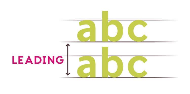
Leading
I don’t know how it was for you all, but when I learned to write, my teacher had a problem with my Ts, Fs, Ps, Ls, Hs, and all the other letters that feature vertical lines.
The rule was “go up with your ts, ls, fs, bs to the line above, and down with your ps, qs, gs, to the half of the row below. Avoid the letters from separate rows from touching.”
This is Leading; the essential design aspect that determines the distance between the baselines of successive lines of type.
Don’t let its spelling full you. The origin of the word is not the verb “to lead,” but the metal “lead (Pb).”
Therefore, we pronounce it ledding.
Back in the days of mechanical typesetting, the typographers would use strips of lead to separate the lines of a text.
Leading is crucial in your design because it makes the difference between a squashed text, properly divided lines in a text, or too loose text.
Tracking
This is where it gets a bit tricky.
Pay close attention to your sensei.
TRACKING and KERNING are very similar, thus frequently confused.
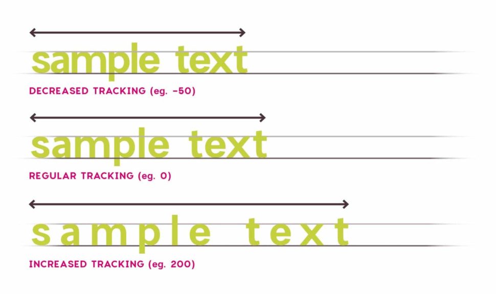
Tracking strictly refers to the spacing you choose throughout your word.
It determines a universal distance between every letter.
Coming as a further step after KERNING, TRACKING can be used to equally change the distance between every letter at once.
Tracking affects the density of your text, which may result in three possibilities.
If you choose to cut the space between the letters, you risk to end up with a word that’s difficult to read.
If you choose to add space, you might end up with a too airy text that looks like a super long word.
But, of course, you have the third option where the spacing you choose is perfect and your text looks impeccable.
Kerning
We finally get to the part you are here for. I’ll try to make it as easy to understand as possible.
When you write or type a word, you do not use the same space for each letter.
The space the letter “m” takes, for example, is larger than the space letter “i” needs. So far so good.
What does KERNING mean then?
Imagine that each letter is in a separate box, but all the boxes for all letters are equal in size.
When you take the letters and put them in a word, the boxes around them lose their margins, and you are left with letters awkwardly suspended in the air.
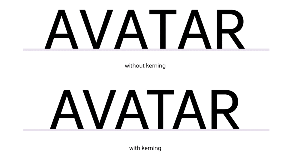
Now you have to kern, to cut those imaginary corners and extra spaces of the boxes so that your word looks more compact, and your font flawless.
Fortunately, Photoshop features a button for this.
If you are not satisfied with the result, though, you can manually do it in the same program.
Tips and tricks for kerning like a pro:
When creating your own font, it is important to make it look good from all points of view.
Learning to kern properly is not rock science, but there are a few aspects you need to take into consideration:
1. Certain letter combinations are trickier than others
Kerning is a matter of taste more than a mathematical problem.
For certain letter combinations, you have to try different spacing until you get the one you like the most.
When dealing with a problem letter in the middle of the word, you have to make sure that the letters on each side look alright.
For example, “Massage therapist” logo that is so popular among the funniest design fails was based on a kerning mistake.
Written in capitals, H + E looks just fine, but without kerning, E+R creates a bigger gap, even though the same spacing has been used.
Because we are so used with the word “the,” the brain automatically perceives is and separates it from the rest of the words, resulting in “the rapist.”
The biggest trouble makers are:
- the letters: A, K, V, W, Y
- letters that feature arms or cross strokes: F, L, T
- combination A+V/W (or the other way around)
- T/F + a lower case letter
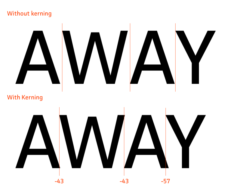
2. In order to check your kerning skills, try the following tricks:
- Whenever you think that you’re done with your editing, turn your word/text upside down. This allows you to view the spacing between letters without being distracted by the meaning of the words
- Kern your words in groups of three letters so that you may visualize each letter with its neighbors at a time
- Manual kerning is much more efficient than automatic kerning. Use the in-app kerning as a first step, but never skip the manual one. Your final will make your design unique.
- Kernign deals with details, leading and tracking with the overall looks. Save it for the last step, and spend the most time on it.
- Do not exaggerate with cutting the edges of the imaginary boxes. Make sure you “Kern,” not “Kem.”
3. Because I believe that this will make you the a master in kerning, I decided to save it ’till last. PRACTICE.
Become the designer/lettering artist you dream to become practicing whenever you get the chance.
I hope that this lesson has a great effect on your work and future, and I would love to know your progress and results.
Share your journey with us in the comment section below.


Pingback: 12 Stunning Handwriting Fonts To Spice Up Your Projects - Web Design Ledger