We all know that there are tons and tons of different fonts out there. They all have particularities that either make you want to reuse them and that way you remember them forever, or that make you never want to go back to them. There are eligible ones, and there are negligible ones. Ones that are suitable for any project, and others that no one will ever use. Sans Forgetica is different from all of the above. It is both useful and limited in usages, easy to remember, yet hard to read, it has a funny name, but a serious purpose. How’s all that possible? Let’s find out!
What is Sans Forgetica?
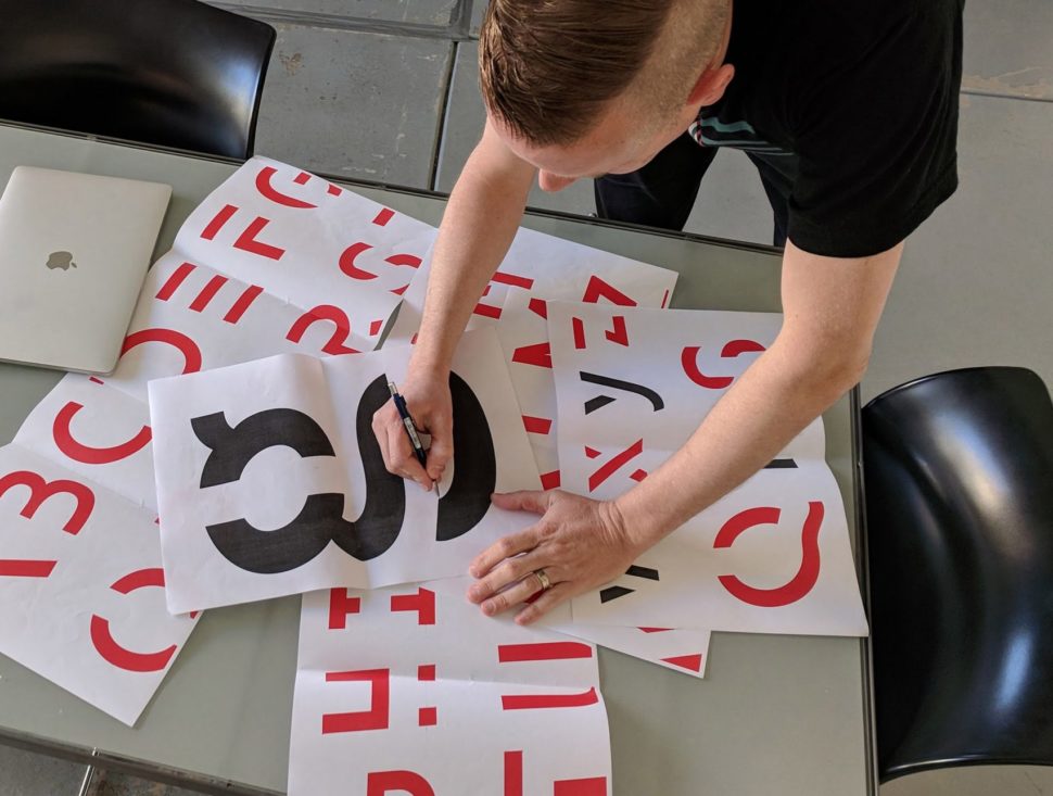
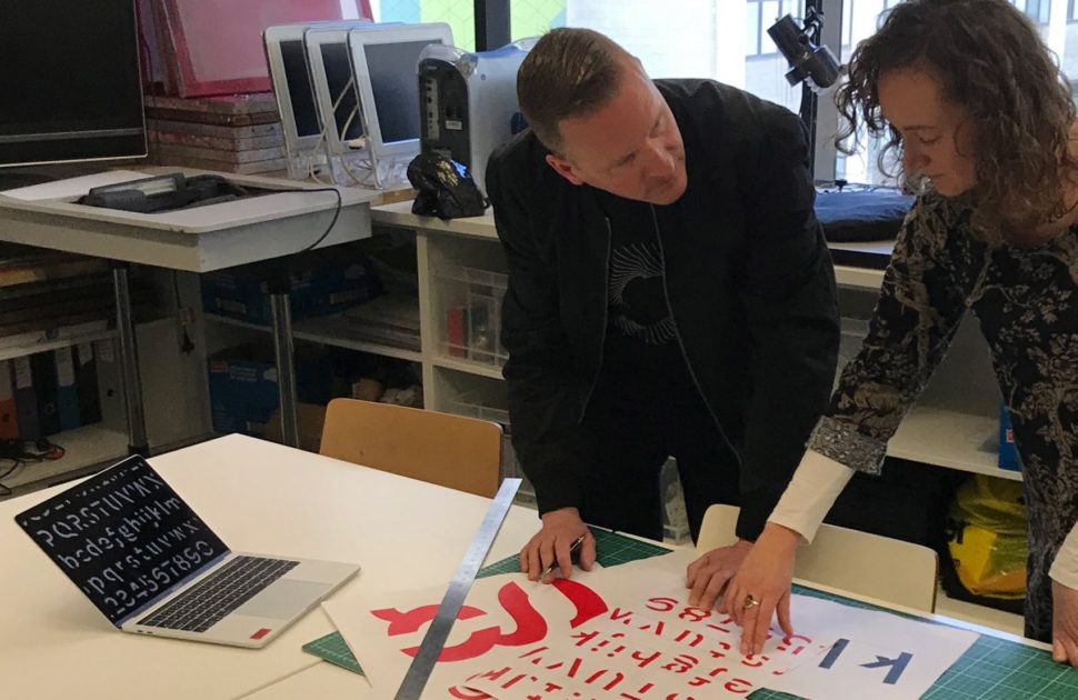
Researchers at RMIT University Behavioral business lab in Melbourne has recently uncovered a strange way for us to remember what we’ve read. The idea is simple in theory, but more complex once played out. Each letter in this font is tilted exactly seven degrees to the left, and has various gaps drawn right through the middle. The name comes from a pun by combining Comic Sans and Helvetica. The result literally translates to “without forgetting.”
This is the first time ever that specific principles from psychological theory have been combined with specific principles from design theory in order to create a font. – Jo Peryman, chair of RMIT Behavioral Business Lab

How does it work?
Sans Forgetica works by making your brain work. As you read each word, your brain has to function harder to decipher what it’s seeing. Your brain works hard so that your eyes can fill in the gaps and tilt the letters right-side-up again. Your brain has to slow down in order to fill in these gaps and holes. Once it slows down, it has more time to really understand what you’re reading, and engage in deeper and more direct thought.
Sans Forgetica works by a learning principle called desirable difficulty, which is where an obstruction is added to the learning process in order to promote deeper cognitive processing which results in better memory retention. – Jo Peryman
Very often, our minds aren’t actually comprehending what we’re reading. As we read faster and faster, it becomes more of a reflex rather than a memorization exercise.

Researchers had to work very precisely in order to get this new font to do what it’s designed for. You have to engage the brain just the right amount or else nothing but frustration and exhaustion will come of it.
On the other hand if a font is too different, our brains can’t process it and no memory trace is created either. Sans Forgetica lies at that sweet spot, where just enough perceptual rules have been broken to create that memory trace – Janneke Blijlevens, a founding member of the lab
What do you think of this crazy looking font? Is it something that could actually work, or a giant waste of time? Let us know in the comments below! If you want more interesting, design related stories like this, and want to stay up to date in the design world, make sure you follow Webdesignledger.


Leave a Reply