
When you get down to brass tacks every website is really about content. And while video is a huge market, nothing can ever replace text. Books have made it this far and I don’t think books are fading out anytime soon.
One aspect of content is the content itself. The other aspect is the display of content & how it looks on the page. I’ll be focusing on content design and specifically how font choices affect the consumption of content on the web.
There is no single right or wrong answer when it comes to picking fonts. Instead you have a wide array of choices, some better than others. Once you learn to recognize content hierarchy you’ll understand why some fonts are more significant than others.
Font Selection Methods
The reasons why a designer chooses a certain font are as varied as the total number of fonts online. Generally speaking, web designers go with sans-serif because it’s more prevalent and easier to match with any topic.
But contrast also plays a role in typography. Some designers like serif in headers and sans-serif in body text. Your goal should be matching the tone and purpose of a company so the fonts on their website tell a unique story.

Also consider the differences between distinct areas of the page like navigation menus. Some websites prefer to use completely unique fonts for the navigation which never get used elsewhere. Links stand out against everything else and they’re given prominence through disparity.
If you’re not an expert on typography don’t sweat it. Just slap on some deodorant and follow the techniques of others.
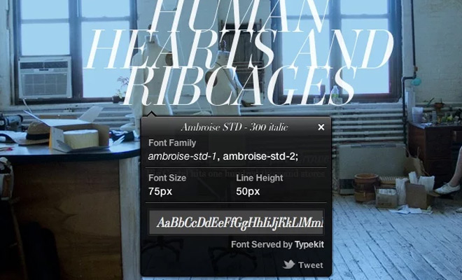
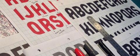
You can learn a lot by looking at other websites and investigating their font choices. The Google Chrome extension WhatFont can help you identify fonts on a webpage. Study everything from page headers to form labels and slideshow captions.
Find your Favorite Typefaces
Perhaps the best advice I can give is to spend time researching fonts on popular websites. Google Webfonts is one example along with Typekit.
Start a list of the fonts that you repeatedly bump into, or fonts that capture your attention. Look through font foundries and tally up the most popular choices. Over time you may find yourself with a list of 30+ fonts that you love.

The reason fonts are so important is because they leave an impression. A paragraph composed of Tahoma will be consumed differently than one using Open Sans.
Recognizable typefaces leave an impression on readers. Your job as a designer is to convey information so that it’s easy to read and impressionable. If you have a real interest in typography then delve into the deeper topics.

Learn about the differences between grotesque and geometric fonts. Learn about the aspects of typography such as leading, kerning, and baseline grids. You don’t need to be an expert but it doesn’t hurt to have a working knowledge of typographic design.
Headers with Magnetism
Visitors won’t always stick around to read through your content. In truth you only have a few seconds to convince people to stay on your page. This means you really need to dole out the charm and captivate people with your design wizardry.
Big bold headers always capture attention. There are certain fonts made for headers that work best in such a situation. But in truth, a header is something that stands out as its own element. A header defines the content beneath it and gives visitors a glimpse into the content.

The blog header on Pen Heaven is a great example of a magnetic design. The font itself isn’t very large, but it uses 2 lines to define the baseline height. These lines draw you into the text and signify that it’s an important part of the page.
To create magnetic headers you just need to find text styles and typefaces that feel prominent. Some choices are better than others, but it’s all relative to the design. An online magazine can get away with oversized text that an investment firm may not even consider.
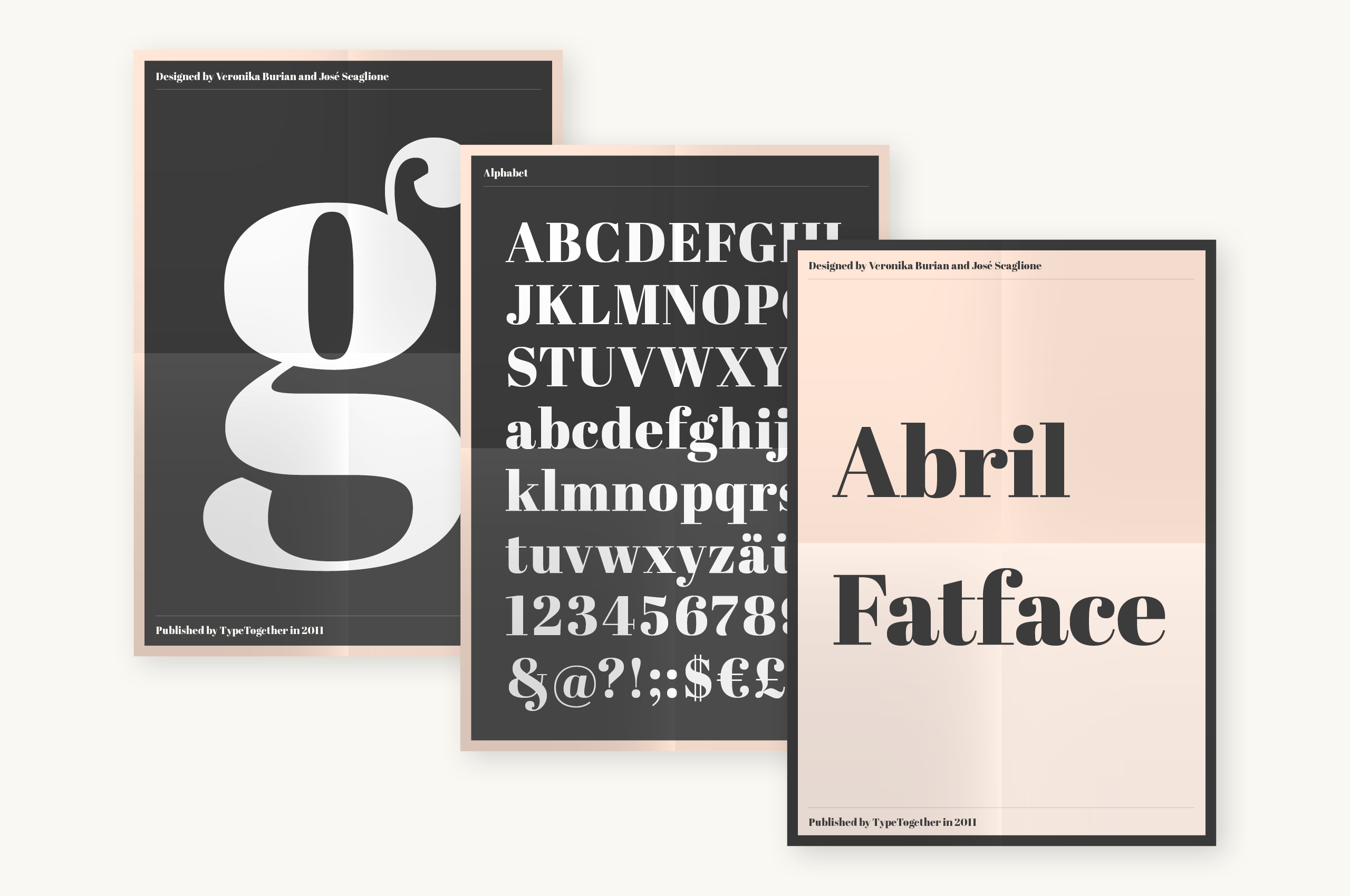
Also keep in mind that free fonts can work just as well as premium ones. For example, Insolent is a great font that’s bold and catchy. Scour the web for any fonts you really like and learn how to incorporate them in a noticeable fashion.
Match Typographic Concepts
A culmination of knowledge and practice will teach you how to match fonts over time. This should be the goal of every designer who wants to create beautiful compositions.
You need to practice and research other designers in order to match fonts effectively. This is not a skill you can pickup over a weekend, a month, or even a year(although anything is possible).

Consider each layout as one large design element with individual components. Navigation, headers, forms, paragraphs, links, bulleted lists, every contextual element deserves attention.
You should also consider the smaller aspects of a page that need attention. Microcopy on the web is a huge part of design. You need to think about tooltips, form hints, button text, and smaller labels for images or videos.

Most smaller bits of text can just use the same typefaces as your page body. However you will need to show proportion by changing the size, spacing, and colors of individual elements.
Truthfully the best way to learn is just by doing. Try stuff out, copy other websites and see what you can build. Derivative works are not always bad unless you blatantly steal 90% of the same ideas.
The more you practice the easier it’ll get. With enough projects under your belt, matching fonts will come to you with the same insouciant effort as breathing and blinking.
Free Font Resources
When you’re just getting started you really need to consume as much as possible. Learning comes from doing but you need a base to get you on the right path.
Read up on the basics of typography and browse around for helpful articles written by designers. From here you’ll be able to recognize different typefaces and make decisions based on mixing & matching.
The following resources are completely free and great for new designers. As mentioned before, you do not need to become an expert in typography. You just need to understand the basics and play around to learn how different fonts work together on the page.
- Type Genius
- WhatTheFont!
- Tips for Combining Fonts
- Behance Free Fonts
- 8 Rules for Creating Effective Typography
Wrap-Up
I hope these tips and examples can demonstrate the significance of typography. In print these same rules apply, but they’re composed in a different way. Ultimately I feel that typography should be a significant component of every designer’s toolset and the way to get there is with consistent, earnest practice.


This is kind of my quote: ‘Truthfully the best way to learn is just by doing. Try stuff out’.
@ https://wecreate.com.hk/
Hey WebDesignHongKong,
impressive font connection with web design page and see clear transparency at your website.