Designing logos can be a very difficult task.
When designing a logo, you want it to stand out from the crowd, yet still be really simple.
Sometimes the designer is really clever and makes the logo very simple, yet includes a hidden message within the logo that has a deeper meaning.
In today’s article, we’re going to cover 20 logos with hidden messages.
Some logos you will have seen before, and some may be completely new to you, but hopefully, you will enjoy them all.
Amazon

The Amazon logo is an extremely simple logo and while the arrow may just look like a smile it actually points from a to z.
This represents that Amazon sells everything from a to z, and the smile on the customers face when they bought a product.
Goodwill
Goodwill. The one thrift store we all know and love.
When you look at the logo, you see it’s a person smiling, probably happy that they just donated their clothes or just copped an awesome find for a great deal!
Now look at the letter ‘g’ from ‘goodwill’.
You’ll see that same smiling person in the first letter of the logo!
LG
At first glance, you might think LG’s logo may just be the winking face of a happy client.
But look closer.
You’ll see that in the winky face logo, there’s actually an L in the center, and the face is a G!
Super clever on their part.
Pinterest is one of my favorite social media apps out there.
It’s always full of great ideas and new trends that I can get inspired from, and then I can pin those images to one of my boards.
Hence, “Pin-terest”.
Duh.
Anyway, to the untrained eye, you might just see the letter “P” in the logo.
But if you really pay close attention, you’ll see that the letter “P” is actually a pin.
Michael Deal, the co-designer of this logo said, “For most of the project, I had avoided making visual reference to the image of a pin because it seemed too literal. But the “P” started to lend itself too well to the shape of a map pin.”
Toyota
Next up, we have Toyota.
This one is definitely one of the coolest of them all, and if it hasn’t received some kind of award already, well, it definitely deserves one.
If you didn’t already know, the Toyota logo has the entire word “Toyota” written in it!
Here’s a diagram to explain it better.
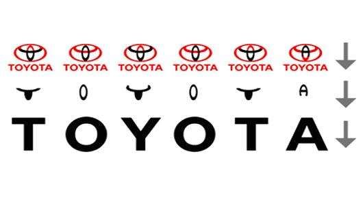
Isn’t that the coolest thing you’ve ever seen?
BMW
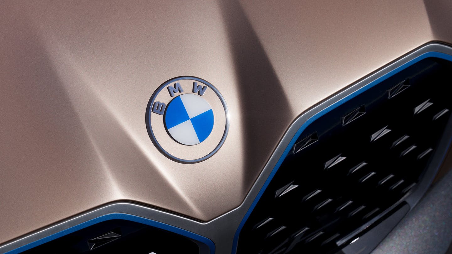
BMW just recently updated its logo and it looks amazing.
I wrote an entire piece about the new BMW logo because that’s how much I loved it.
But anyway, let’s talk about the hidden message here!
This logo actually represents a propeller in motion, with the blue part representing the sky, and the white part representing the propeller.
BMW’s logo is a tribute to the company’s history in aviation.
Baskin Robbins
The Baskin Robbins logo may look like it includes a simple BR above the name. bBt if you take another look, you will that it includes a pink number 31. This is a reference to their original and iconic 31 flavors.
Chick-fil-a
The Chick-fil-a logo incorporates a chicken into the C. Although this isn’t very hidden, it is still very clever.
Eighty20
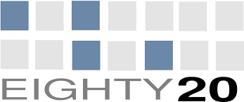
The eighty20 logo is a bit of a geeky one to figure out, the two lines of squares represent a binary sequence with the blue squares being 1’s and the grey squares being 0’s.
Which makes 1010000 which represents eighty and 0010100 which represents 20.
F1
The F1 logo is a fairly simple one to figure out. The negative space in the middle creates the 1.
Facebook Places
If you didn’t already know Facebook Places, it is Facebook’s new geolocational product, which is in direct competition with the current leader in that area, Foursquare.
Now if you take another look at Facebook Places logo you will notice there is a 4 in a square.
Now is this a coincidence or is it a dig at Foursquare?
Fedex
The FedEx logo looks like a plain, text-based logo.
But if you take a second look, between the E and the X, you will see an arrow, that represents the speed and accuracy of the company’s deliveries.
Milwaukee Brewers
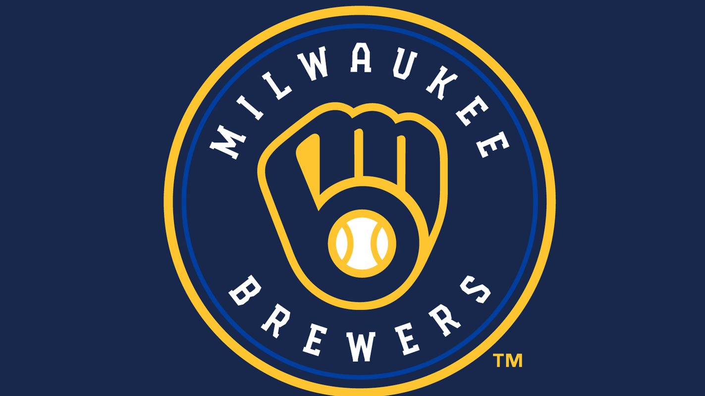
The old Milwaukee Brewers logo may look like a simple catchers mitt holding a ball, but if you take a second glance, you will see the team’s initials M and B.
Museum of London
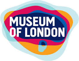
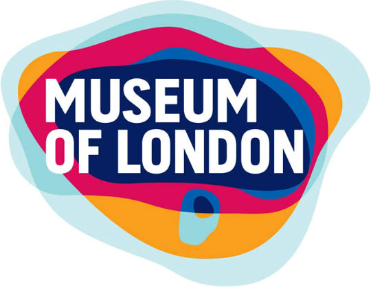
The Museum of London logo may look like a modern logo design, but it actually represents the geographic area of London as it as grew over time.
NBC
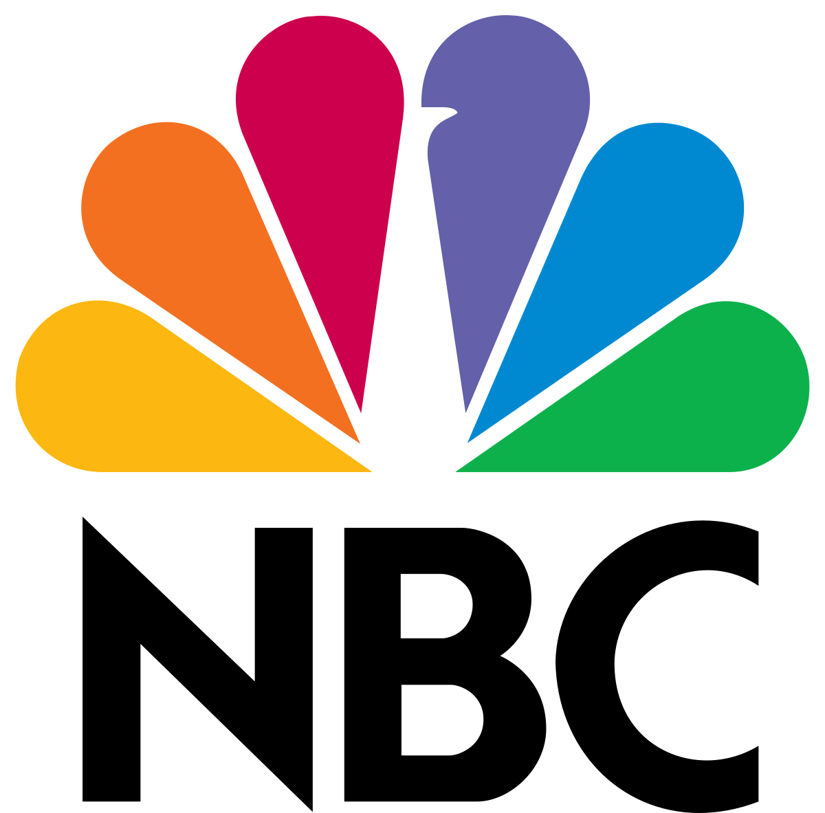
The NBC logo has a hidden peacock above the above text which is looking to the right.
This represents the companies motto to look forward and not back, and also that they are proud of the programs they broadcast.
Northwest Airlines

The old Northwest Airlines logo may look like a simple logo, but if you take a closer look, the symbol on the left actually represents both N and W and because it is enclosed within the circle it also represents a compass pointing northwest.
Piano Forest
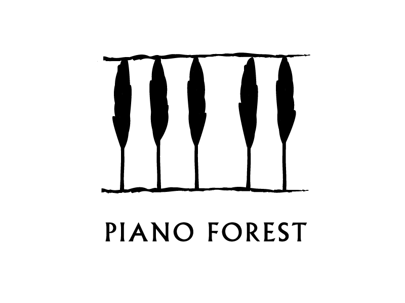
The Piano Forest logo may look like a simple text logo with trees above it, but if you take another look you will see that the trees actually represent keys on a piano.
Toblerone
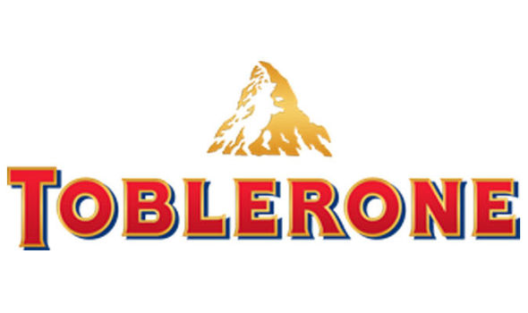
The Toblerone logo contains the image of a bear hidden in the Matterhorn mountain, which is where Toblerone originally came from.
Tostitos
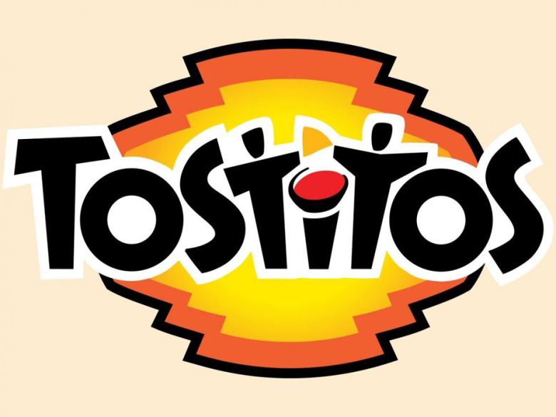
The Tostitos logo includes two people sharing a chip and a bowl of salsa, this conveys an idea of people connecting with each other over a bowl of chips.
Treacy Shoes
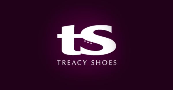
The Treacy Shoes logo is very cute logo with a shoe hidden between the t and s.
In Conclusion
Making a clever logo doesn’t always just come easily to you.
It can take weeks, months, and even years to come up with something mindblowing.
Other times, the idea comes to the forefront of your brain and you can see it clear as day.
Gather inspiration from these amazing logos with hidden messages and start making your own!
You could design the next big logo.
Did I miss any other big logos that have hidden messages within them?
Let me know in the comments!
Until next time,
Stay creative, folks!



Genial, great insight.
Thanks for sharing.
Thanks for sharing mate, this was such an interesting read.
Thouroughly enjoyed this article. Cheers!
What could I say? Creative! This is how logo should be. Simple, beatiful and meaningful.
Superb, aside from the obvious “popular topic” shoehorning in of the Facebook Places logo. If that’s how you draw the number 4, you need to go back to school. It just isn’t there.
There’s a rough version without the map indicator on it (Some colors have been changed for visibility)
https://tinypic.com/r/16kyk44/4
Designers with brains. I like that!
me too 🙂
These guys should go bowling with Leonardo Da Vinci :)))
Thanks for the article, I will never view the logos the same anymore.
Great list… I have to be totally honest and say that I never noticed the connections and hidden meanings behind the logo designs you’ve shared with us. I really enjoy logo design and also try to include little secrets here and there but like you mentioned the simpler the logo gets the harder it is to incorporate hidden meanings. This was a really good read. Thanks for sharing.
Doesn’t the eighty20 one only work backwards.
– It should be 1, 2, 4, 8, 16, 32, 64, not the other way around?
The eighty20 logo is correct. Binary is written with the lowest number to the right, just like hexadecimal and decimal notation.
I don’t think Facebook places logo is related to 4square, it’s only Facebook’s F rotated 90°CCW…
Whether or not the 4 / square was intentional is debatable, but I bet whoever designed it, even if they meant for it to appear like the facebook lowercase “f”, must have realized it at some point, smirked, and left it like that on purpose.
Cool collection
To be honest, your post is just a rehash of about a million other blog posts out there that showcase hidden messages in logos. If you had found a new one then that would have been cool.
I agree – disappointing collection, and rather limited observations too, compared with what’s gone before.
Brilliant post, indeed. Wasn’t a part of the idea behind the NBC Peacock to highlight the vibrant colours of the colour TV set? Can’t remember where I picked that up, though. Nevertheless; thanks for sharing!
Their slogan at the time was that they were “proud as a peacock” to have their station transmit full color.
Nice post, i never noticed the amazon logo points from A-Z before…
The Big Ten Conference logo (American college football) also has a good one. A few years back, they expanded to 11 teams, but Big Eleven doesn’t have the same ring to it. So, they put some 1’s on either side of the T in negative space.
Bar the Eighty 20 logo, I don’t think any of these were particularly designed to be ‘hidden’- rather they all represent the ingenuity of good designers (I would have said they were all quite overt). But seeing them altogether is a great celebration of what makes a memorable brand design, so thanks for sharing 😉
I never noticed the arrow in FEDEX! I feel so ashamed.
Simply brilliant!What could I say? 😀
The NortWest Airlines,Fedex and Amazon logo are
created by real,creative designers!
This is how it should be done!
Another one I’ve always liked is the Safe Auto logo. There is a rear view mirror in between the “S” and “A” in the logo.
https://www.safeauto.com/
Now I want a toblerone…!
I know it’s an old joke, but it’s near impossible to eat a Toblerone without hurting yourself.
Didn’t know that the bear was in the Toblerone logo.
Abuse of the word “hidden”.
Amazing, very creative logo design…
Thanks…
Check out the Big Ten Conference logo.
The task was to create a logo for a conference that actually has eleven teams. Great.
Great article. That’s amazing pice of art!
Creative and well thought out Logos, Thanks for the share.
Lots of interesting stuff.
This was the first time I was looking at most of this logos differently.
Cheers for this article.
Creative, yes. Hidden, no.
Nice Collection
…very interesting stories behind those logo designs, especially Amazon & NBC.
TH4NK5 : )
“The xx logo may look like a simple logo but if you take a closer look …”
good article, thank u.
guys who made those logos are pure genies.
Most of these are pretty obvious. Come on- Baskin Robbins? The “hidden” element is highlighted in pink.
I feel like the only one that will always truly shine is the FedEx one. That is because it works and reads exactly the same weather you see the negative space or not.
whether*
Very interesting article! I really like Amazon and Fedex. All of them are very good though.
Amazing, very original logo designs. LT
Brilliant, and loved the explanations too!
Not sure if I should be amazed or feel shameful. Most of those logos have been in front of me for years and I never saw the hidden elements in them.
Fedex logo is classic!
Brillian job…quite interesting
Interesting information on how some of these logo designs came about, Cheers
Very interesting article! I really like Fedex.
Carrefour logo?
There’s a “C” in the white neutral space.
What might be a coincidence, the blue area of the letter ‘m’ in the baseball Milwaukee Brewers logo appear to be three mugs of beer, and the yellow part could be the foam! Brewers and Beer!
Nice job choosing the most obvious hidden messages. And I think your the 1000th designer to write about the fed ex arrow.
Never noticed the bear in the Toblerone logo before. I’ll sleep better for that.
This Facebook Groups thing…turned sideways represents an f.
Maybe you could see the Carrefour supermarket logo, it’s a good example as well 🙂
Fantastic article.
Thanks
Wow, that Fedex and Toblerone thing really got me – seeing it for years but never REALLY seeing it. Thanks for sharing and opening eyes. 🙂
Nice collection, there were plenty of hidden elements that I’ve never noticed… I can’t believe I’ve missed the fedex arrow.
These are brilliant! I’m from Milwaukee, and never saw the hidden initials in the Brewers logo until you pointed them out! I was here looking for some inspiration, as I have a brain-block right now trying to design a logo for a new company. These were very inspiring and got my brain moving again. 🙂
I like the new Starbucks logo, goes to show how a brand can do away with name and slogan using a good logo.
Many of them are not really hidden. Especially the 31 in BR is SO obvious.
Never knew about the Baskin Robins logo and 31 flavors… Fedex is still my favourite! very clever
Museum of London logo & NBC logo are the best in the list.
You guys forgot to mention that in the NBC logo there is also the hidden acronym for NBC which stands for Nothing But Commercials.
One of my favorites is the new(ish) Caribou Coffee logo. The body of the caribou is a coffee bean.
John Alex ·
Harvard University
Hi,
I am working in designhill.com as designer.
We are working on same kind of stuff. I hope you and your readers will like our interactive guide too.
https://www.designhill.com/…/famous-logos-hidden-meanings
Amazon continues to be viewed as a logo-design master with its a-z and smile integrated into their brandmark. But, has anyone else noticed that the arrow actually looks like male genitalia? I really think Amazon should address the issue, and consider a change.
must be east Asian dicks, really thin like the arrow he is pointing at.
Slanted too.
The Northwest Airlines logo actually shows a compass shows a compass pointing northeast … because the orientating arrow always points north.