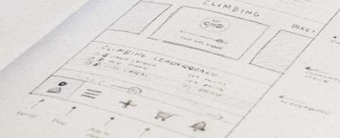
In the context of web design the definition of “fidelity” refers to the level of exactness in which a design is recreated. Low-fidelity wireframes are not very exact and focus more on the general picture. High-fidelity wireframes should feel much more exhaustive in the nature of both design and content.
Not all designers like to work with low-fi and hi-fi wireframes, but this workflow can save a lot of time and stress on bigger projects. In past writing I’ve covered some tips on low-fi wireframing which were meant to be a starting point for designers. This post will follow the process of converting a low-fidelity wireframe into a more detailed high-fidelity version.
Differences in Detail
A designer’s wireframe is comparable to a writer’s outline. A writer may not need to use an outline for all of their writing but it will be helpful to organize thoughts. Low-fi and hi-fi wireframes behave similarly but are used for different purposes.
After completing a simple low-fi design you should have a general concept of the website’s layout. But at this stage it can still be difficult to imagine how content should be placed onto the page. Typography, widgets, icons, and page sections often require more detail than a simple sketch.
If you’re a skeptic on the benefits of high-fidelity design then take a peek at this brief article covering some benefits of the process. Generally speaking, a high-fidelity wireframe leaves less to the imagination. With a more detailed wireframe as a guide your design mockup will require minimal guesswork.
When thinking about a hi-fi wireframe there are only a few details worth excluding. If you’re wireframing on paper then you should ignore the minutiae of textures and exact pixel-perfect placements. Digital wireframing makes rendering a bit easier so when wireframing on a computer you might try to recreate some textures.
A suitable color scheme may also be floating around in your head, but try to keep wireframe colors to a minimum. The wireframe is meant to convey exactness related to content.
Hi-fi wireframing should become a tool used to delve deeper into your layout and pinpoint the specifics of a navigation, footer, CTA button or photo slideshow. Color may become part of this process but it should be left at a minimal stage and fleshed out further in the PSD construct.
Focus on the Interface
Low-fi wireframes are meant to be an exploratory process. These are the original sketches or crude designs meant for testing different ideas. But once you’ve found a low-fi design that looks good it’s worthwhile to focus more on the little things.
A website’s composition should be in your mind at all stages. But the low-fi wireframe is more of a “big picture” design while the hi-fi wireframe is about smaller details. You don’t need to add every bit of content but you should get more in-depth by outlining areas of content, buttons, input fields, and other interactive elements.
Try looking at at the wireframe interface through the eyes of a potential client. Would they be able to tell how the website works? Is the layout clear enough to distinguish between different areas of the page? A hi-fi wireframe should ultimately become the final blueprint used to create your first design mockup.
Some designers prefer to work with a medium fidelity wireframe because it offers the best of both worlds. This way you can start looking for the composition and once you find a great design it’s easy to add content. When first getting started I’d recommend moving from low-to-high and then figuring out what works best for you.
Each designer has their own personal process and it’s important to follow whatever offers you the most creative output. The only thing to remember about wireframing is that it’s a tool. The wireframe isn’t always going to be useful to a client, but it should always be useful to you.
Adding Features
Once you have a general wireframe it may feel awkward to start adding details. How do you know if you’ve gone too far? There is no rulebook but generally speaking wireframes can go as far as you need. The best wireframe should map out every confusing aspect of your design to make the final idea crystal clear.
Low-fi design shows blocks of content to express composition. Hi-fi design molds these blocks into typographic elements, icons, or simple image placements. In some wireframes you might use rectangles to represent images. In others you may add real images as placeholders. The choice is always yours.
Adding features into your wireframe is a personal process much like all areas of design. This is why it’s a good idea to start with low-fidelity and slowly add more detail. Eventually you’ll realize that further detail seems redundant, at which point you’re ready to move onto the full layout mockup.
If there’s a visual aspect of the design which you can’t express in wireframe format try to keep a list of notes for the mockup process. These notes might include links to sample textures, icon styles, font families, or color schemes.
Sometimes it’s easier to just leave icons out of the wireframe because it’d be too much work to create high-fidelity versions. The same is true for other detailed elements which are best left for the final mockup. Wireframing is just a tool meant to guide the design process.
Wireframes can once again be compared to a writer’s outline for their next book or magazine article. The editor may want to skim the outline but they really only care about the final product. You and your client may want to skim the wireframe, but the final mockup is what really matters.
Add just enough features to get your wireframe to that level – no more, no less.
Programs & Tools
It seems the most notorious choice for wireframing is good ol’ pencil and paper. Transferring ideas directly onto paper can be more of a free-flowing process rather than relying on a mouse and keyboard. Also you don’t need to be an artist to sketch boxes onto a sheet of A4.
Regardless of your handwriting or artistic talent, wireframes can flow much nicer through traditional graphite. Those who prefer pencil & paper might check out dot-grid notebooks like Gridbooks or Moleskin notebooks.
However some people don’t feel comfortable sketching ideas for a handful of reasons. Digital wireframes can be created with desktop programs or with online web applications.
Many designers like to use Adobe Illustrator or Fireworks because they support natural vector elements. Mac OS X users have fallen head over heels for Sketch App which is a graphics program specifically made for web/UI design.
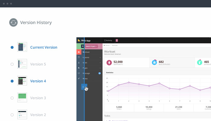
Even though there are many online wireframing tools which run in-browser, it’s difficult to find one that supports detailed high-fidelity features. But it seems one of the most popular hi-fi webapps for wireframing is InVision. It supports version control along with team projects and a large number of personal features.
InVision can be used for free but limits your account to only 1 project. Most free wireframing apps can only be used for low-fi designs because of feature limitations. Personally I would recommend using a program like Illustrator, Sketch, or Inkscape as opposed to an online tool.
But as mentioned before, wireframing is very much a personal process.There is no right or wrong tool for the job. Try out various methods and see which one feels right for your workflow.
Final Thoughts
Wireframing is an acquired talent which becomes easier with practice. If you’re already familiar with the basics of web design then you might find wireframing to be a lot of fun! Wireframing is quite a virile creative process where raw ideas start merging into tangible concepts. Hopefully these tips can get you started on a path toward interface design mastery through the mechanics of high fidelity wireframing.


Any love for PC designers?