The best landing pages are the ones that have been built with one specific goal in mind. Whether it’s to encourage users to sign up, encourage purchases or convince people to buy a product, the landing page can make or break a sale.
It’s often not enough for a landing page to look great, it also needs to turn potential customers into actual customers. We’ve selected several beautifully designed landing pages that all appear to have been built with one particular goal in mind – increasing conversions.
Highrise

There’s a lot to love about the landing page for Highrise, the CRM tool from 37signals (makers of Basecamp), but the most obvious is the ultra-testimonial. It’s impossible to miss – the landing page leads with a promising quote from a Highrise user, along with a link to their business and a huge image of them, an effect which results in a lot of personality and an increased level of trust. The idea is – if this person trusts Highrise so much, why shouldn’t I?
The landing page also keeps it simple – there are three images which expand in a lightbox to show you what Highrise looks like, there’s three bullet points – the first two explaining what Highrise let’s you do, the final bullet point explaining the benefit of that – and there’s a large button above the fold. They’ve done several things with the button to help encourage potential customers to click it – firstly, it stands out by having a different contrast to the background, and they’ve given it a white border to help make it seem more pronounced. Secondly, the text “See Highrise Plans and Pricing” makes it immediately obvious about what will happen when that button is clicked (unlike buttons that say “Submit” or even “Sign Up”) and finally they’ve added a small line of text underneath saying “Risk-free 30 day trial. Cancel anytime” – to help put people’s minds at ease that there’s nothing to lose.
The other important thing about this page are that there are very, very few distractions – the page’s sole purpose is to get people to click that button, so there aren’t links to a blog or to other 37signals products, they’ve deliberately kept distractions to a minimum.
Square

Square, the app that allows you to accept credit card payments on your iPhone or iPad via a small plugin card reader, has a beautifully designed landing page. The visual imagery is huge, with a massive background image of a white iPhone taking a credit card payment – which also demonstrates an excellent context-of-use (a way of easily visualising how the app works).
The form begins with a large call-to-action that offers a benefit – “start accepting credit cards today”. The form itself is beautifully designed because it’s so simple. The easiest way to get a user to fill in a form is to reduce the number of things the form asks for, with Square you only need to add an email address and a password, as well as confirming your password. Small, simple forms typically lead to better conversion rates.
The copy on the page helps to show the benefits of Square, rather than the features. The bullet points under the form both demonstrate a relatively low charge for use, fast payment, fast setup and the fact that the app itself is free. Finally, the landing page includes small, but noticeable, icons for Visa, MasterCard, American Express and Discover which helps to prove that the app is trustworthy, or at least that it can accept payments from the majority of card providers.
Square’s is an effective landing page because it’s so simple – you’re not overwhelmed with information, the call to action is obvious, the form is quick and easy to fill in and it looks stunning.
Fantastical

Fantastical by Flexibits is a calendar for Mac that sits in the taskbar and allows you to add new reminders by typing in a natural language, for example – writing “Client meeting at 2pm on Tuesday” will add the reminder with the proper date and details set. It’s a beautifully designed app and the landing page clearly reflects that, while also encouraging conversions.
The most direct, important elements are above-the-fold – a “Download” button (with some helpful “Free trial” reminder text) and a “Buy Now” button, both brightly coloured and with different contrasts so that they stand out and are easy to spot. The main, full-width image is that of the app in use (and hovering over it reveals more – a nice effect that helps show the app in use) and a screencast demonstrating the features and benefits of the calendar, which is particularly important as studies have shown that video can result in up to 80% improvements in conversion (according to EyeView Digital).
Scrolling below the fold also shows a beautifully designed set of features and benefits – and uses images of the app in action to show how it works and to highlight it’s ease of use. Finally, three features are included at the end – each feature ends with a benefit – for example, there’s a run-down of “Automatic alarms”, followed by the sentence “you’ll never miss an important event again”. Each feature is separated by a healthy amount of white-space to help keep the design visually appealing and easy to read – the only thing the design is really missing is the “Download” and “Buy Now” buttons repeated at the end.
Gift Rocket

Gift Rocket, a new startup that allows people to buy gift cards for any business and redeem them on their smart phone, keeps their landing page simple, and beautiful. It’s obviously a very visually appealing homepage, but everything about it has also been geared towards encouraging conversions. The opening title “gift cards to anywhere” helps to explain what the service is, while the opening form is extremely simple – there’s a business name which you can enter (or, if you just want to search you can try “restaurants” or “bars” etc), and there’s a location. Gift Rocket keeps it even simpler by automatically entering your location as soon as you’ve added it – meaning you can speed through the form and onto the search page.
Like many successful landing pages, Gift Rocket also makes a feature of the press mentions they’ve received. Quotes from Bloomberg Businessweek, UrbanDaddy, Mashable and TNW are all prominently displayed and aim to encourage users to trust the service.
The only criticism I have of the Gift Rocket landing page is that the copy perhaps focuses a bit too much on what it is and how it works, rather than why you’d want to use the service – the important lesson there is that it’s best to focus on benefits, rather than features.
Tumblr

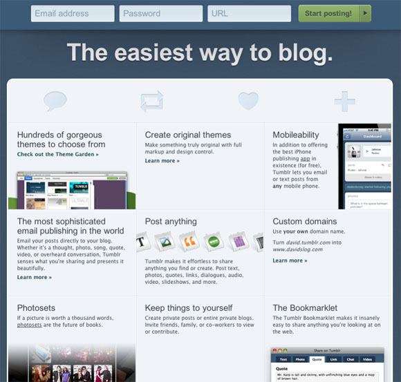
Tumblr, the blogging platform that rivals WordPress and Posterous, has clearly spent a lot of time thinking about design when creating their homepage, and importantly on how to encourage people to sign up. Tumblr has one of the best examples of short-form design out there – the form asks you for the absolute minimum that is required – your email address, a password and the URL that you want. To further speed up the process, the first input box in the form – the email address field – is automatically focused on as soon as you arrive at the landing page. The wording on the sign-up button is also brilliantly worded – “Start posting” is a call-to-action that let’s you know immediately what will happen as soon as you push it. Despite following the page’s visual aesthetic, it also stands out by being the only green object on the entire page, drawing attention to it.

For people that need more copy in order to be sold on a new product or service, there’s a “30 reasons you’ll love Tumblr” banner at the footer, which reveals a new page, full of benefits (as well as features) of the blogging platform. This is extremely useful as not everyone is the same – some visitors will be more likely to sign up with as few visual distractions as possible, while others will want to read up on the service first in more detail before they are persuaded to join. Tumblr cleverly satisfies both.
Have you got any examples of sites with brilliantly designed landing pages? Let us know in the comments.


Each of these is a wonderful looking website in its own right. The fact that their beauty accentuates their purpose (conversion) is true testament to the skill of the designer.
Leading Edge Web Designs.!!! Their use of effective Images that convey the whole of what is being offered, combined with with a Quick clean call to action conversion mechanism. Inspiring ..Thanks
Thank you for this interesting post. And of course I especially love the design of Tumblr. Direct and perfect to use 😉 All websites should like that :p
@Pragmatic – You took the words right out my mouth. Beauty meets purpose. It truly is what top notch design is all about.
I would love to see a lot more landing page designed for conversion as a follow up post?
This is a brilliant collection that demonstrates perfectly why a well thought out holding page is always a worthwhile investment. Especially if your website is going to be down for a while or isn’t ready yet. There is no need to miss out of existing traffic to your website.
All are these looking nice and Fantastic and introduced best concepts. Thanks
I believe good design also cover the website content, without this it would only be a great picture.
Great post!
Great tips.This is a very helpful article in designing web sites for international use.
great designs on show.
The Highrise conversion page experiment was just inspiring to read about. A true testament to less is more. Abtests.com is a great site to check out if you’re looking for more examples of conversion page tests.
These are ALL great examples. I think the ‘Square’ page nailed it perfectly – image of product/service in action, coupled with a simple headline. Easy to sign up form, with easy bullet point ‘benefits’ and trust symbols to reduce friction and anxiety.
Oh my – We LOVE #2 – Square.
That image is striking and the enquiry form is sleek!
Check out the bullet points with subtle icons!
And then the logos…
The Gift Rocket Landing page is amazing. I guess it’s quite effective. I’ve read the post similar to this one – https://designwebkit.com/web-and-trends/how-design-perfect-landing-page-your-website/ – it’s also good. But I’d like to know your thoughts about these tips. Do they seem to be good for everybody or just for me?