In an internet world, a website is a way to share information with readers and to convert users into possible clients. Websites are a client’s portfolio and make up the center of marketing efforts.
However, in a rapidly changing world, where internet trends shift and change, a website may grow to feel outdated. Redesigning a website is expensive. Here are some ways to keep your website efficient.
Design for your audience
When working towards your audience, remember to use market research to find out who your audience is. Then make sure to design your website around your audience.
A corporate audience would engage differently with teenage gamers, for example. Once you know who your audience is, match your website to user needs. Request user feedback, and then follow these guidelines to improve your site.
Create personalized experiences for your users
There have been a lot of improvements lately in personalized experiences. You’ve seen chat bots and conversational interfaces everywhere. But an interesting new feature that you might see is age-responsive design.
It may sound strange, but it’s actually an amazing thing. With it, you can tweak the user’s experience to suit it better for them. You can change the font size, color or other elements that will make it easier for older people to consume your content.
Less is more
Internet viewers are impatient, and you might only have a few seconds to hold their attention.
Keep only important information on your homepage, and let viewers find what they need by installing an effective navigation panel.
Include your logo, brand, and call to action details on your homepage, so that users know that they have come to the right place. From here, users can navigate to different areas of your site.
Structure your site
Your navigation panel, content, and action panel should be designed as clearly and concisely as possible so that they meet user needs.
If a website flows and a user is easily able to communicate, this will ensure return customers.
Text
When including written content, look at the size and choice of font. Your goal is to make the content as easy to read as possible. Use only three fonts at most, and divide paragraphs into easy to read headings or subheadings. Make sure you’re writing an easy to understand website tagline. It’s the first thing your users will see.
Use bullet points to make instructions clear. Read the text carefully so that you are aware of how to structure information to meet users’ needs.
Also, make sure the fonts you use are easy to read in paragraphs or titles. There are lots of articles with free fonts. Pick one or two fonts that are fit for your audience and have a good readability score and you won’t be missing any visitors/clients due to font issues.
Navigation bar
Your navigation bar is used by viewers to access your site. Make it simple, easy to access and efficient.
Help visitors to return to your homepage easily. Your homepage displays your brand and logo, and assists with defining your product.
Page speed
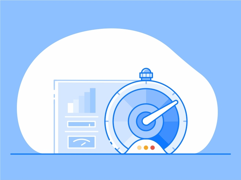
Internet users are impatient. Ensure your page downloads quickly. This is particularly important for mobile devices; which viewers may use to quickly access information during a quick time gap.
If your user is going for a quick cup of coffee or making a hasty purchase between phone calls, and your page takes a long time to install, your client will feel frustrated and you’ll lose a customer.
Slow pages often result in viewers ‘bouncing’ or leaving the site after accessing the home page. A two second time delay may result in 87% of viewers leaving the site. This has a massive impact on a business.
Find out from Google what your page speed is, and pick up any suggestions they have to offer on improving your site’s downloading time.
Be bold with your calls to action
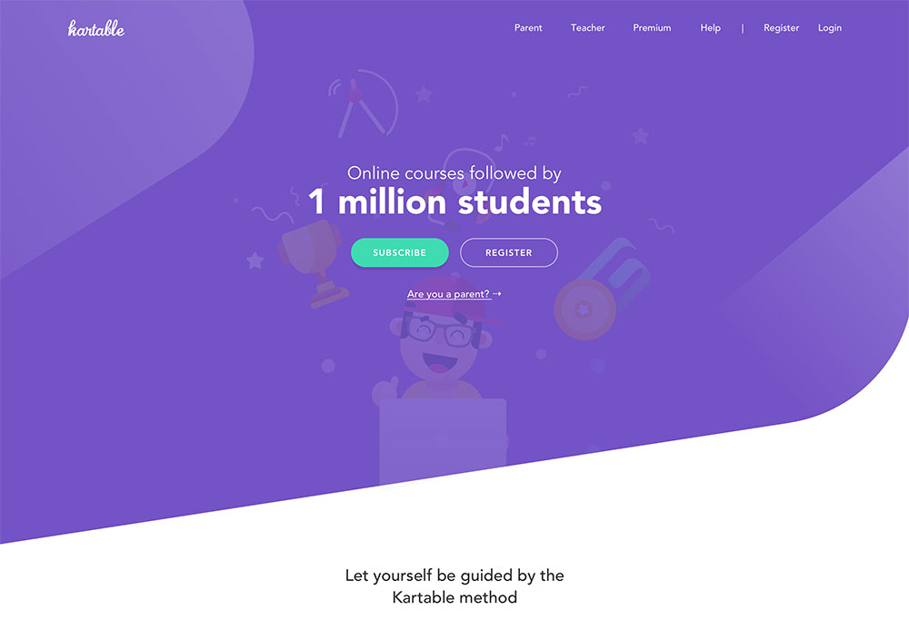
Calls to action show viewers how to subscribe, join a forum or make a purchase. These buttons are often clearly and simply labeled. Use bright website color schemes or strong contrasts to highlight your buttons. Pick colors carefully, depending on the message you want to give your user (reliability, intelligence, urgency).
When labeling your call to action, use words that encourage action. Focus on encouraging your user to identify emotionally. Words such as ‘Join Now’ encourage belonging to a forum. They also give a sense of time, which prompts the user to join ‘now’ and not later.
Keep your call to action message direct and precise. Showing customers how to subscribe and offering a prompt such as a good deal or free download can also encourage customer participation.
Keeping space
Keeping your website uncluttered will give your user an easy and relaxed experience. A cluttered, chaotic site is often difficult to negotiate.
Make sure your content, images, and icons all have breathing space. This will give flow to your unique website. Group together all connected data to keep your site clean and easy to understand, and connect your pages through consistent color, font, and style.
Contact details
If you want your users to engage or get in touch with you, make sure your contact details are easy to reach. Add all the necessary means of communication (such as phone, address or email).
Social media links
Your users may find out about your product via your website, but they often engage via social media. Include links to your social media pages so that your users are able to find you, engage with you, and follow your latest posts.
All businesses should have a social media page in order to engage clients, show new updates and keep in contact with potential customers.
Include a search field
When your user comes to your site and wishes to make a quick purchase, or has a question, search tools vital. If you have a great deal of information on your site, and precise details are hard to access, customers may use the search information to access the data they need. This will give quick and easy answers, prevent frustration, and keep your user on your site.
Frustrated users will go to your competition. To make your website quick and efficient (particularly if you have a lot of information) make your search bar easy to find.
Fix your broken links or install a custom 404 page
If your website has broken links, these may result in users leaving your site. This is because they find a ‘dead’ page, which cannot take them where they want to go.
404 pages are like blind alleys that block access to your site. Identify your broken links by checking your website in Google’s webmaster tools.
Redirect your old page to a new URL with a similar topic.
Request that your old URL is removed from search engines.
You can design a custom 404 page, taking users to your main site, offering up good deals and explaining your brand. Show your viewers new products, special offers, and top deals.
Use humor and apologize to your viewers for the broken links. You could also offer an apology on your custom page, give users the option to access a great deal, or offer a voucher or free delivery on a product.
Summary
Giving your viewers an excellent online experience will engage viewers, converting them into clients.
Use these helpful tips to get the best from your website and give your viewers a worthwhile online experience.






Leave a Reply