
6. Uglytub
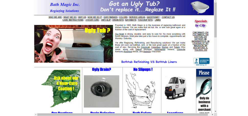
Are you thinking of replacing your old bath tub? Then you should do it because this website doesn’t really convince you to do otherwise. A combination of flashing poor quality imagery, tiny fonts, and garish colors in conjunction with the limiting frames minimizing the site to a small window in the center of the screen sure makes this the worst offenders on the web.
7. Jamilin

Jami Lin “Love Love, LOVES helping you to evolve” but maybe she could use a little of her own advice to revamp her website. Collages of images, videos, links, adverts, and copy are all crammed into the center of the site. This surplus of images and text is a little overwhelming and blocks the clear navigation
8. Gatesnfences

At first glance, this Florida-based company has a website that’s stuck in the past. And taking into consideration that you will find a copyright notice of 2004-2008, I think I’m right. At the same time, they’ve decided that the best way to increase the user engagement is to bombard them with A LOT (and I mean A LOT) of information straight on the homepage. Some small, low-quality images are scattered throughout the page, but nothing to break up the huge amount of text. It hurts. Badly. Maybe they should learn that sometimes less is more.


So… you need to link your titles to the websites.
That’s pretty funny. If you’re going to write up a page criticising other websites, maybe best to make sure that page has functioning, and correct, links.
The attitude behind this article is why designers frequently clash with business folk. What you think is a fail by your design standards most times generate quite a lot of traffic and income.
One example is the Lings automobiles site. He found a way to differentiate himself from the crowd and get people talking. For a business website, the only two metrics that matter is how much sales is generated and how much trust is built. Aesthetic beauty is not a requirement for either of those, although it can help.
The only thing people are talking about is how or his website is. I’m not sure it will generate much in the way of sales.
But you may have a point. My Father spent his life working in advertising and h with regards to TV Adverts he always said the only ads that are remembered are the really good ones and the really bad ones. And it’s always easier to make a really bad one!
And someone at Web Design ledger needs to learn how to actually spell the word ‘Failures’!
Brutalism is a growing (but very misunderstood) trend in web design. Most, if not all, of these could be considered brutalist.
There might be some negativity about this, but I think there are some useful takeaways. If an element adds to the user experience then great. But if it doesn’t add to the experience, it usually detracts.
As designers that work for businesses we need to meld our own design ideals with the business goals. That means creating a user experience that is positive and generates income, whether that means incorporating more than we would like into a page or chiselling some away to reveal a product that gives the best of both worlds. 🙂
People always share the most beautiful and well organized website. But in this article it was really different idea. Sharing the worst websites ever. Are they really worst?/?
Great feature!! you need to link of this page to the websites.
TRY ‘The Daily Dot’
This is the first time I’ve heard of Ling’s Cars. IMO I think the gaudy design is intentional and awesome.
I believe is succeeds in executing what it is attempting to achieve.