

For decades, James Bond has been gracing the silver screen as a charismatic, charming and ultra-slick secret agent. Yet, the website for the James Bond museum is SOOO FAR AWAY from the classy image of the secret agent that it’s offensive. Its stark background and Times New Roman typeface make it obnoxious. Barely expressing the character of Bond himself, the homepage is an overwhelming, sour and incomprehensible mix of menus, hyperlinks, and random imagery.
10. Rudgwick Steam & Country Show
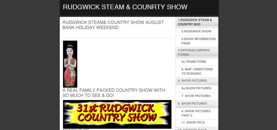
Although this may not be the worst website, it’s still terrible. I think the developers tried to have a responsive design, but they failed miserably. If you visit the website using a phone, it doesn’t look that bad, but if you use a laptop or a desktop, the website looks like an image placed in the center of the screen. What’s more, they’ve chosen a design packed with primary colors and a collage of random images. The relevant information is there, but it is confusing due to the busy layout.
In contrast to many websites listed here, this one lacks not just a catchy title, but also text. Larger pictures, a new layout, and functional links would help make this website more inviting and visually-appealing.


So… you need to link your titles to the websites.
That’s pretty funny. If you’re going to write up a page criticising other websites, maybe best to make sure that page has functioning, and correct, links.
The attitude behind this article is why designers frequently clash with business folk. What you think is a fail by your design standards most times generate quite a lot of traffic and income.
One example is the Lings automobiles site. He found a way to differentiate himself from the crowd and get people talking. For a business website, the only two metrics that matter is how much sales is generated and how much trust is built. Aesthetic beauty is not a requirement for either of those, although it can help.
The only thing people are talking about is how or his website is. I’m not sure it will generate much in the way of sales.
But you may have a point. My Father spent his life working in advertising and h with regards to TV Adverts he always said the only ads that are remembered are the really good ones and the really bad ones. And it’s always easier to make a really bad one!
And someone at Web Design ledger needs to learn how to actually spell the word ‘Failures’!
Brutalism is a growing (but very misunderstood) trend in web design. Most, if not all, of these could be considered brutalist.
There might be some negativity about this, but I think there are some useful takeaways. If an element adds to the user experience then great. But if it doesn’t add to the experience, it usually detracts.
As designers that work for businesses we need to meld our own design ideals with the business goals. That means creating a user experience that is positive and generates income, whether that means incorporating more than we would like into a page or chiselling some away to reveal a product that gives the best of both worlds. 🙂
People always share the most beautiful and well organized website. But in this article it was really different idea. Sharing the worst websites ever. Are they really worst?/?
Great feature!! you need to link of this page to the websites.
TRY ‘The Daily Dot’
This is the first time I’ve heard of Ling’s Cars. IMO I think the gaudy design is intentional and awesome.
I believe is succeeds in executing what it is attempting to achieve.