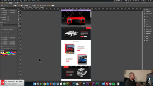
Creating Responsive Compositions in Adobe Muse. No Coding Skills Required.
Responsive slideshows, compositions, and forms are finally here! Adobe Muse 2017.1 was released on August 22, 2017 with more responsive widgets, stability and performance improvements, and productivity improvements. The release notes can be found here:
https://helpx.adobe.com/muse/release-note/adobe-muse-release-notes.html
If you are an avid Adobe Muse user you will know that these updates have been anticipated for quite some time. Since the release of breakpoints and fluid-width design we’ve all been waiting for these widgets to catch up with the new way of designing in Adobe Muse. Prior to this release slideshows, compositions, and forms were not able to respond to the browser width.
I created the video tutorial above to showcase the new updates and to show the power of responsive compositions within Adobe Muse.
Here is a preview of the website: http://bit.ly/2w5Ihgj
The assets to re-build this website can be found at the following link: http://bit.ly/2xumluL

To create a responsive composition in Adobe Muse:
- Go to Object > Insert Widget > Composition > Blank
- Add triggers and targets by click on the ‘+’ symbol around the triggers. To have all the triggers and targets have the same styling initially, delete all triggers besides one, then style the first trigger and target. Now when you add a new trigger and target they will have the same styling as the first.
- Style and add content to the triggers of the composition.
- Style and add content to the targets of the composition.
- To have the composition be responsive set the composition to ‘Responsive Width’ by going to the ‘Resize’ option in the upper toolbar and selecting ‘Responsive Width.’
- Done!


For more video tutorials and widgets for Adobe Muse visit http://museforyoushop.com.
Happy Musing!


Leave a Reply